Arizona State University brand guidelines
Arizona State University provides a comprehensive brand portal with design standards, execution rules, and asset libraries.
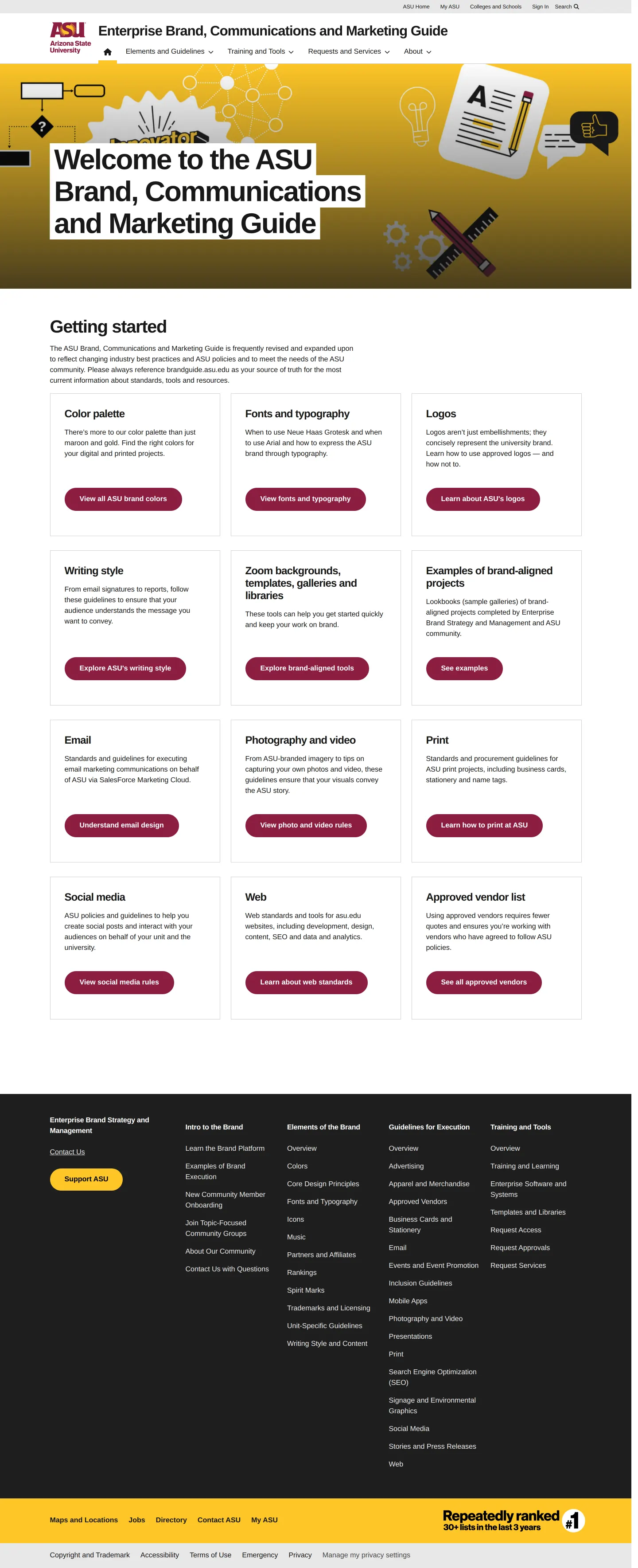
Homepage of the Arizona State University Enterprise Brand, Communications and Marketing Guide.
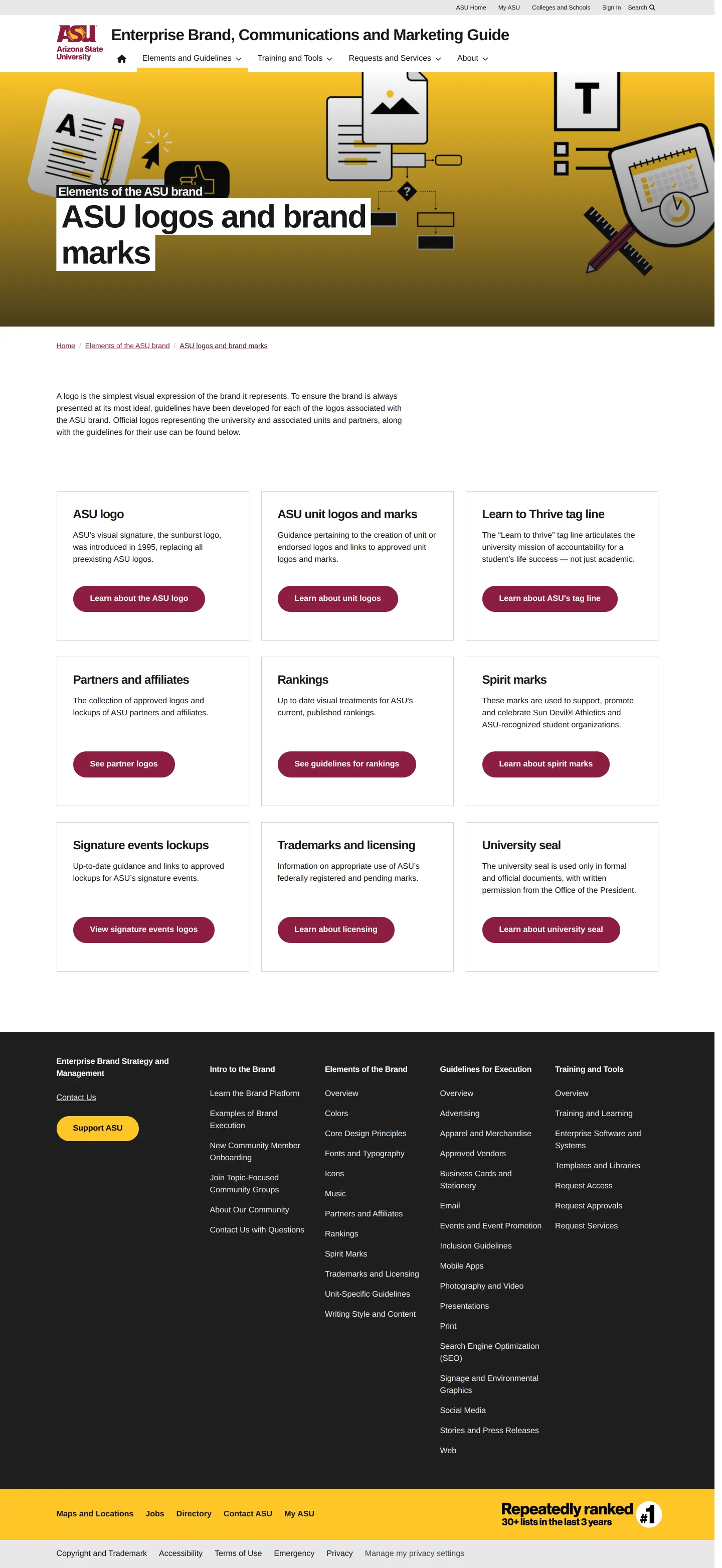
Index page for Arizona State University's brand logos and marks, displaying a directory of sub-categories in a card grid.

Arizona State University brand guidelines page outlining the primary and secondary color palette, usage proportions, and technical color builds.

Brand guidelines page for Arizona State University detailing typography rules, approved typefaces, icon fonts, and typesetting best practices.
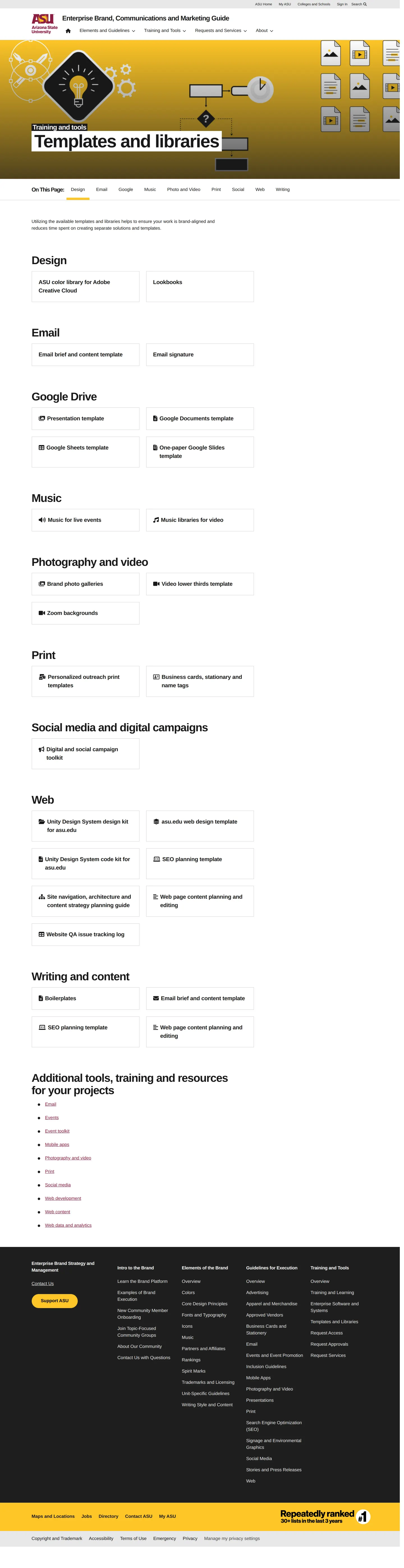
Arizona State University brand guide page featuring an index of branded templates, assets, and libraries across various media categories.
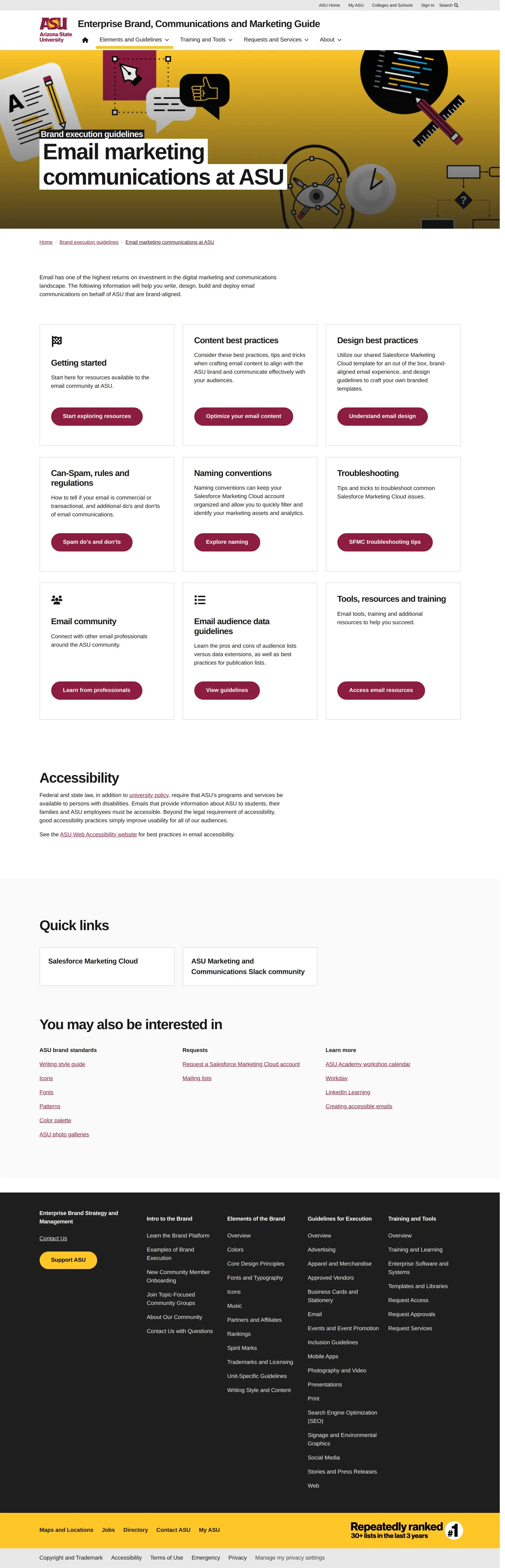
Email marketing communications guidelines page from the ASU brand guide featuring navigation cards and policy links.
Want a brand center like Arizona State University’s?
Create your brand center with Freedam ↗Freedam's take
I like how practical Arizona State University makes its brand portal. Rather than burying rules in dense documentation, it acts as a working directory for a large institution. The color section catches my eye immediately with a clear pie chart showing exactly how to distribute primary and secondary tones across projects. It also bridges print and digital cleanly, listing foil stamping vendors alongside web kits and Google Drive assets. I appreciate that they offer practical tools like custom icon fonts right next to straightforward guidance on kerning and drop shadows.
At a glance
- Sections
- Elements and Guidelines · Training and Tools · Requests and Services · About
- Downloads
- OTF
- Tone
- Clear, practical, and highly organized institutional guidance.
What I noticed
- The color palette specifies a distribution pie chart allocating 20% each to Maroon, Gold, Rich Black, and White, with the remaining 20% divided among secondary hues.1
- Primary typography is designated as Neue Haas Grotesk for print, Arial for digital, and Sun Devil Bold for athletics.23
- The templates section organizes resources into media cards covering design, Google Drive, music, photo, video, print, social, and web.45
Numbers refer to the screenshots above.
What I could not see
- Could not inspect the full content behind individual logo download cards without navigating further into subpages.
- Could not view individual Google Drive or Adobe Creative Cloud files directly from the index overview.
Ideas to borrow
- Show a color distribution pie chart to communicate how primary and accent colors should be visually balanced across layouts.1
Quick answers
Reviewed on 26 September 2026. Request a correction · I built this
Similar brand centers
All brand guidelines →