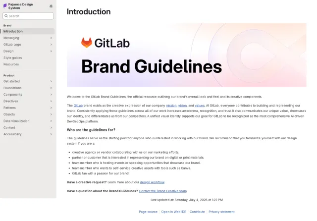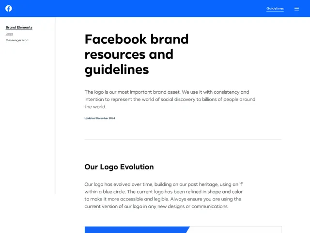
Amplitude brand guidelines
Amplitude's brand guide features a structured sidebar navigation paired with dimensional brand visuals and real-world event photography.
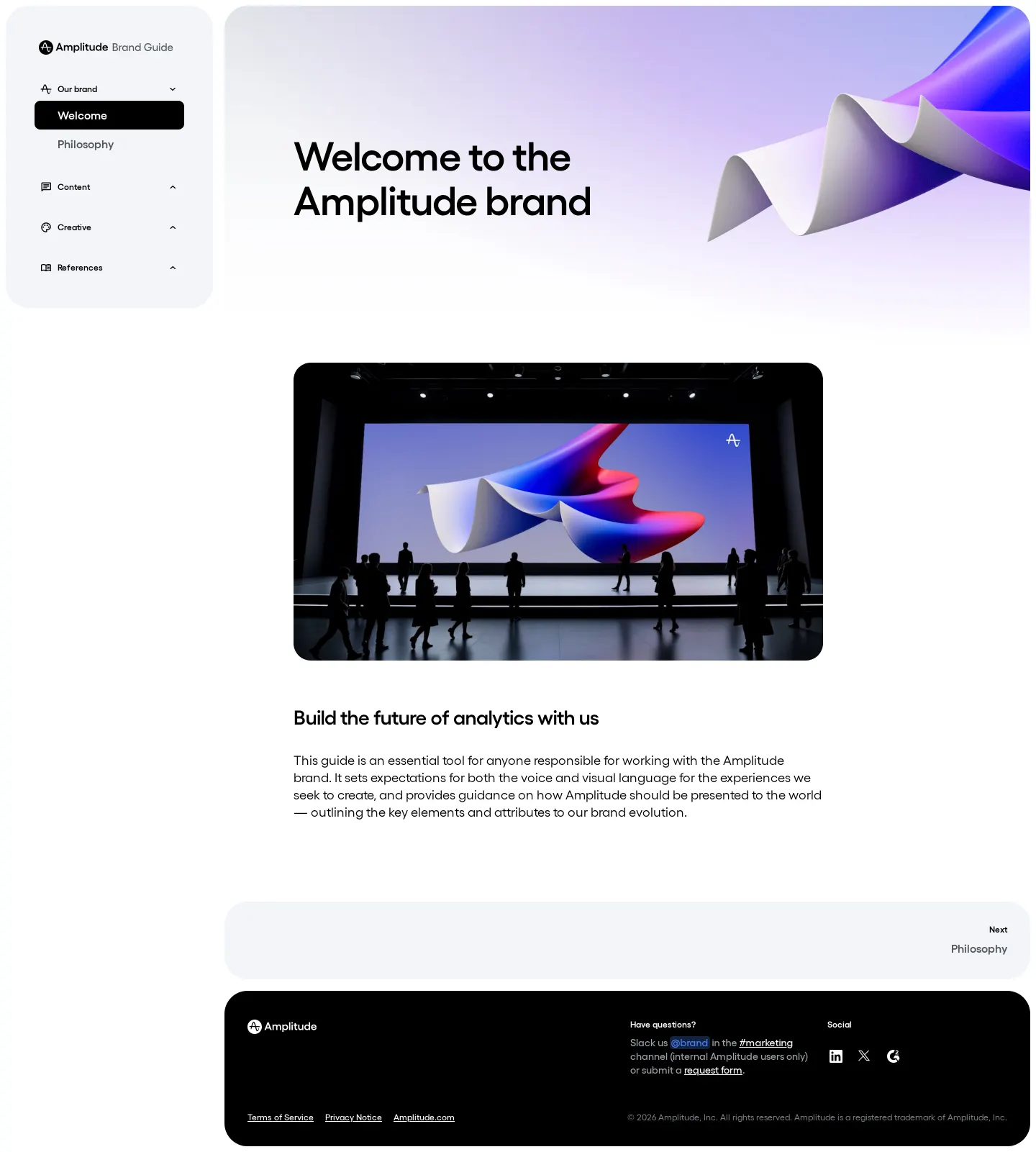
Welcome homepage of the Amplitude Brand Guide showing the category sidebar, 3D ribbon graphic, and event stage photograph.
Want a brand center like Amplitude’s?
Create your brand center with Freedam ↗Freedam's take
I like how cleanly Amplitude welcomes visitors into their brand space. The landing view keeps things focused with a distinct left sidebar organizing the system into Our brand, Content, Creative, and References. Right beside it, a large 3D folded ribbon in gradient tones sets a polished visual tone, paired with an event stage photograph that shows the identity working in a physical space. It feels like a thoughtful portal designed to help people orient themselves before digging into specific style rules and assets.
At a glance
- Sections
- Our brand · Content · Creative · References
- Tone
- Modern, clean, and welcoming with a structured corporate software tone.
What I noticed
- The left sidebar organizes brand navigation into four distinct categories: Our brand, Content, Creative, and References.1
- The welcome view showcases a 3D folded ribbon visual rendered in gradient tones beside the primary greeting heading.2
- A card on the page depicts the brand applied in an environment, showing an event stage with audience silhouettes facing a screen.3
- The site is built using Framer.4
Numbers refer to the screenshots above.
What I could not see
- Could not view the contents of the Content, Creative, or References navigation sections.
- No asset download links or file pickers were visible on the captured welcome screen.
Ideas to borrow
Reviewed on 25 September 2026. Request a correction · I built this