Aalborg University brand guidelines
Aalborg University provides a Danish-language design guide covering core rules, typography, brand assets, and structured logo packages.
Freedam's take — I like how direct Aalborg University is with its core design elements. Right from the main guide page, you get straightforward access to their typography, color palette, and their distinct fifth element, which includes direct downloads for custom wave assets and InDesign swatches. When you jump into the logo section, everything stays very practical. They group assets clearly by context, offering dedicated packages for print, web, social media, and specific campuses, paired with clear usage dos and don'ts. It feels like an efficient, no-nonsense workspace for university staff and partners to get what they need.
Details
- Type
- Guidelines
- Access
- Public
- Source
- aaukommunikation.aau.dk
- Industry
- Education
- Capabilities
- Guidelines, Downloads
- Tags
- do's and don'ts, asset downloads, typography, color system, logo usage, multilingual
- Added
- Last checked

What I noticed
- The main design guide page includes sections covering typography, color palettes, a distinct fifth element, and five design rules.1234
- Users can directly download assets including the Barlow font via Google Fonts, InDesign color swatches, and AAU wave graphics.567
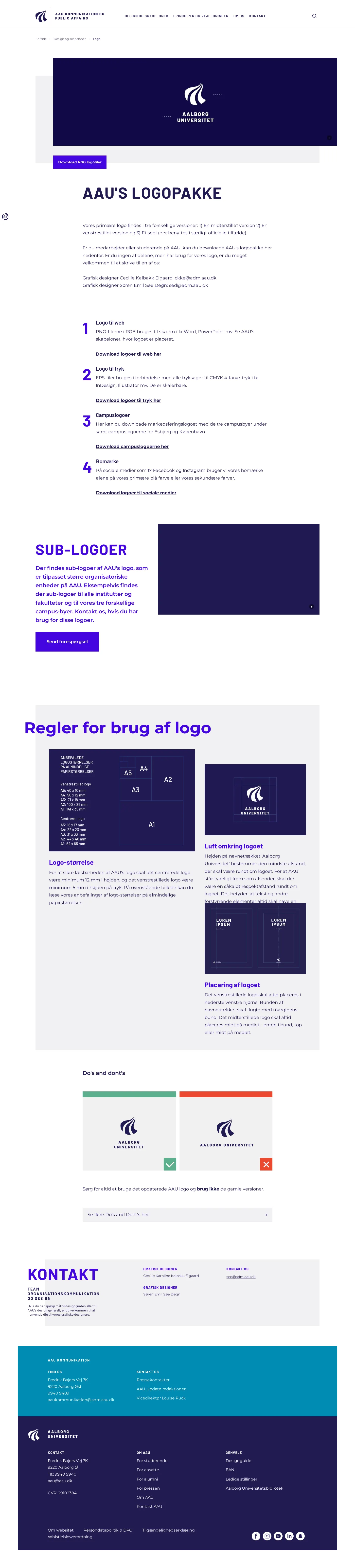
- The logo section divides downloadable asset packages by use case, such as web, print, campus logos, and social media icons.891011
- Logo guidance includes rules for sub-logos alongside do's and don'ts.121314
Numbers refer to the screenshots above.
What I could not see
- The templates, images, and video pages were not captured, so specific asset libraries or template implementations could not be inspected.
Ideas to borrow
- Organizing logo downloads into specific media packages like web, print, and social media helps users quickly locate files formatted for their immediate task.
Reviewed on 18 September 2026. Request a correction · I built this