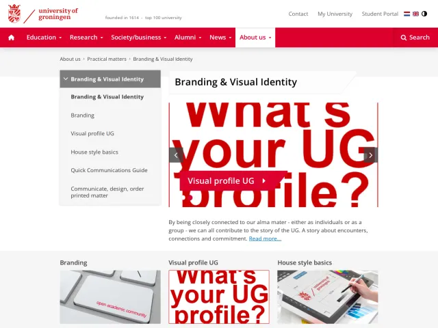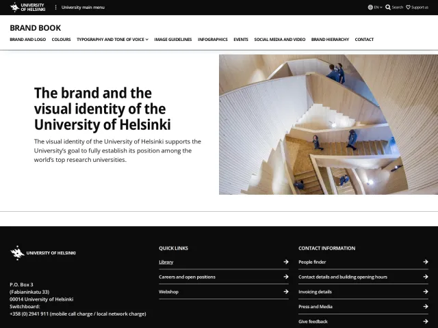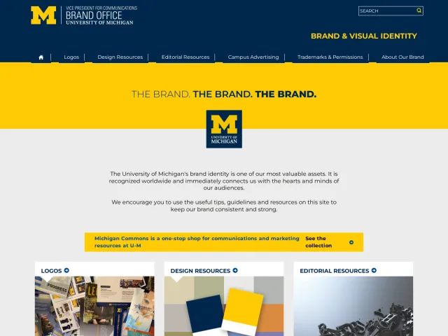
Vanderbilt University brand guidelines
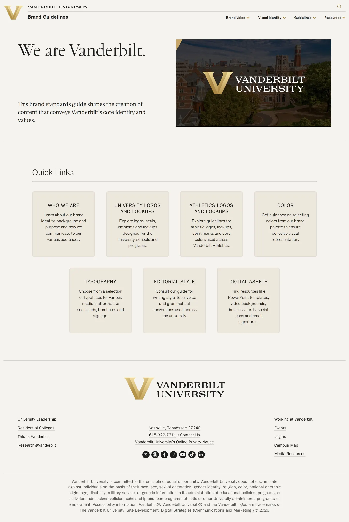
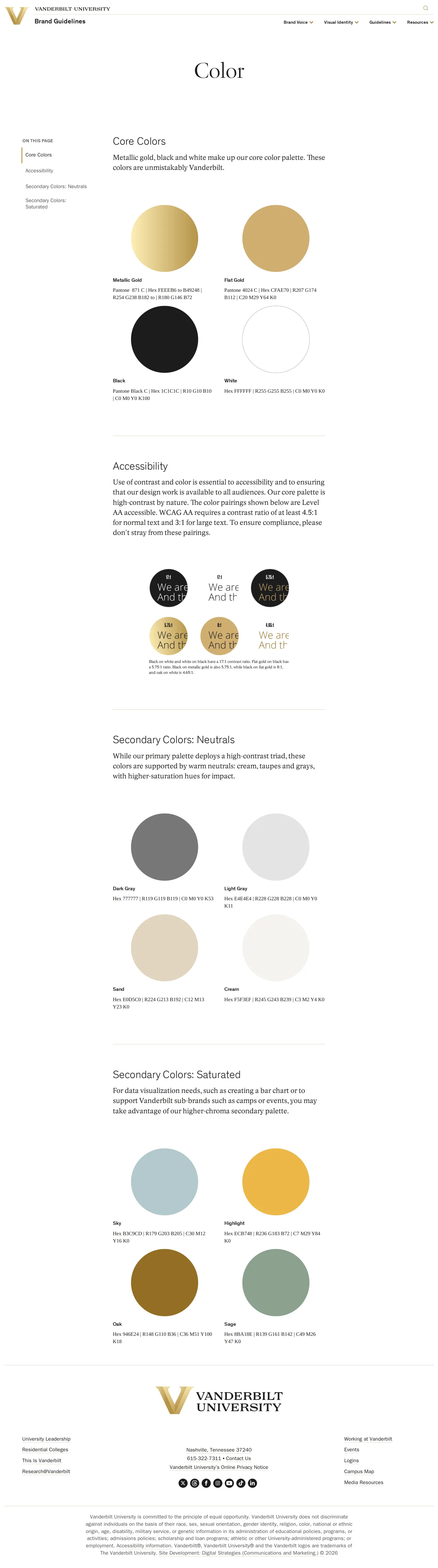
Vanderbilt University's brand guide outlines academic marks, athletics logos, color palettes, and accessible typography pairings.
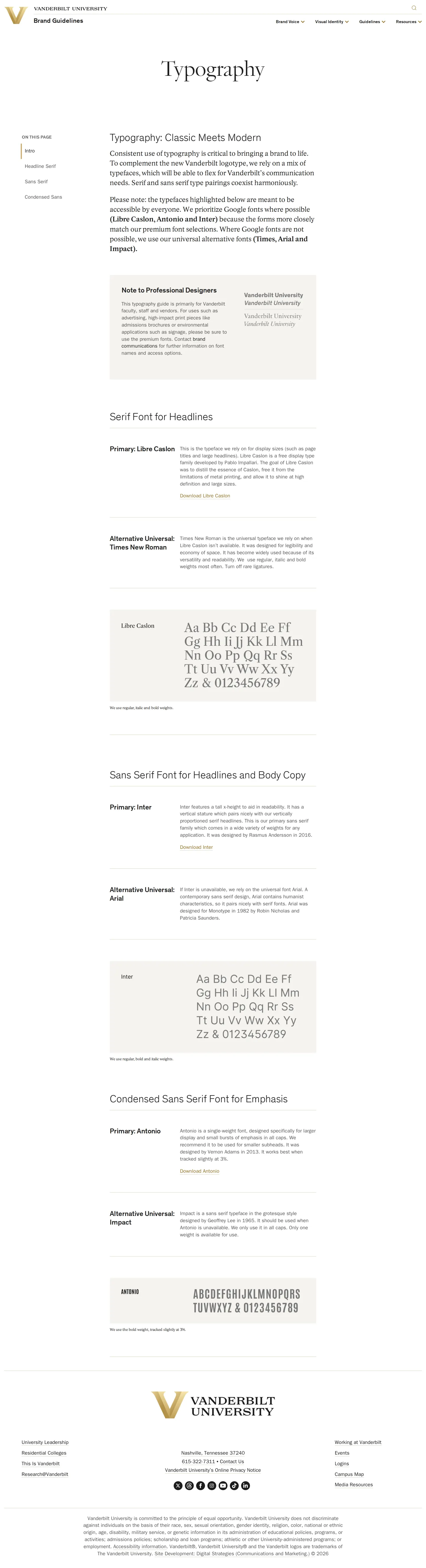
Freedam's take — I really appreciate how clearly Vanderbilt structures their visual identity. They separate academic marks from athletics while maintaining a cohesive look, which can be tricky for large universities. The typography section is remarkably practical: pairing Google Fonts like Libre Caslon, Inter, and Antonio with universal system fallbacks like Times New Roman, Arial, and Impact makes implementation painless for non-designers across departments. Storing assets on Box gives their community direct access to essential files without complicating the documentation site.
Details
- Type
- Guidelines
- Access
- Public
- Source
- brand.vanderbilt.edu
- Industry
- Education
- Capabilities
- Guidelines, Asset browsing, Search, Downloads
- Tags
- typography, logo usage, color system, asset downloads
- Added
- Last checked


What I noticed
- The guide differentiates between university marks and athletics marks, offering dedicated guidance for each.12
- Primary open-source typefaces (Libre Caslon, Inter, Antonio) are paired with universal alternative fonts (Times New Roman, Arial, Impact).345678
- Logo and asset downloads are hosted externally using Vanderbilt Box links.9101112
Numbers refer to the screenshots above.
What I could not see
- Could not view the contents of the Editorial Style or Digital Assets pages beyond the homepage quick links.
- Could not verify whether full brand templates or campaign materials exist behind authentication.
Ideas to borrow
Reviewed on 17 September 2026. Request a correction · I built this
Similar brand centers
All brand guidelines →