University of Utah brand guidelines
The University of Utah brand portal details institutional positioning, storytelling principles, logos, and color palettes with downloadable toolkits.
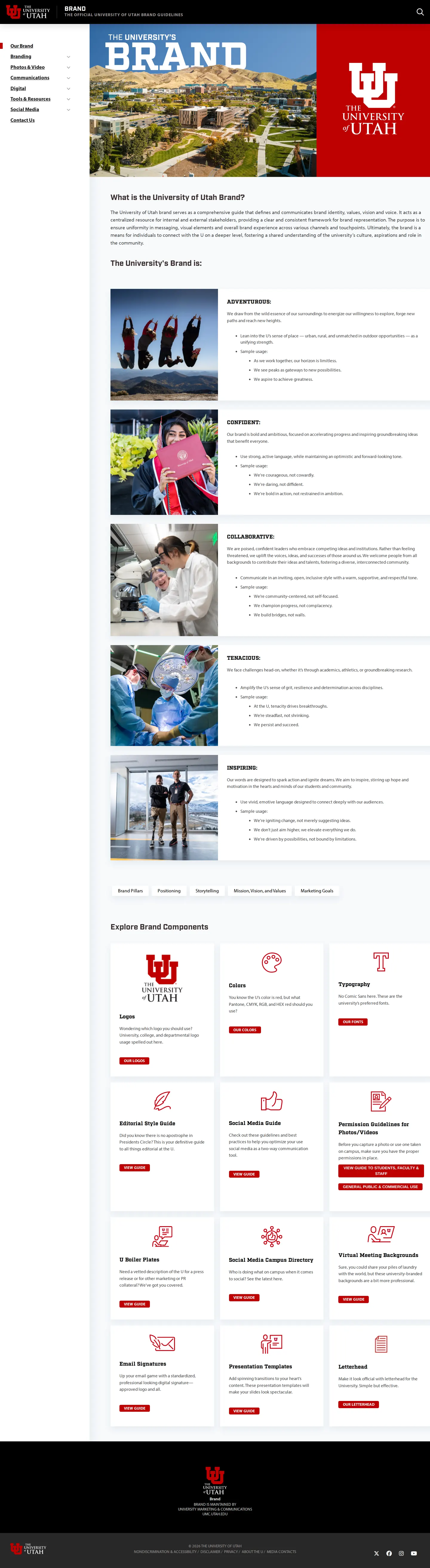
Freedam's take — I spent some time looking through the University of Utah brand portal, and I appreciate how systematically they approach their identity. The site walks through core positioning, foundational pillars, and storytelling mandatories alongside the visual essentials. Their logo documentation outlines institutional marks, secondary versions, and medallions with dedicated asset links, though several route behind a restricted access gateway. They also package their color guidance into a downloadable toolkit PDF. It feels like a clear, practical manual built to keep a vast university system aligned.
Details
- Type
- Guidelines
- Access
- Public
- Source
- brand.utah.edu
- Industry
- Education
- Capabilities
- Guidelines, Search, Downloads
- Tags
- brand story, logo usage, color system, pdf downloads, search
- Added
- Last checked

What I noticed
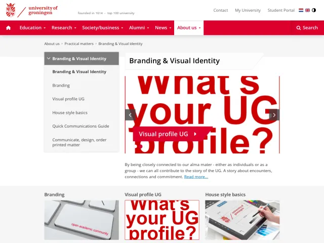
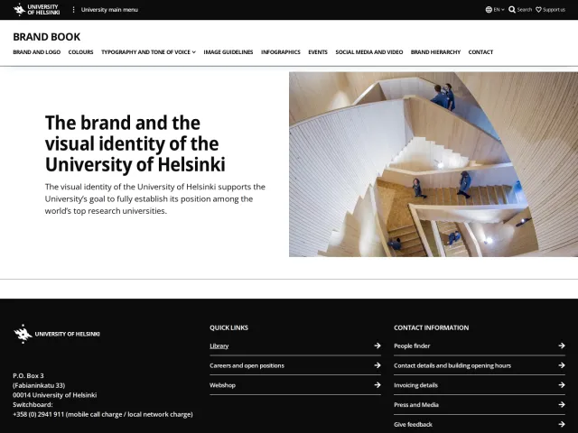
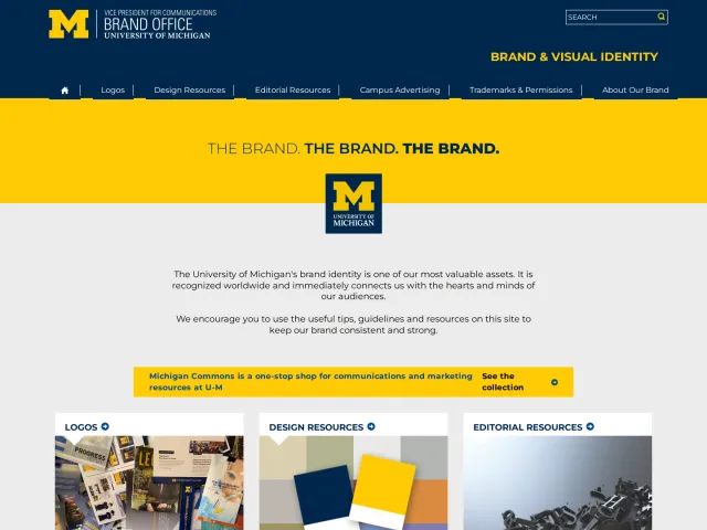
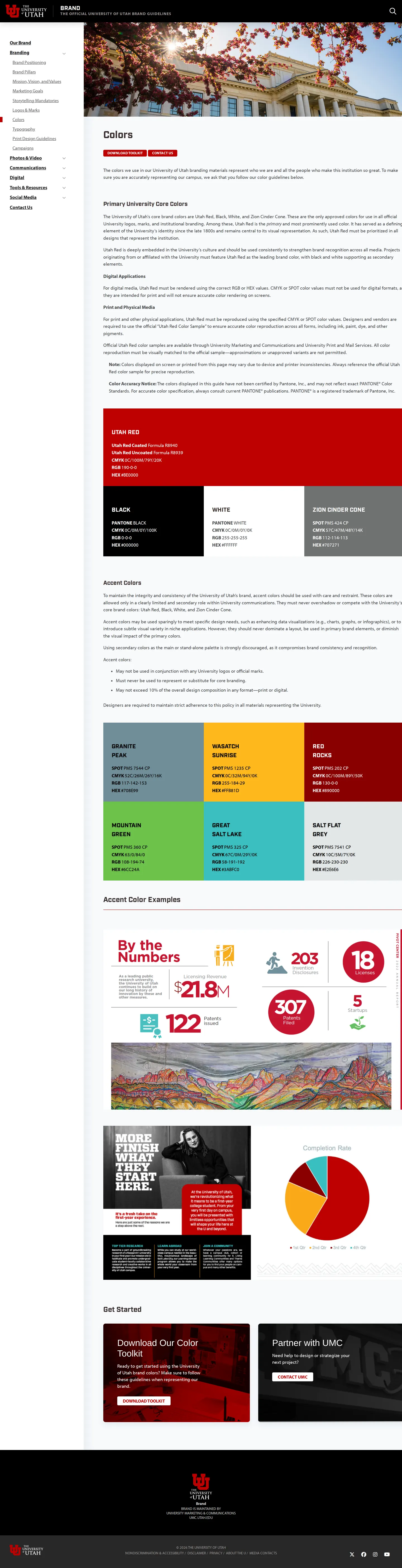
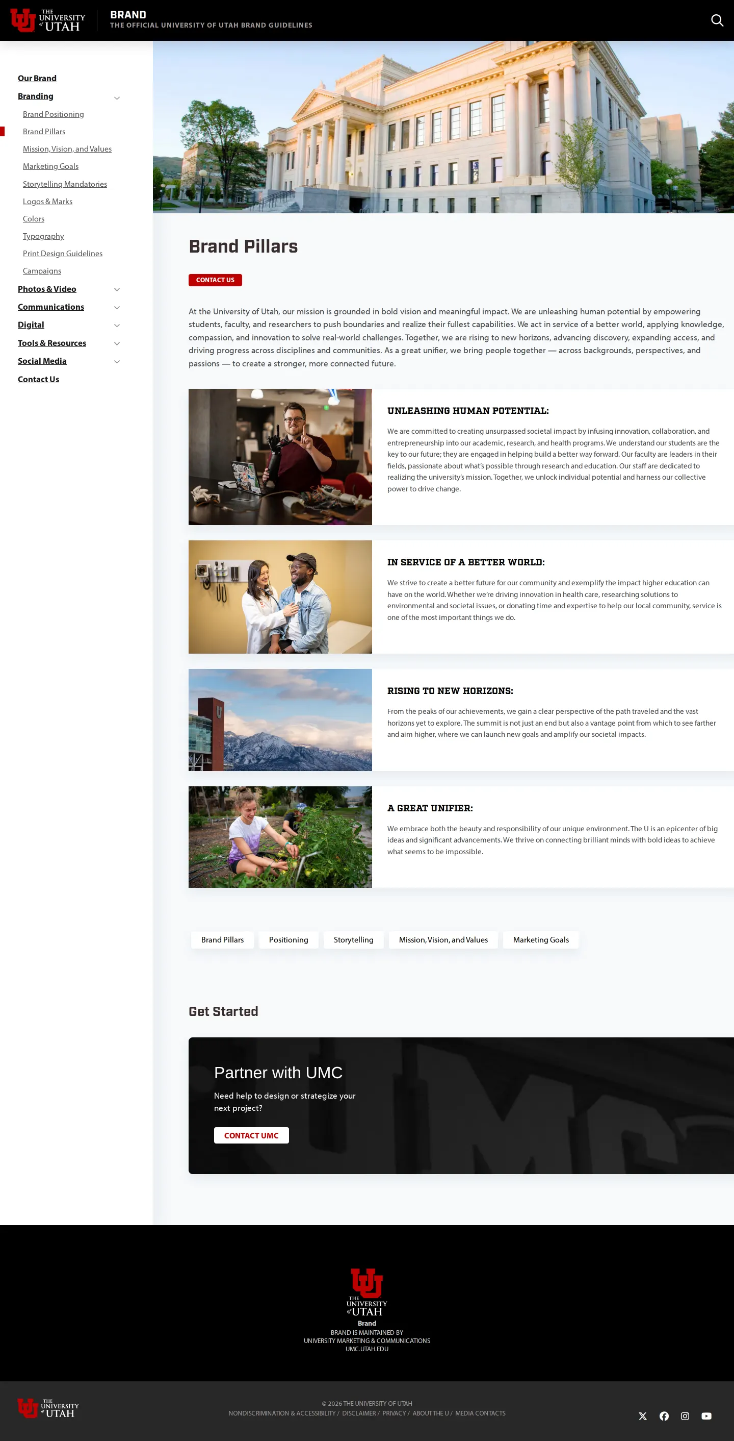
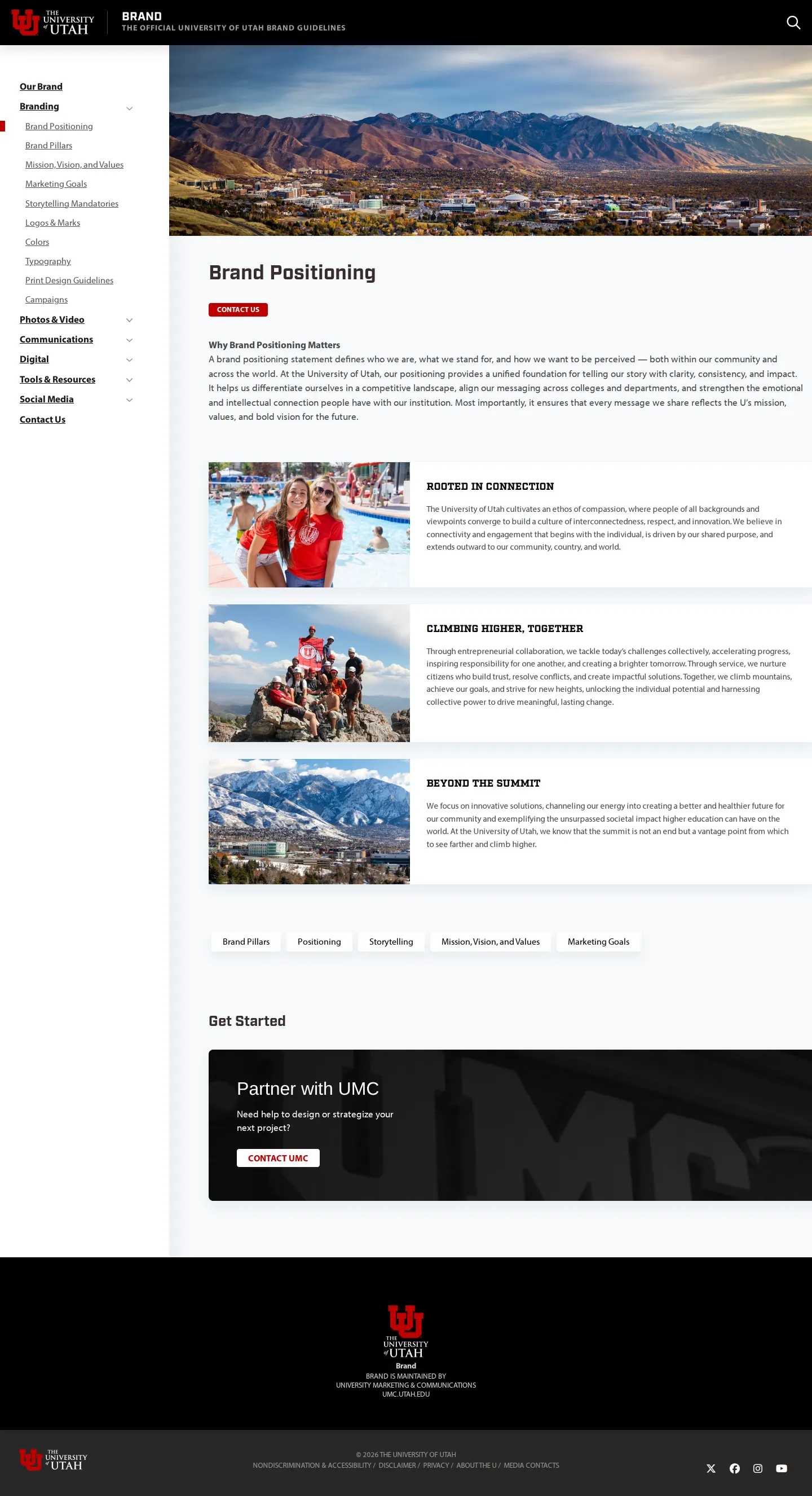
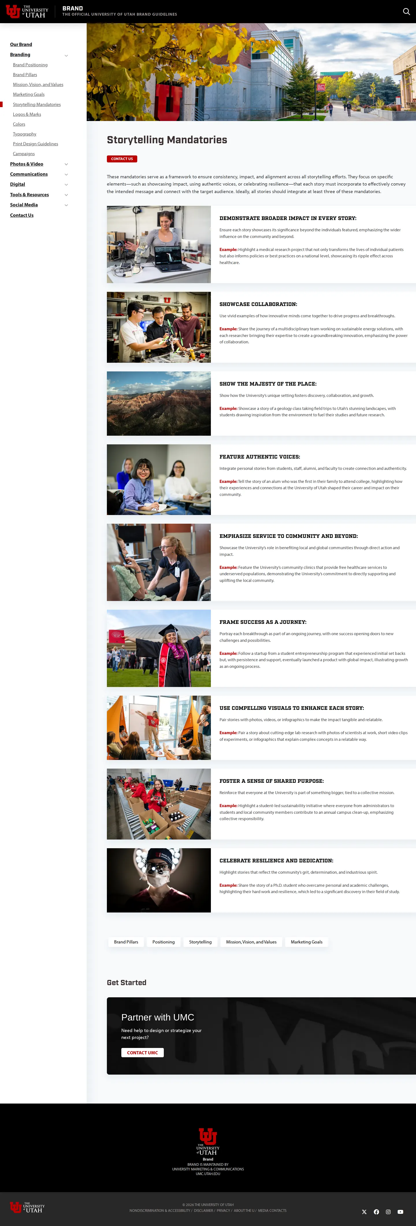
- The portal covers brand positioning, brand pillars, and storytelling mandatories alongside visual guidelines.123
- Several logo download links point to URLs nested under a specific download pathway on the university site.456789
- Color documentation includes a downloadable PDF toolkit.10
- The website includes a search function across its pages.111213
Numbers refer to the screenshots above.
What I could not see
- Could not view the contents behind the internal download paths for logo assets.
- Could not evaluate typography or photography guidelines as those pages were not captured.
Ideas to borrow
- Pair core visual elements with explicit storytelling mandatories to help campus communicators write with consistent framing.
Reviewed on 17 September 2026. Request a correction · I built this
Similar brand centers
All brand guidelines →