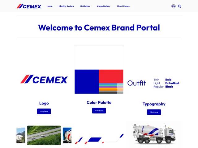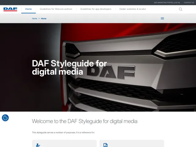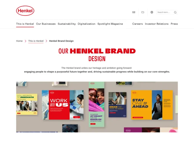
Umicore brand guidelines
Umicore's brand center outlines corporate guidelines, layout grid principles, and collateral applications while routing asset downloads to an external assets bank.
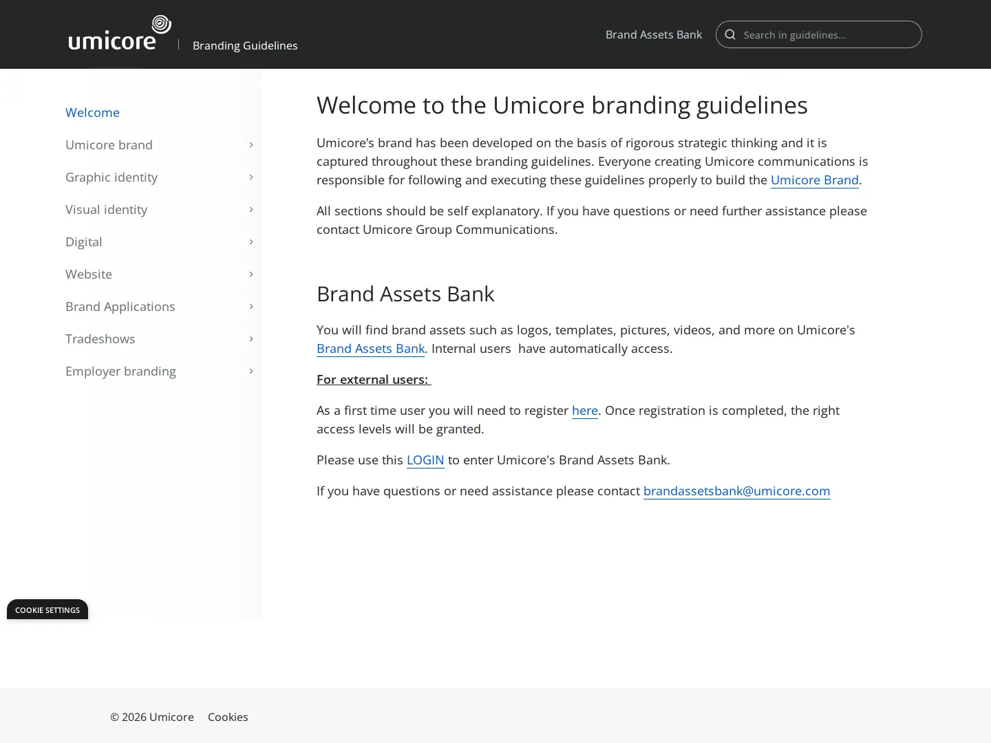
Umicore guidelines welcome screen with left navigation and instructions for accessing the Brand Assets Bank.
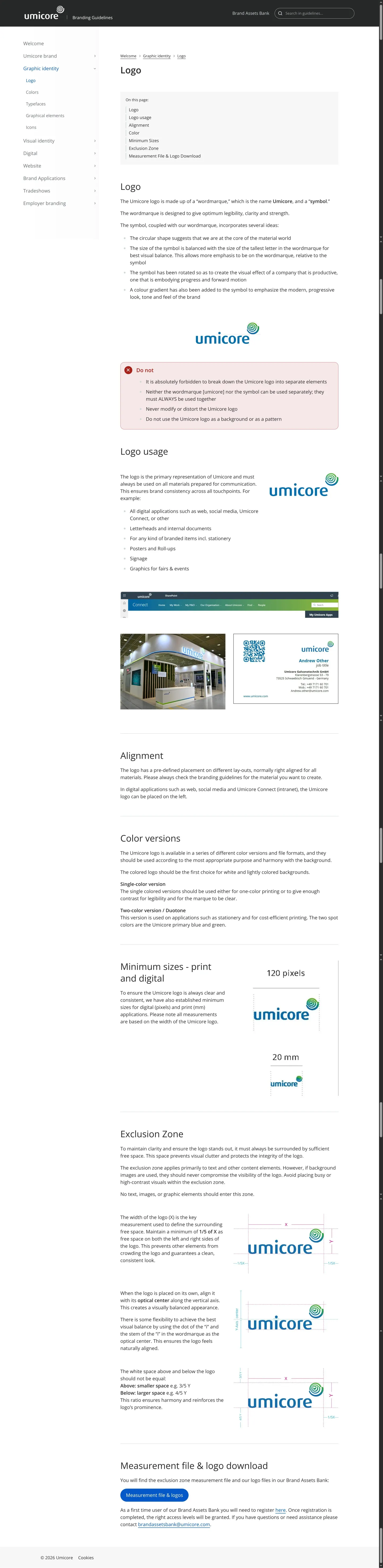
Logo specifications page detailing composition, clear space, minimum sizing, and misuse warnings.
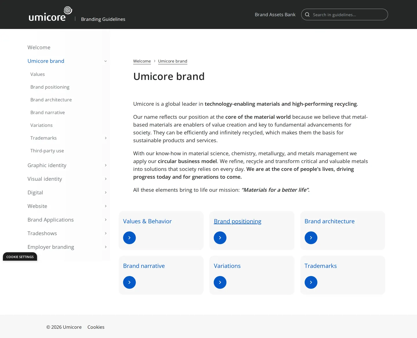
Brand overview page presenting Umicore's circular business model, mission, and strategic foundation.
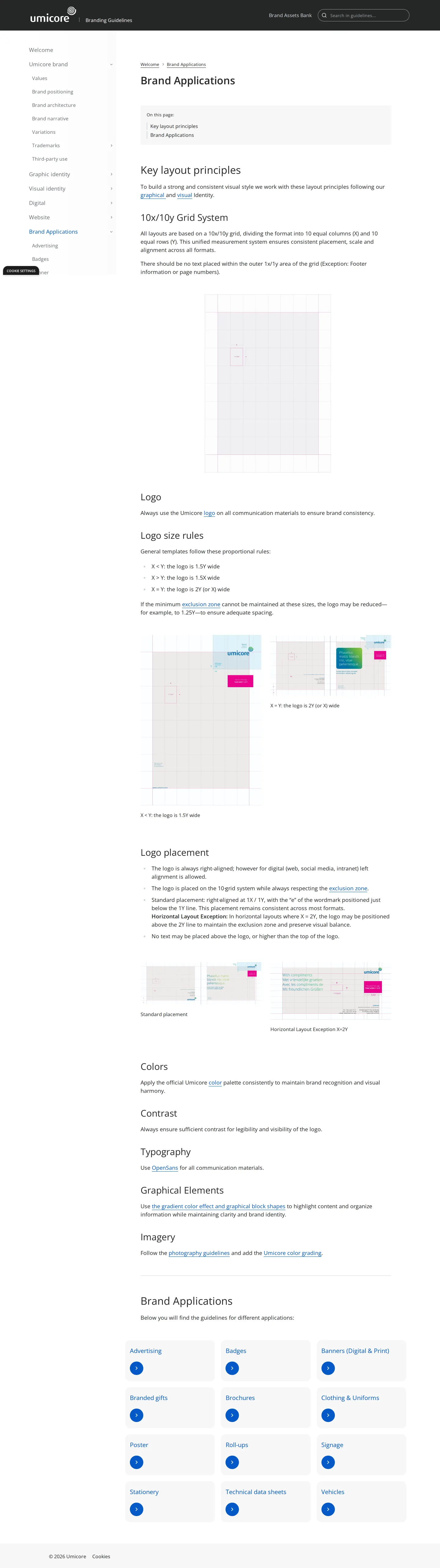
Brand Applications page explaining the 10x/10y grid system and linking to collateral categories.
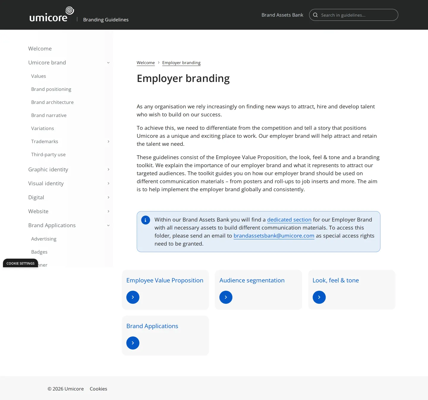
Employer branding section describing talent attraction resources and asset bank access requirements.
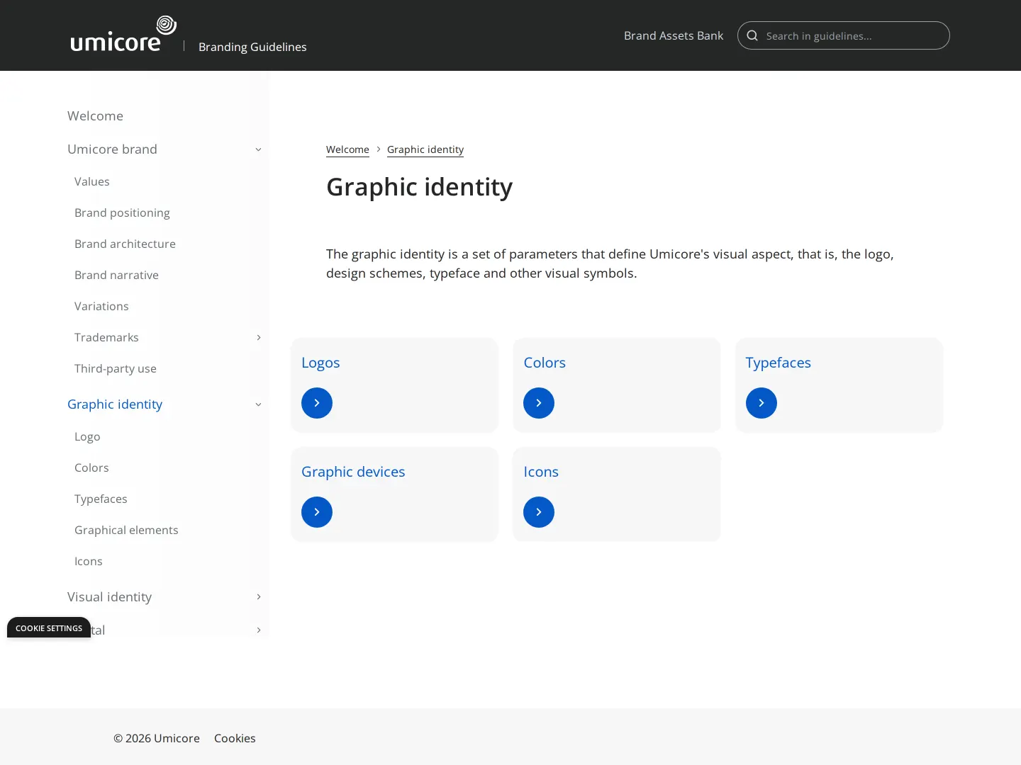
Graphic identity landing page linking to logos, colors, typography, graphical elements, and icons.
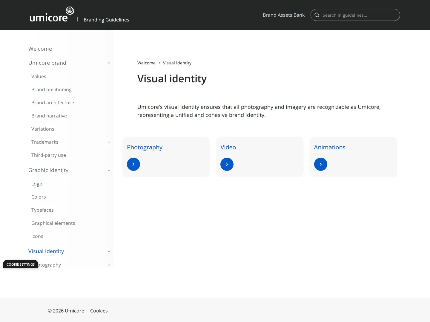
Visual identity directory linking to guidance for photography, video, and animation.
Want a brand center like Umicore’s?
Create your brand center with Freedam ↗Freedam's take
When I looked through Umicore's brand site, I noticed how methodically everything is structured. They split the creative side cleanly into graphic identity for core assets and visual identity for photography and motion, then lay out an extensive list of real-world collateral. I especially appreciated their practical layout guidance, like using a 10x/10y grid system alongside direct aspect-ratio formulas for sizing the logo across print and digital formats. Instead of cluttering the documentation pages with raw file downloads, they route file distribution into a separate login-protected Brand Assets Bank, keeping the reference manual uncluttered.
At a glance
- Sections
- Welcome · Umicore brand · Graphic identity · Visual identity · Digital · Website · Brand Applications · Tradeshows · Employer branding
- Tone
- Structured, corporate, and instructional documentation tailored for internal and external brand implementers.
What I noticed
- The brand site organizes identity documentation into distinct 'Graphic identity' and 'Visual identity' sections in its sidebar navigation.12
- Collateral guidelines in Brand Applications specify a 10x/10y grid system dividing formats into ten equal columns and rows.3
- The Logo section details minimum dimensions of 120 pixels for digital touchpoints and 20 mm for print applications.4
- Asset downloads and measurement files route users to an external Brand Assets Bank that includes login and registration links.567
Numbers refer to the screenshots above.
What I could not see
- Could not inspect downloadable asset files or templates as they are housed behind the login-gated Brand Assets Bank.
- Could not view full details for subpages like Photography, Video, or individual collateral categories without deeper page captures.
Ideas to borrow
Quick answers
Where can I download Umicore logos and measurement files?
Umicore directs users to its Brand Assets Bank via a dedicated button and top navigation link, requiring a login or registration for access.567
What is the minimum permitted size for the Umicore logo?
The minimum logo size is 120 pixels for digital use and 20 mm for print.4
What primary typeface is specified in Umicore's brand applications?
OpenSans is specified for typography in the layout principles.10
Reviewed on 25 September 2026. Request a correction · I built this