 Shopify
Technology
Press & asset kit
TypeScript provides a developer-focused brand page with downloadable assets, precise icon dimensions, alternative marks, color formulas, and usage rules.
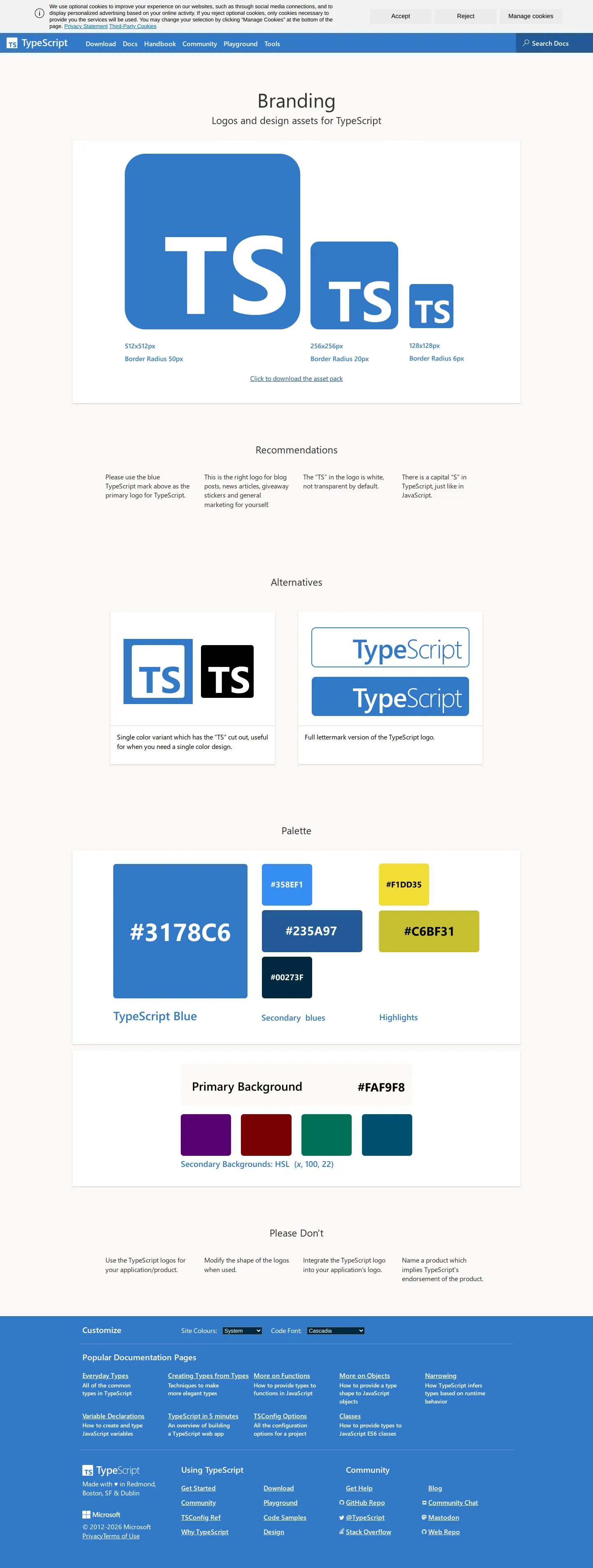
TypeScript branding page providing official logo marks, alternative lockups, color palette values, and usage rules.
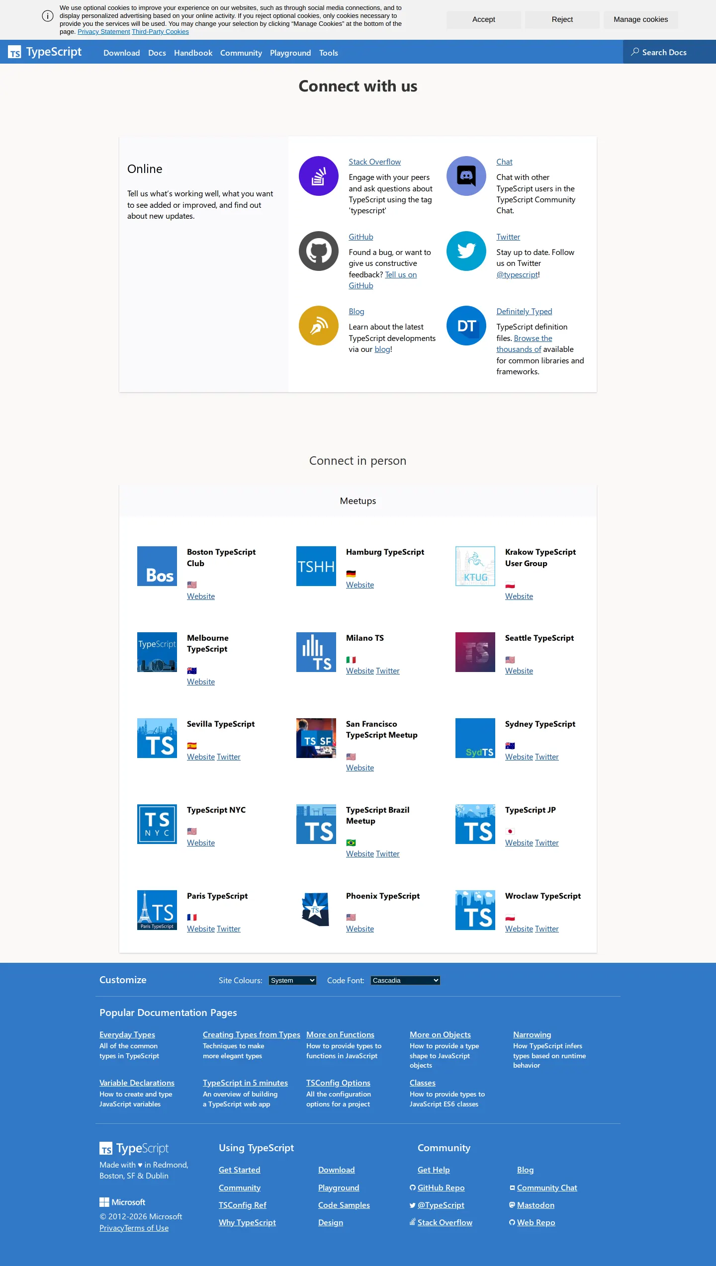
TypeScript community webpage featuring online communication channels and in-person regional meetup groups.
Want a brand center like TypeScript’s?
Create your brand center with Freedam ↗I really appreciate how direct this asset page is. When you are maintaining open source tools or developer ecosystems, people just need the core mark, correct sizes, and basic rules without wading through marketing jargon. I noticed they display the iconic blue square in three fixed pixel dimensions along with exact border radius numbers, which is so practical for digital products. The color palette breaks down background formulas, and the negative rules make naming and visual boundaries straightforward. It gives developers exactly what they need to represent the project accurately.
Numbers refer to the screenshots above.
You can download the full asset bundle via the 'Click to download the asset pack' link, which provides a ZIP archive of design files.23
The primary blue square icon is specified in three dimensions: 512x512px, 256x256px, and 128x128px, each with corresponding border radius measurements.1
Reviewed on 25 September 2026. Request a correction · I built this
TypeScript offers a single streamlined page outlining icon sizing, color formulas, and a single asset pack ZIP, whereas Shopify separates its downloads into individual archives for primary logos, monotone marks, and the shopping bag icon. While Discord uses a letter-based grid system to define clearspace, TypeScript specifies exact pixel dimensions and corner border radii.