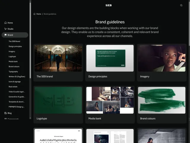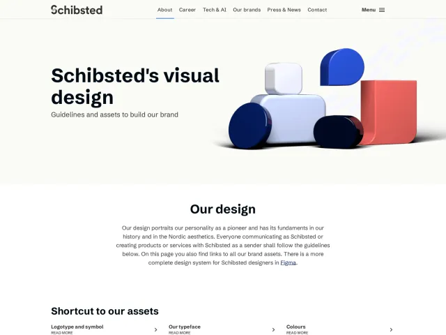
Stanford University brand guidelines
Stanford University's Identity Guide provides actionable brand resources, logo assets, typography rules, and tonal color combinations for university communicators.
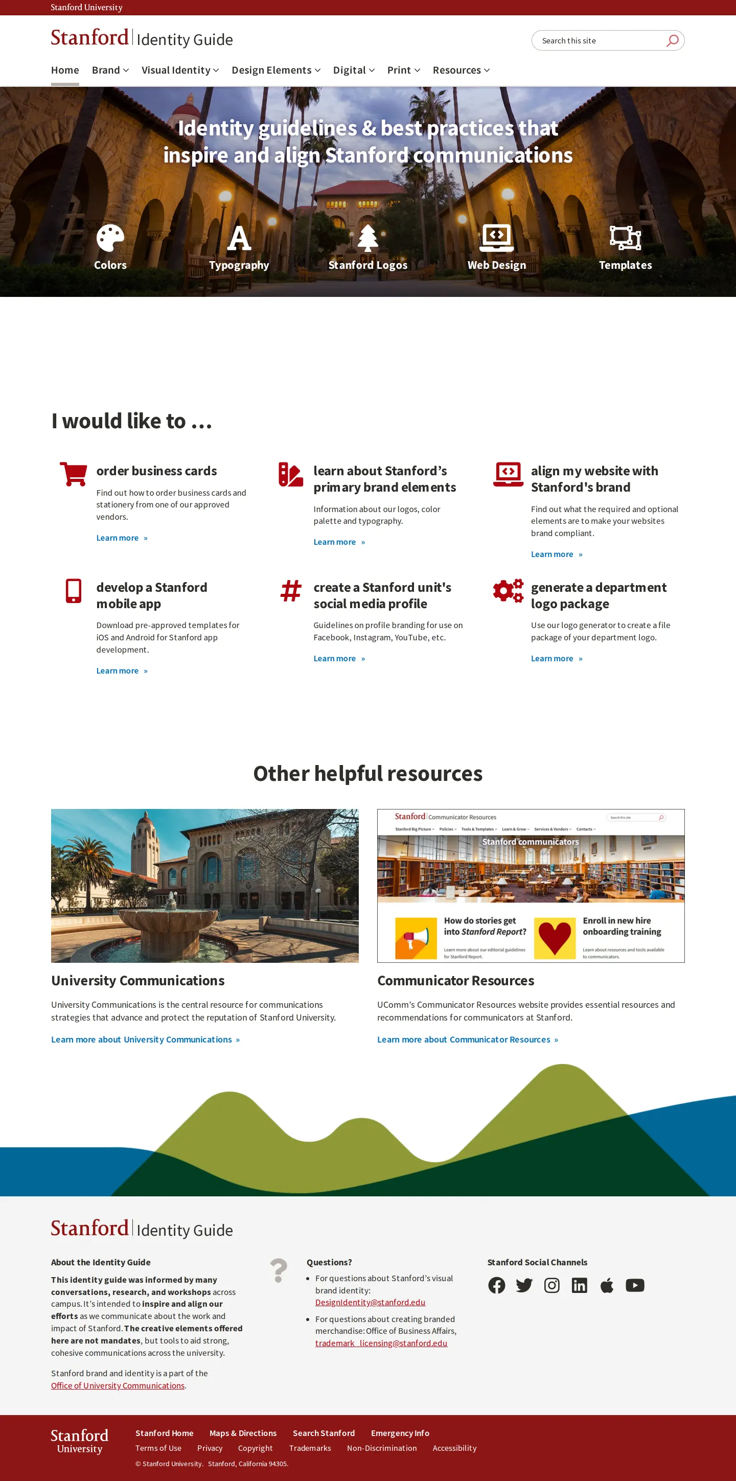
Freedam's take — I really appreciate how direct Stanford's identity portal is right from the homepage. Instead of burying practical needs behind abstract philosophy, it greets you with an actionable task list like ordering business cards, creating social media profiles, or generating department logos. The visual design section covers the basics cleanly, but what caught my eye was the color mood spectrum, illustrating palettes across formal, casual, and subtle tones. It frames institutional guidelines around what team members actually need to get done every day.
Details
- Type
- Guidelines
- Access
- Public
- Source
- identity.stanford.edu
- Industry
- Education
- Capabilities
- Guidelines, Search, Downloads, Templates
- Tags
- color system, typography, logo usage, asset downloads, print & stationery
- Added
- Last checked


What I noticed
- The homepage features an action-oriented section titled 'I would like to…' linking directly to tasks like ordering business cards and generating department logos.123
- The logo guidelines page includes downloadable assets like an art sheet alongside rules for vintage logos and university heraldry.45678
- The color documentation structures palettes around mood spectrums ranging between formal, bold, casual, and subtle.91011121314
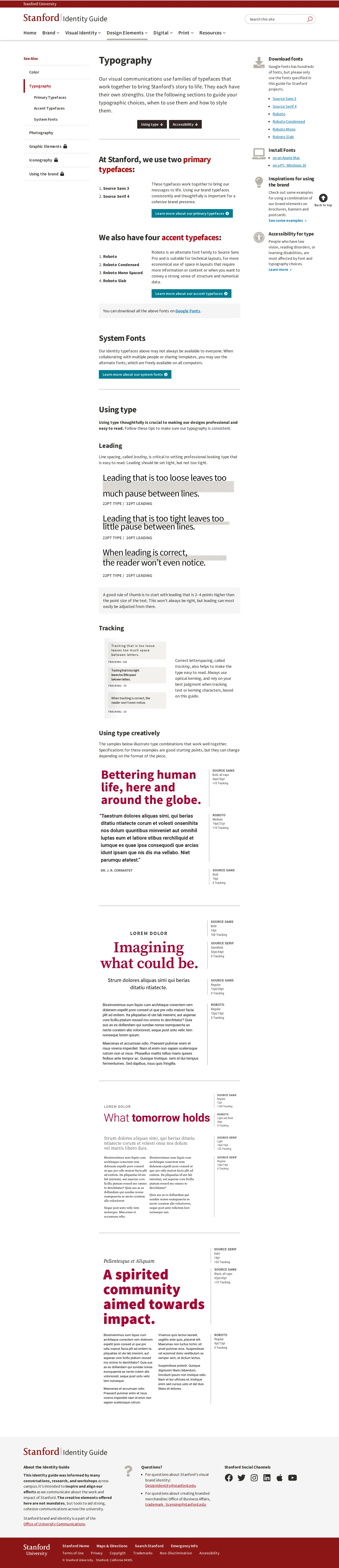
- The typography documentation specifies two primary typefaces along with four accent typefaces and system font alternatives.151617
Numbers refer to the screenshots above.
What I could not see
- Digital asset management browsing functionality and specific typography font names could not be viewed without accessing downloadable files or child pages.
Ideas to borrow
Reviewed on 18 September 2026. Request a correction · I built this