Solo Stove brand guidelines
Solo Stove presents an organized zeroheight design portal covering brand values, typography usage, asset downloads, and their Ember design system.
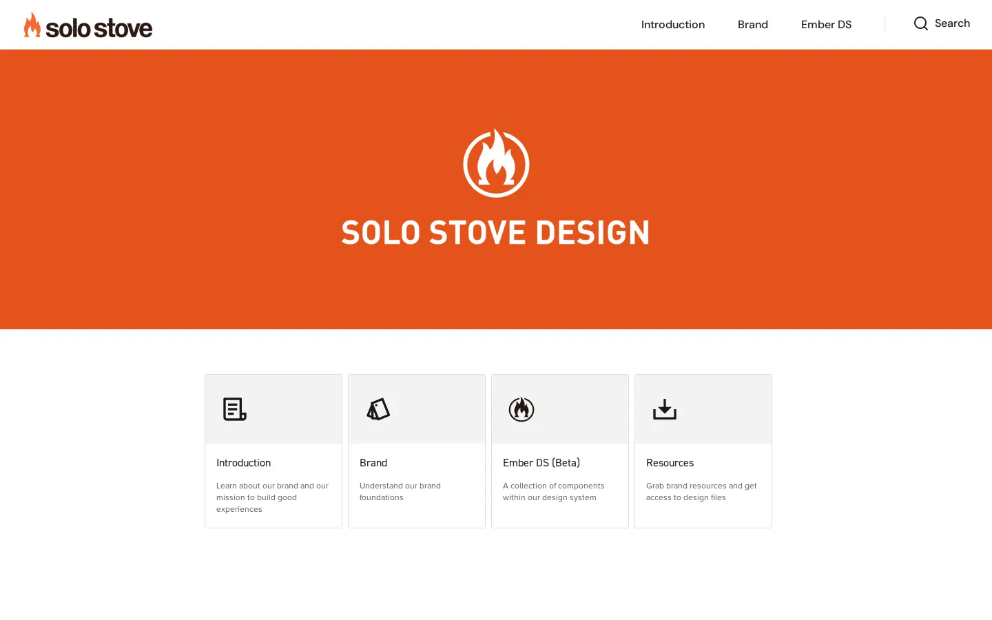
Solo Stove Design home showing four feature cards for Introduction, Brand, Ember DS (Beta), and Resources beneath a bright orange banner.
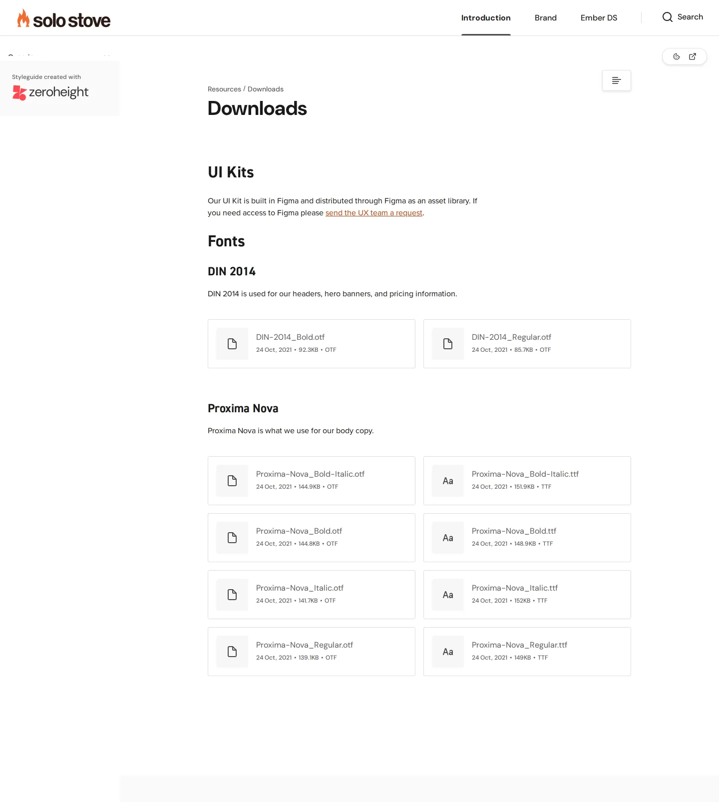
Downloads section showing Figma UI kit access instructions alongside downloadable DIN 2014 OTF font files.
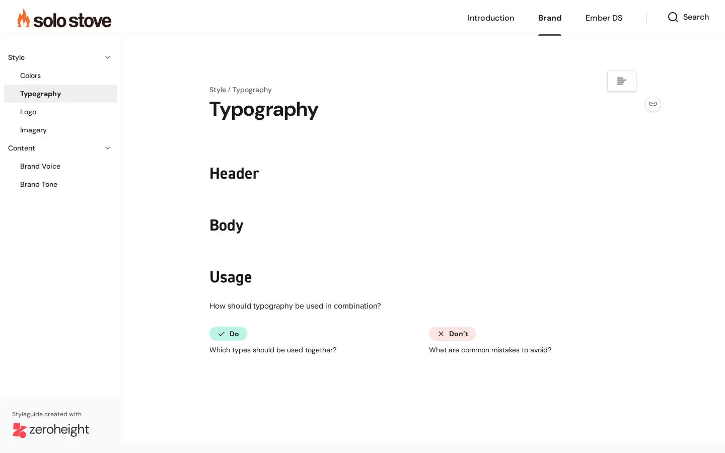
Typography documentation displaying Header, Body, and Usage sections with Do and Don't advisory columns.
Want a brand center like Solo Stove’s?
Create your brand center with Freedam ↗Freedam's take
I like how cleanly Solo Stove structures their design home. Built in zeroheight, the hub separates high-level company values from specific brand styles and their Ember design system. When you drop into typography, they pair clear role definitions for DIN 2014 and Proxima Nova with practical dos and don'ts columns. Distributing font files directly alongside an access request flow for Figma UI kits feels grounded and helpful for internal teams who need to get straight to work.
At a glance
- Sections
- Introduction · Brand · Ember DS · Resources
- Downloads
- OTF
- Tone
- Direct, structured, and practical documentation geared toward digital product and brand design.
What I noticed
- The portal homepage features four primary navigation cards directing visitors to Introduction, Brand, Ember DS (Beta), and Resources.1
- The downloads section supplies font files in OTF format alongside instructions to request Figma UI kit access.23
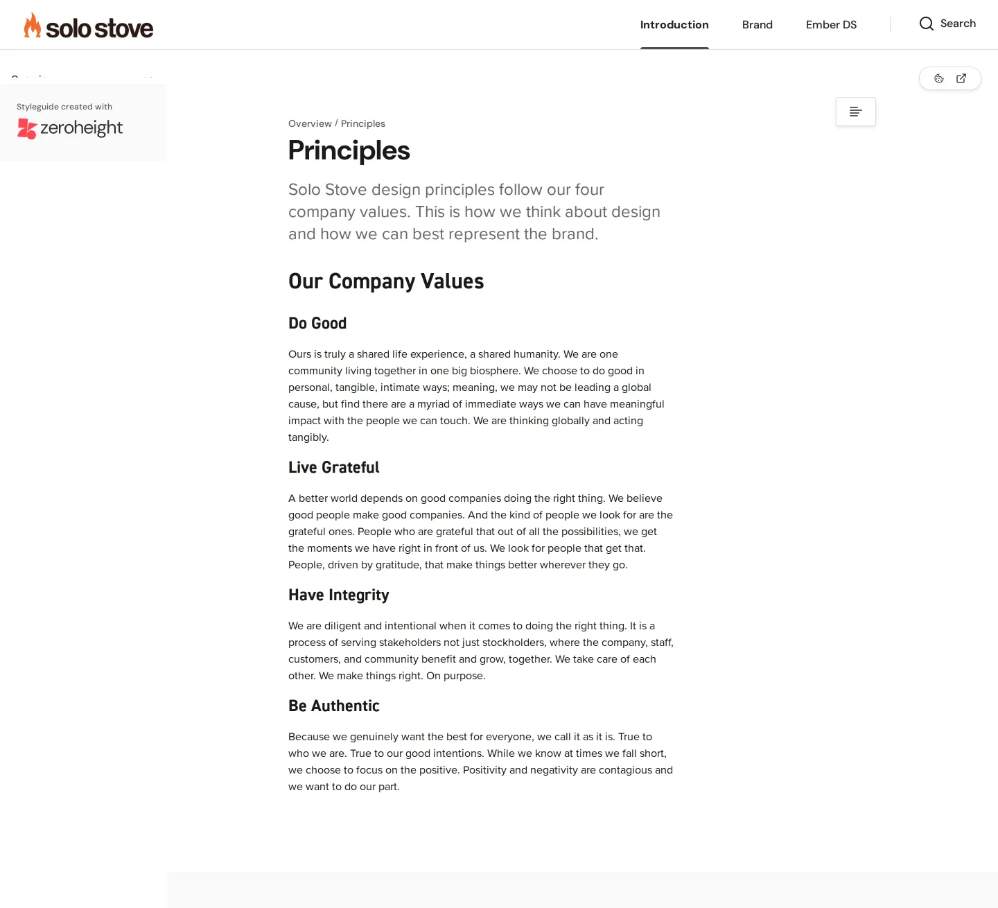
- Solo Stove's company principles page lists core values titled Do Good, Live Grateful, Have Integrity, and Be Authentic.45678
- The typography guidelines use dedicated Do and Don't columns to advise on combinations and rules.9
Numbers refer to the screenshots above.
What I could not see
- Could not inspect the full component library inside the Ember DS (Beta) section.
- Could not view the contents of the Logo, Imagery, Brand Voice, or Brand Tone pages.
- Could not view the Figma UI kit files directly without UX team access.
Ideas to borrow
Quick answers
What primary typefaces are used by Solo Stove?
Solo Stove uses DIN 2014 for headers, hero banners, and pricing, and Proxima Nova for body copy.1011
How can teams access Solo Stove UI kits?
The UI kit is hosted in Figma and accessible by requesting access from the internal UX team via a provided text link.2
Reviewed on 25 September 2026. Request a correction · I built this