Schibsted brand guidelines
Schibsted provides an open visual design guide featuring typography, color systems, templates, and Google Drive download links.
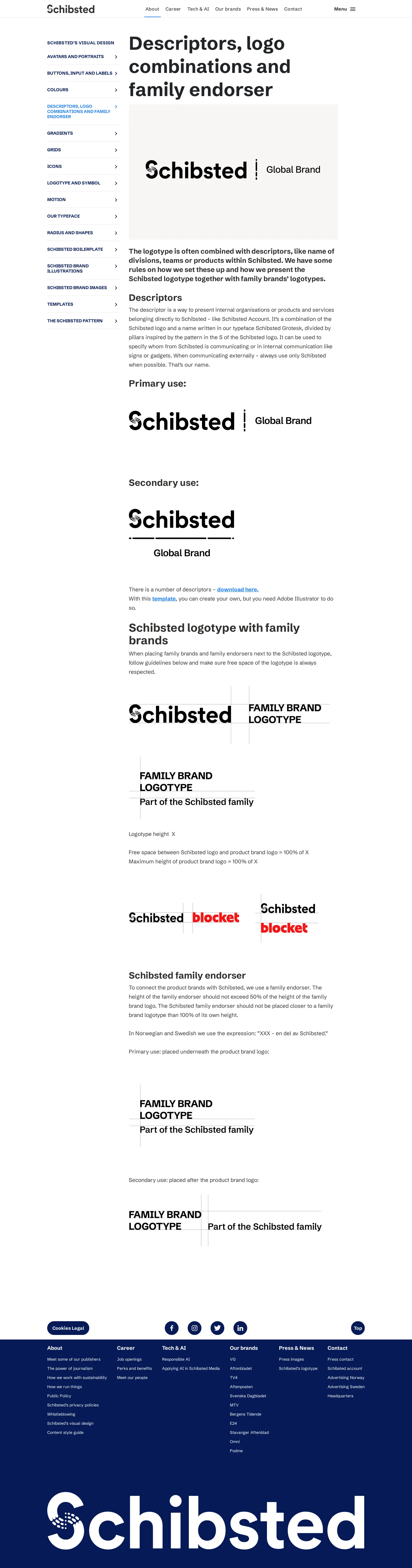
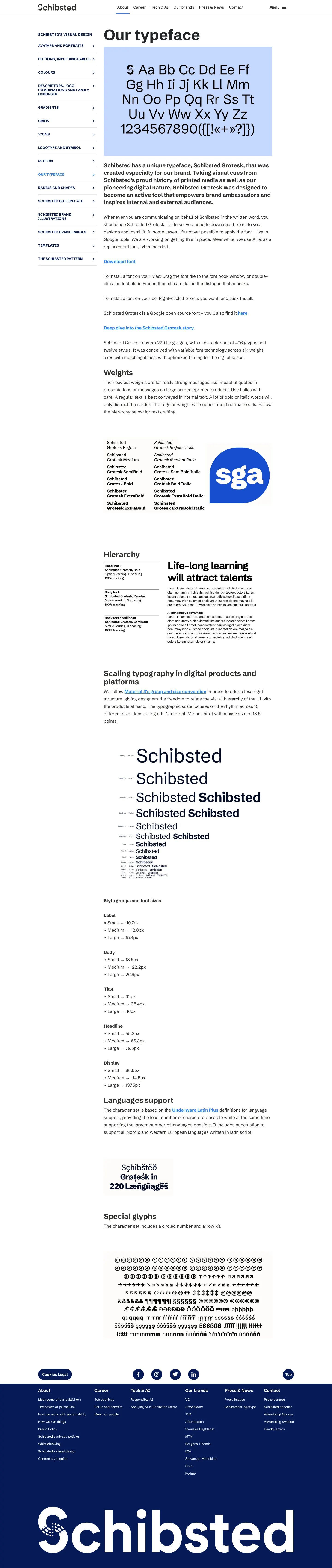
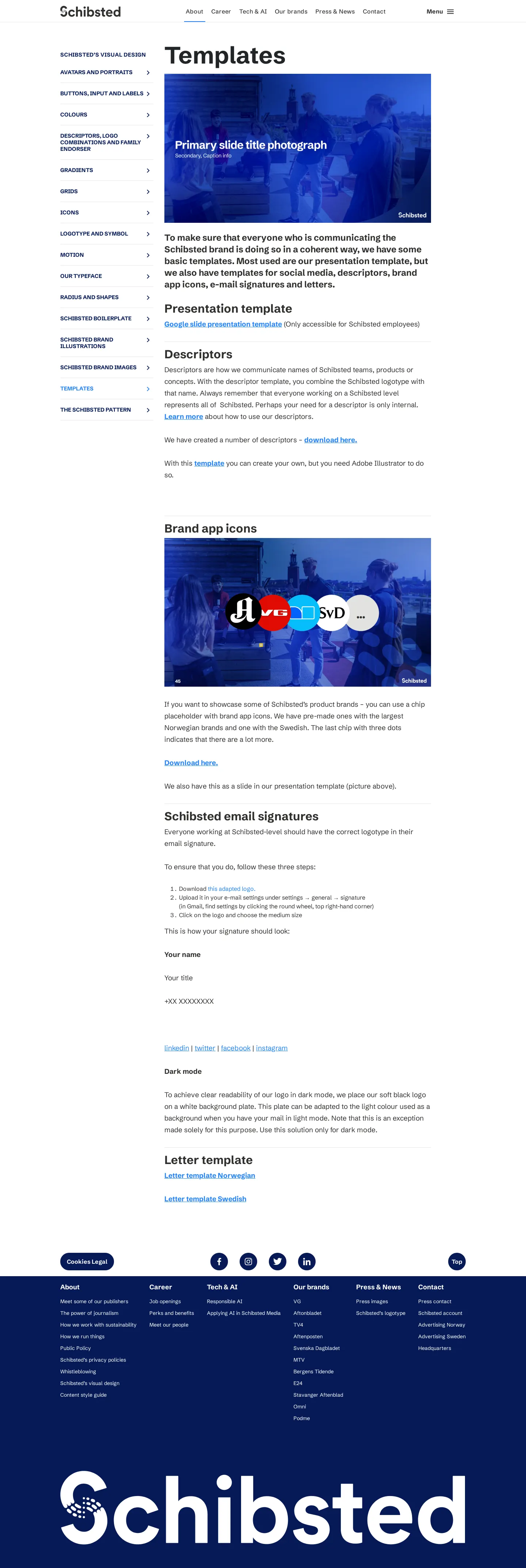
Freedam's take — I really appreciate how open and straightforward the Schibsted visual design hub feels. Rather than tucking everything behind an internal company wall, they walk through their core brand elements directly on their main site. You get detailed pages covering everything from their custom Schibsted Grotesk font to UI color palettes, presentation templates, and guidelines for pairing the parent logo with subsidiary brands. To make implementation effortless, they link out directly to shared Google Drive folders for font files, descriptors, and document templates, making asset access remarkably painless for external partners and media.
Details
- Type
- Guidelines
- Access
- Public
- Source
- schibsted.com
- Industry
- Media & entertainment
- Capabilities
- Guidelines, Asset browsing, Search, Downloads, Templates
- Tags
- typography, color system, presentation templates, brand architecture, font downloads, asset downloads
- Added
- Last checked



What I noticed
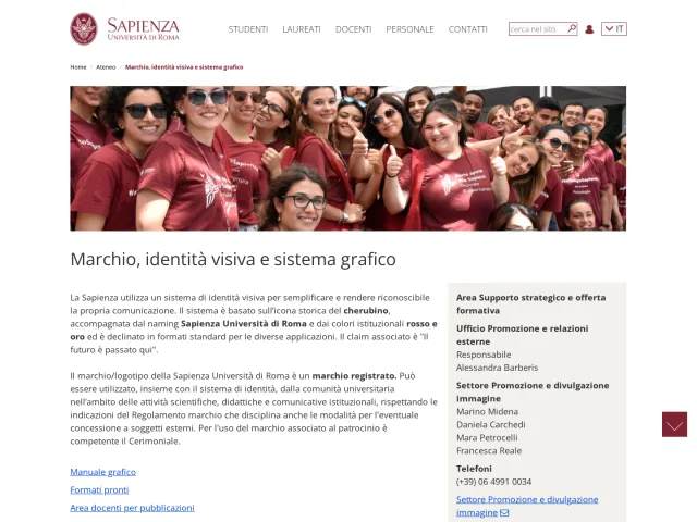
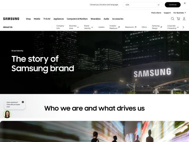
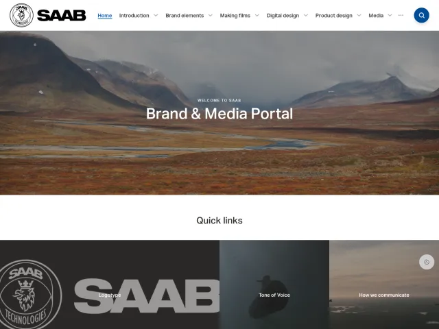
- The visual design hub covers foundational identity elements such as Schibsted Grotesk typography, colours, templates, and logo combinations.1234
- Font files and template assets are hosted externally and accessible via Google Drive links.5678
- The guide includes a dedicated section explaining logo endorsements and descriptor combinations with family brands.91011
- Using open cloud drives rather than an internal digital asset management system makes distributing files to outside collaborators very simple.
Numbers refer to the screenshots above.
What I could not see
- Could not inspect the contents of the linked external Google Drive folders.
- Could not view specific subpages for motion, avatars, or brand illustrations mentioned in the main index.
Ideas to borrow
Reviewed on 18 September 2026. Request a correction · I built this
Similar brand centers
All brand guidelines →