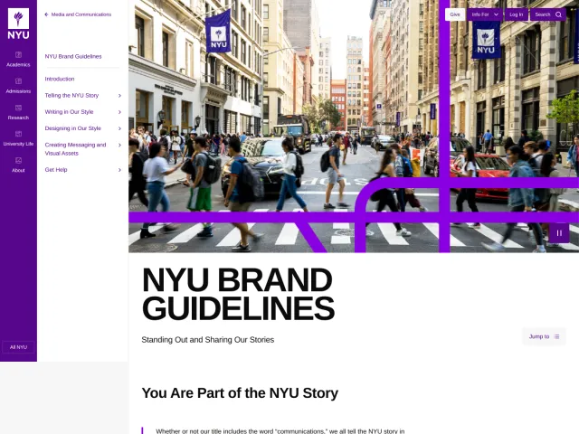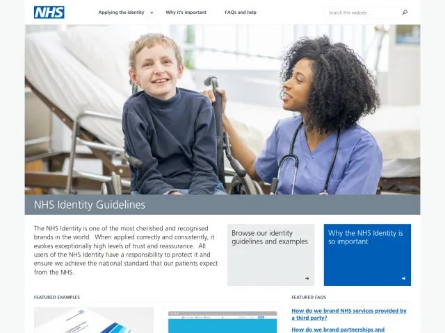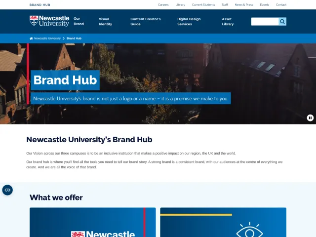
Rocket.Chat brand guidelines
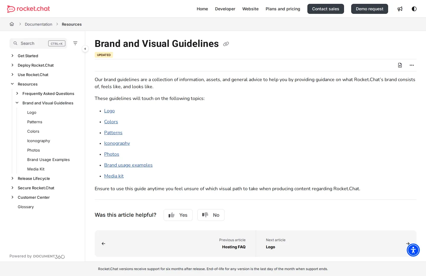
Rocket.Chat hosts its brand and visual guidelines within its documentation site, detailing logo usage, color palettes, and iconography.
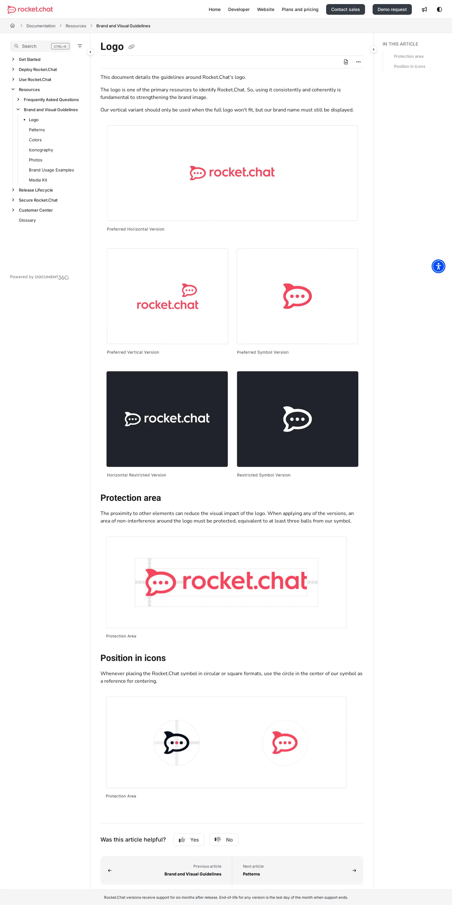
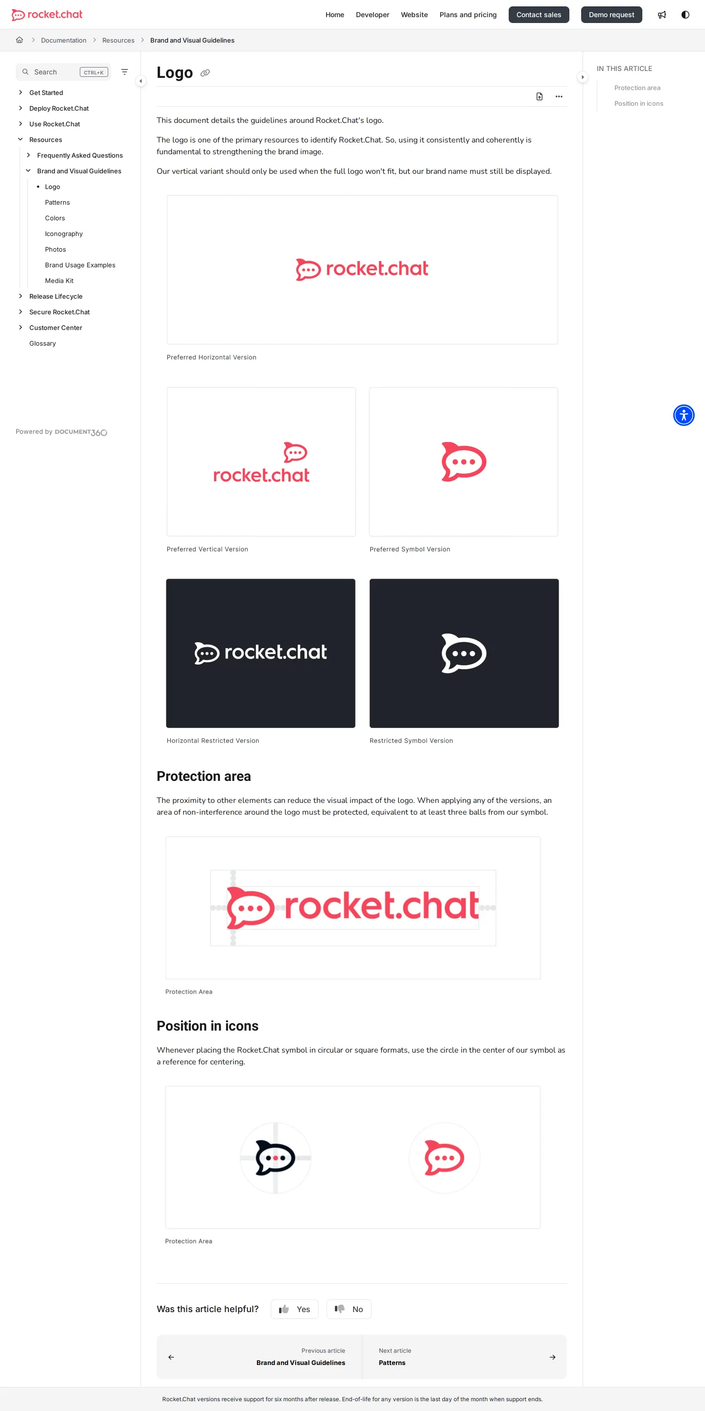
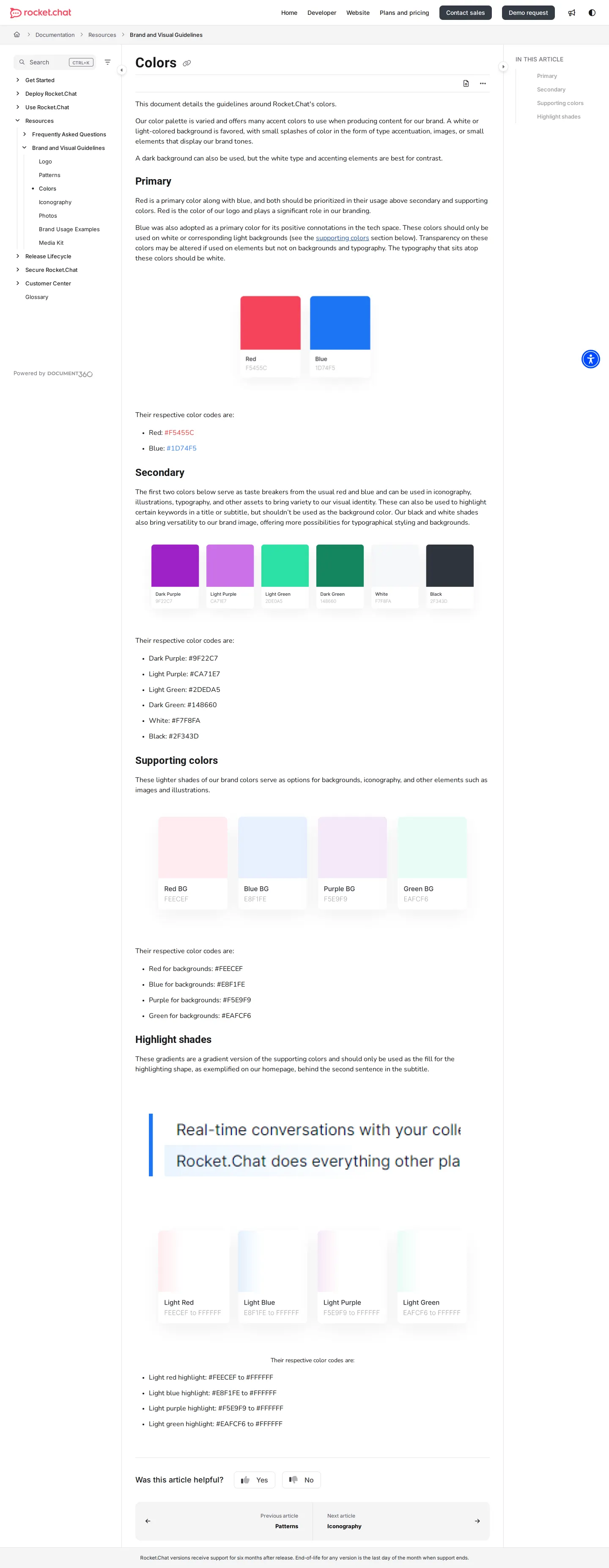
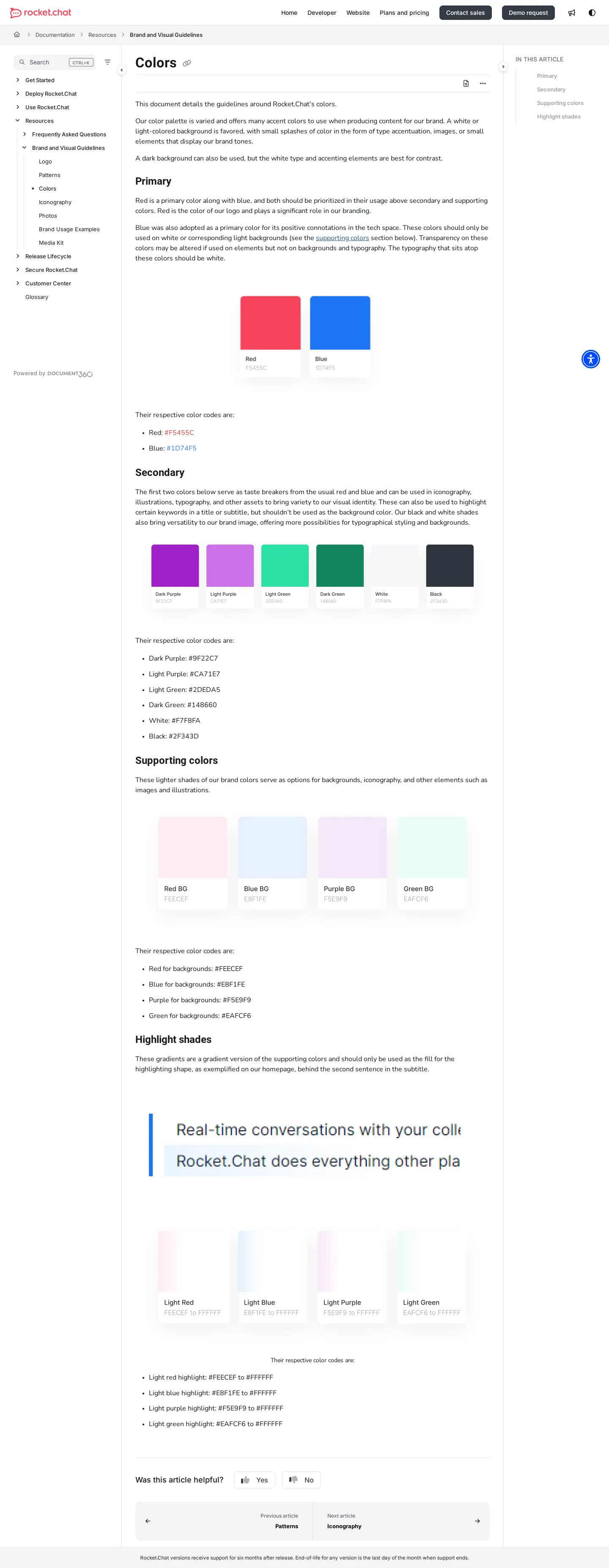
Freedam's take — I like seeing brand documentation live directly inside a team's technical documentation portal. Rocket.Chat houses its brand and visual guidelines right alongside its product and developer materials. The structure is simple and direct, breaking design guidance down into focused sections for logo rules, color palettes, and iconography. On the logo page, you find specific instructions regarding the protection area and positioning inside icons. It feels like a very practical reference manual built for teams who want clear rules without wading through marketing layers.
Details
- Type
- Guidelines
- Access
- Public
- Source
- docs.rocket.chat
- Industry
- Technology
- Capabilities
- Guidelines
- Tags
- logo usage, color system, iconography, api & documentation, open source
- Added
- Last checked
What I noticed
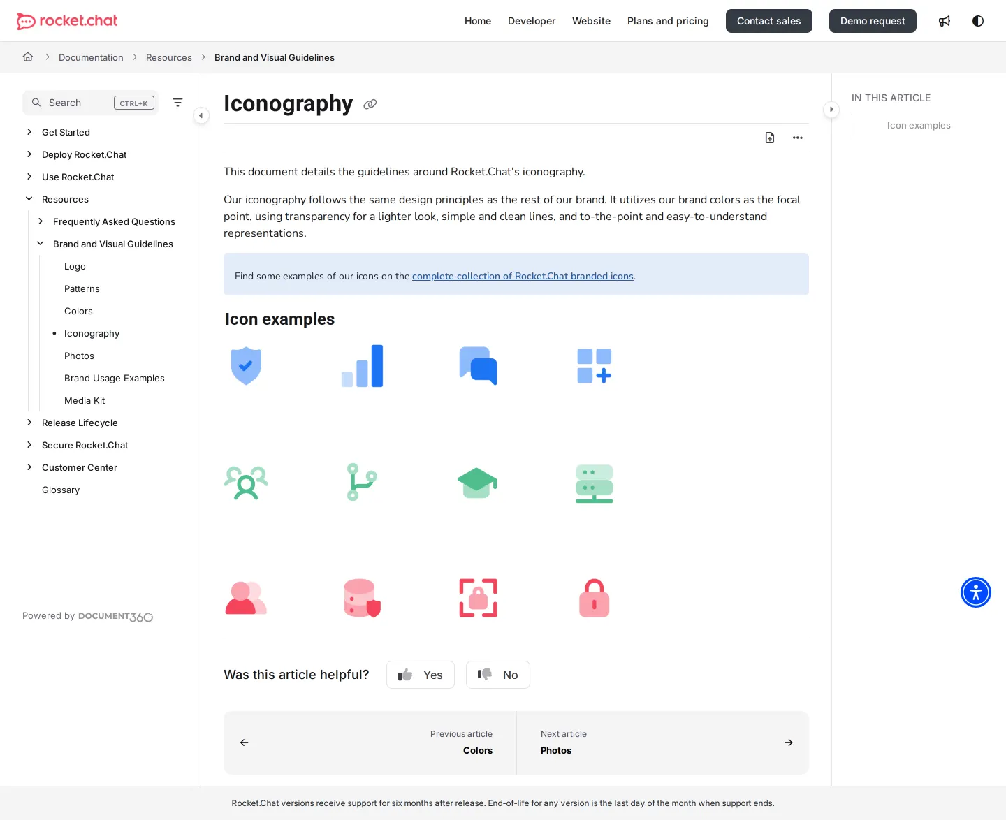
- The brand guidelines are hosted under Rocket.Chat's documentation section alongside developer and product navigation.12
- The logo section outlines clear instructions for protection area and position in icons.34
- The color specification covers primary, secondary, supporting colors, and highlight shades.5678
- Hosting visual guidelines in product documentation makes brand rules immediately accessible to open source contributors and developers.
Numbers refer to the screenshots above.
What I could not see
- No downloadable assets or file browsing capabilities were visible in the captured pages.
- Search functionality within the brand documentation was not captured in the evidence.
Ideas to borrow
- Integrate brand rules directly into existing technical documentation platforms to keep assets accessible in standard developer workflows.
Reviewed on 18 September 2026. Request a correction · I built this
Similar brand centers
All brand guidelines →