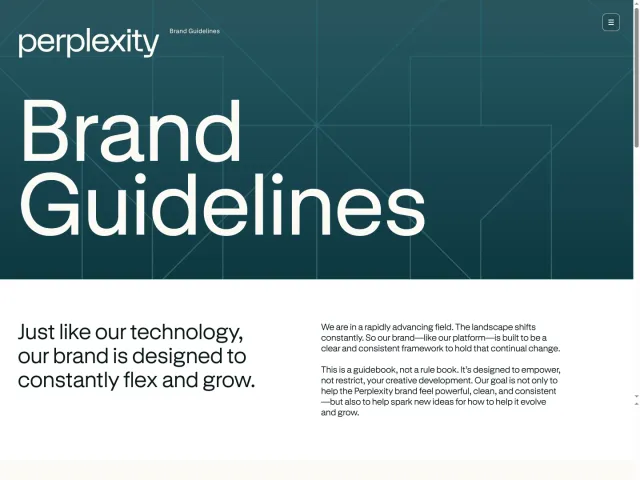
Rice University brand guidelines
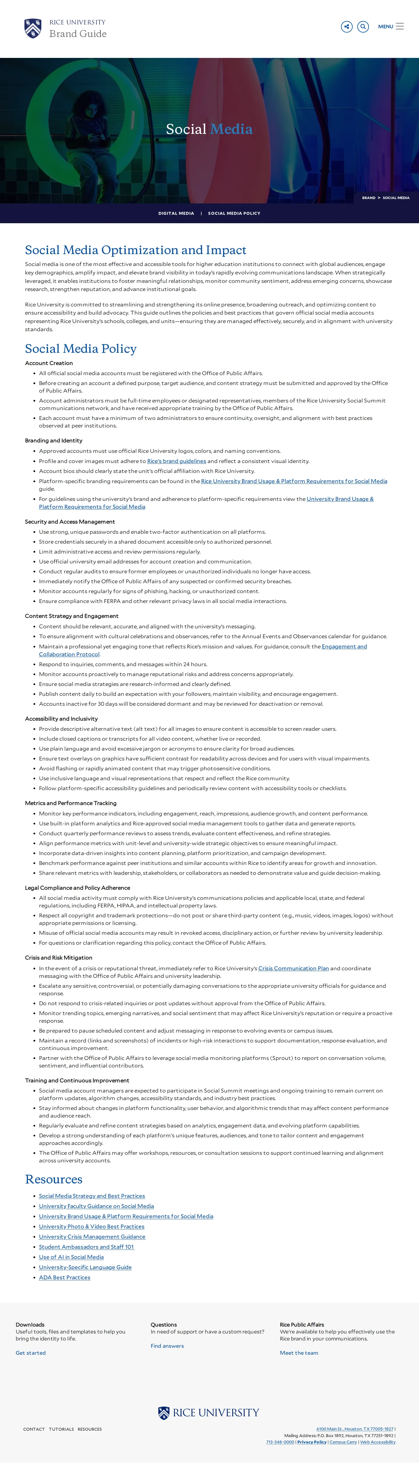
Rice University's brand guidelines provide comprehensive standards covering visual identity, typography, photography policies, social media, and downloadable brand assets.
Freedam's take — I really appreciate how Rice University structures its brand site into pragmatic working sections. They organize the system into standards, style, and extended identity, making it easy to find everything from foundational marks to specific channels like social media and web design. I like seeing explicit pairings between primary typefaces like Copernicus and Mallory and everyday system fallbacks like Cormorant Garamond and Lato. Connecting operational guidelines like drone policies and PhotoShelter archives directly into photography instructions grounds the creative rules in real campus life.
Details
- Type
- Guidelines
- Access
- Public
- Source
- brand.rice.edu
- Industry
- Education
- Capabilities
- Guidelines, Asset browsing, Search, Downloads, Templates
- Tags
- typography, photography, social media, asset downloads, design kits
- Added
- Last checked

What I noticed
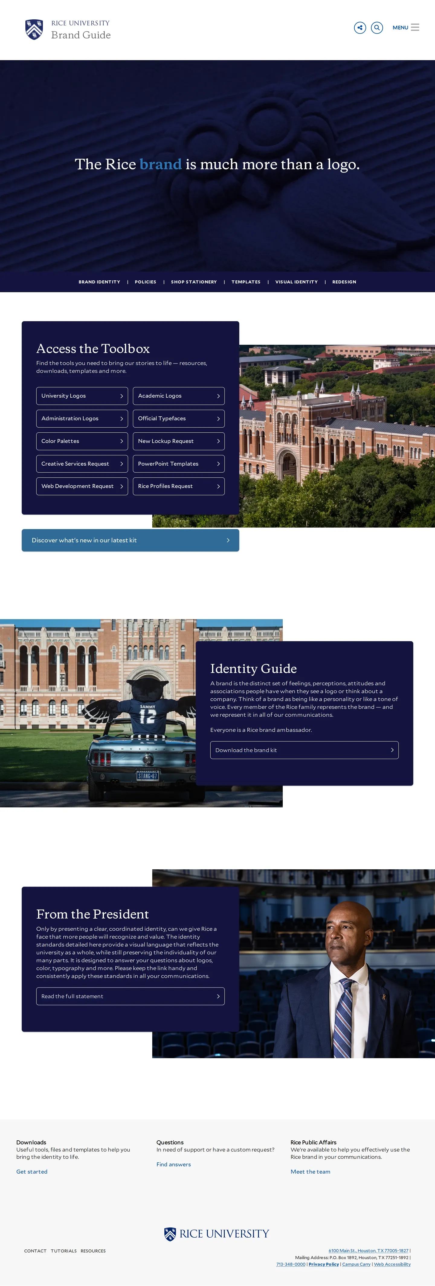
- The brand guide provides a downloadable brand kit hosted externally via Box.1
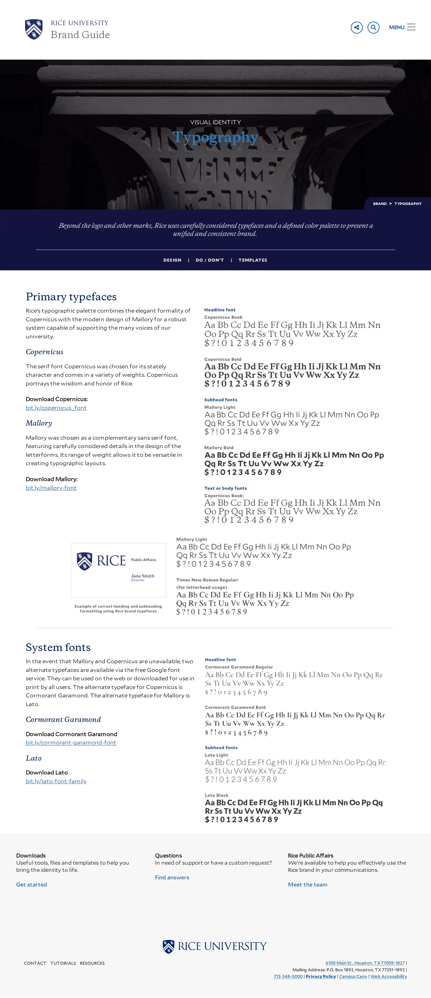
- Typography guidance pairs primary fonts Copernicus and Mallory with system font alternatives Cormorant Garamond and Lato.234567
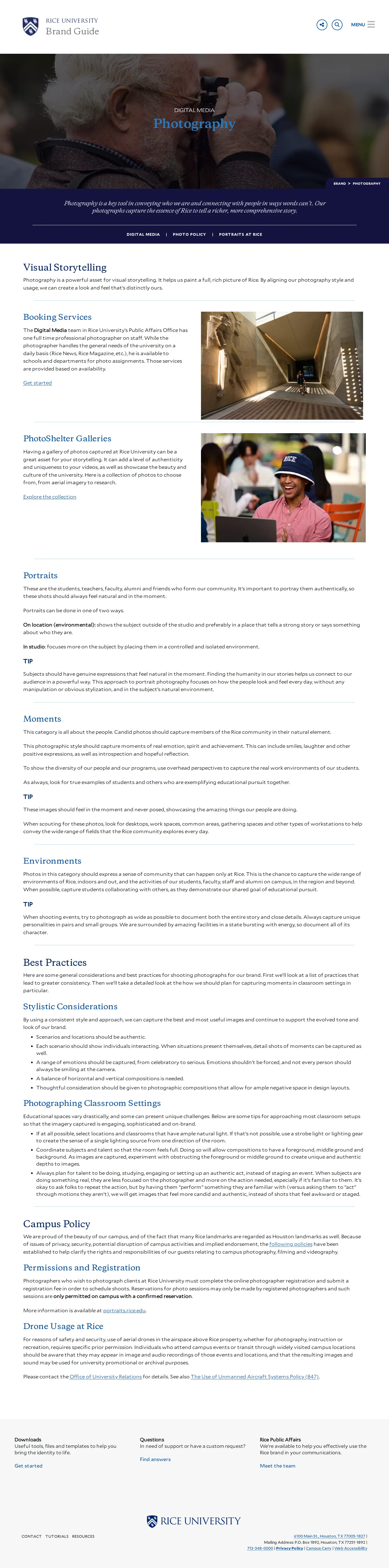
- The photography section details visual storytelling, PhotoShelter galleries, and campus policies including drone usage.891011
- The site structure groups university governance and identity into separate categories such as Our Standards and Our Style.1213
Numbers refer to the screenshots above.
What I could not see
- The contents inside the external Box brand kit download could not be viewed.
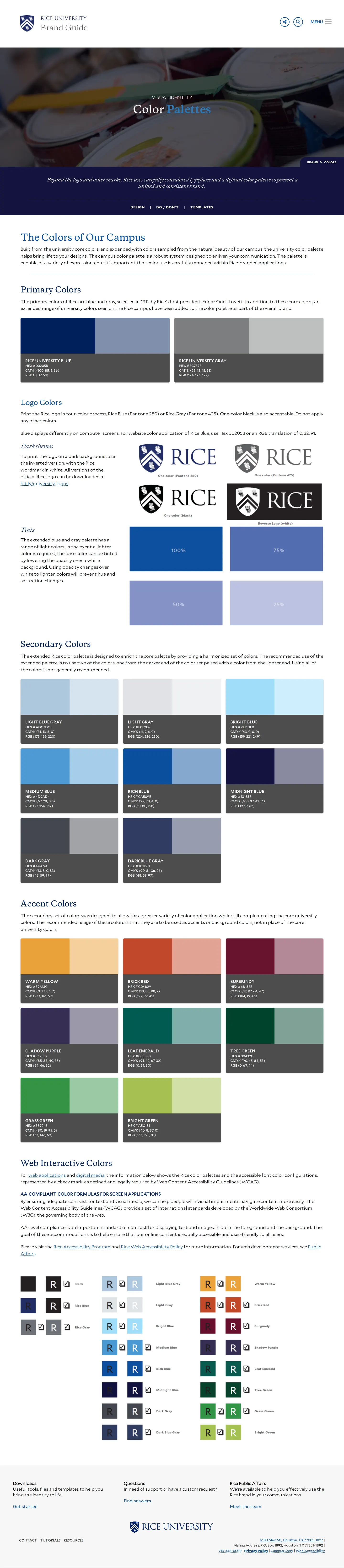
- Specific color swatches and values on the Color Palette page could not be fully inspected beyond visible headings.
Ideas to borrow
Reviewed on 18 September 2026. Request a correction · I built this