Quarkus brand guidelines
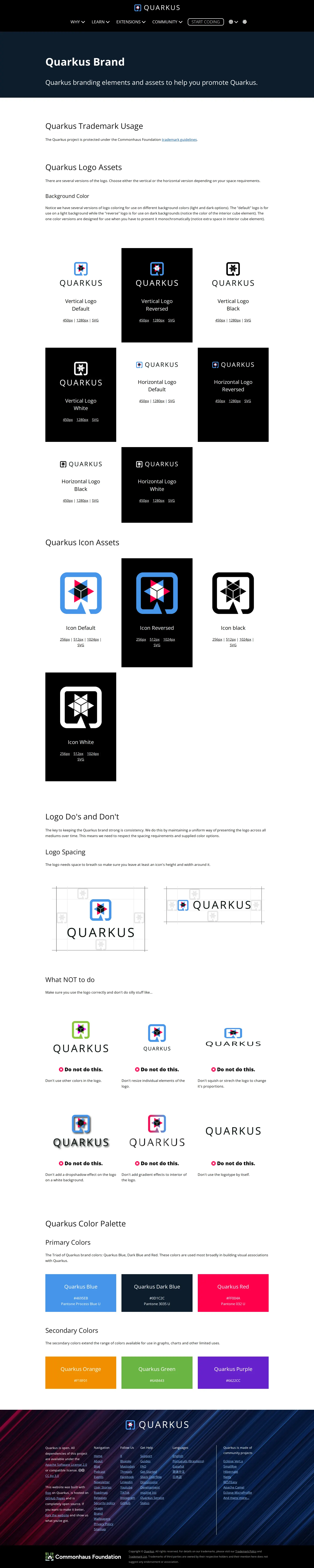
The Quarkus brand page provides essential logo assets, trademark rules, spacing guidance, and color palettes for community use.
Freedam's take — I like the clean utility of the Quarkus brand page. It focuses strictly on what community members and developers actually need to represent the project correctly. You get straightforward trademark notes, clear logo do and don't guidance with clear spacing rules, and a breakdown of primary and secondary colors. Having direct download links for logo variants in predefined pixel sizes and vectors hosted right in their GitHub artwork repository makes grabbing an asset effortless. It is a no-nonsense single-page reference that gets right to work.
Details
- Type
- Guidelines
- Access
- Public
- Source
- quarkus.io
- Industry
- Technology
- Capabilities
- Guidelines, Asset browsing, Downloads
- Tags
- logo usage, do's and don'ts, color system, legal & trademark, vector assets, asset downloads, single page
- Added
- Last checked
What I noticed
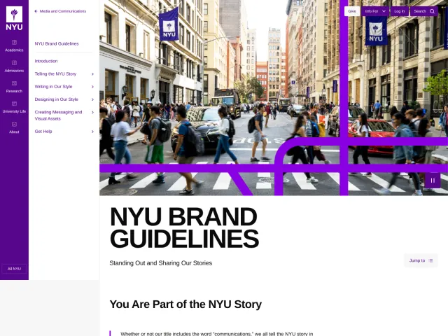
- The page includes guidelines on logo spacing and improper usage under a 'Logo Do's and Don't' section.123
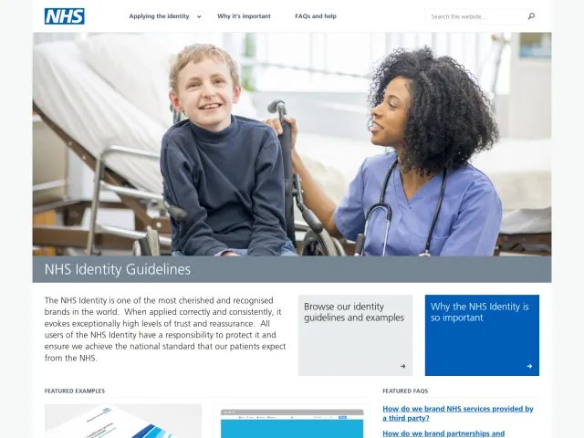
- Asset downloads link directly to raw files hosted on GitHub in vector SVG format as well as 450px and 1280px raster PNGs.456
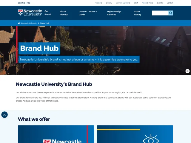
- The documentation specifies both primary and secondary color palettes.789
Numbers refer to the screenshots above.
What I could not see
- Only a single page was captured, so typography specifications and deeper marketing guidelines beyond the main page are not visible.
Ideas to borrow
Reviewed on 18 September 2026. Request a correction · I built this
Similar brand centers
All brand guidelines →