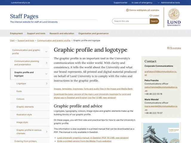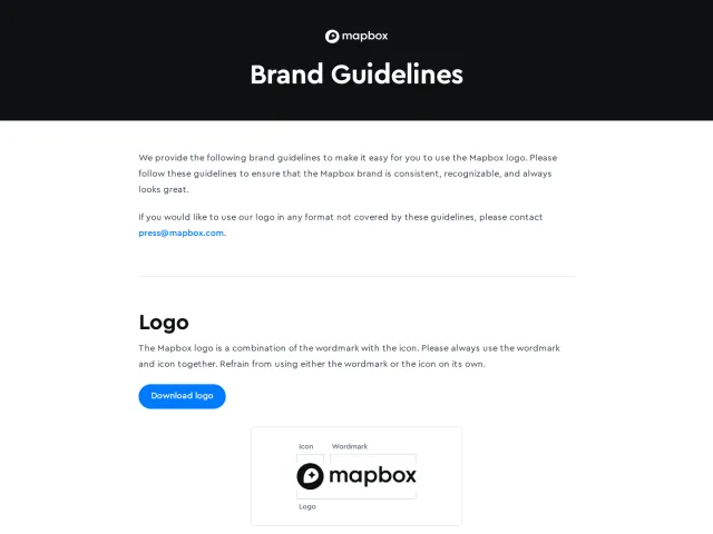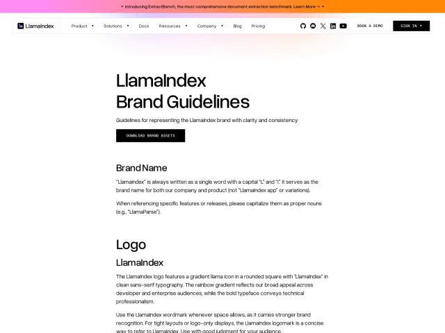
PagerDuty brand guidelines
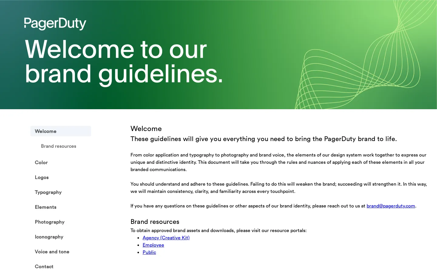
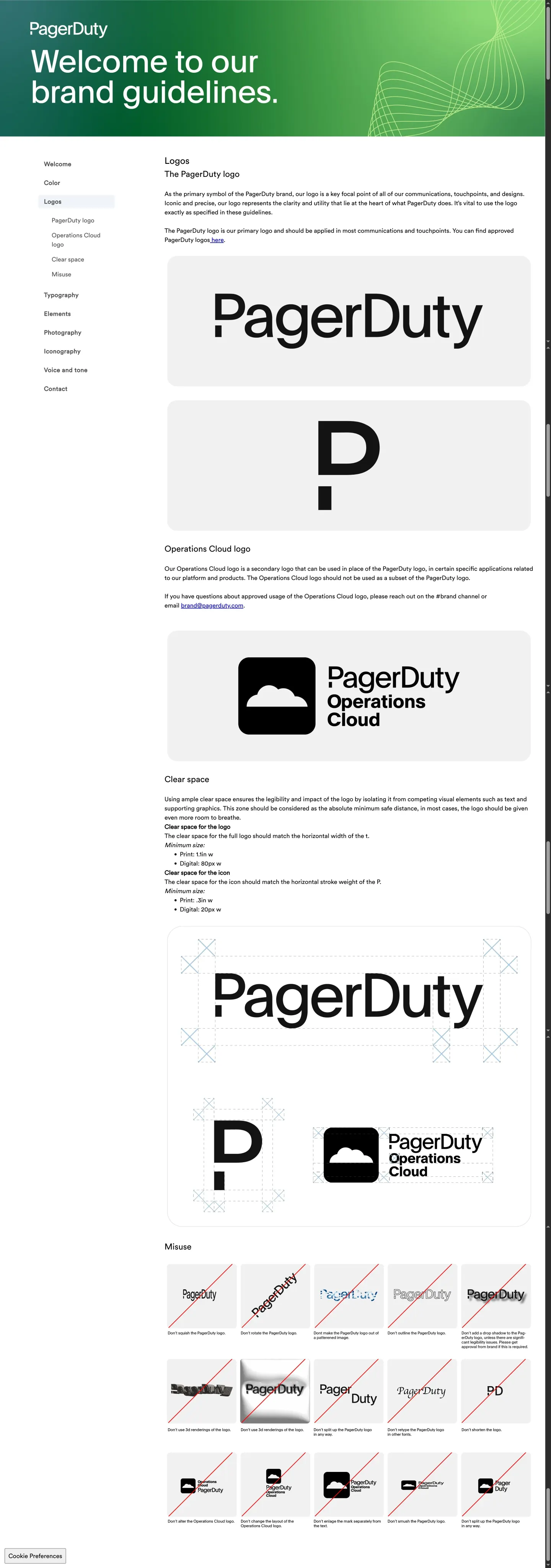
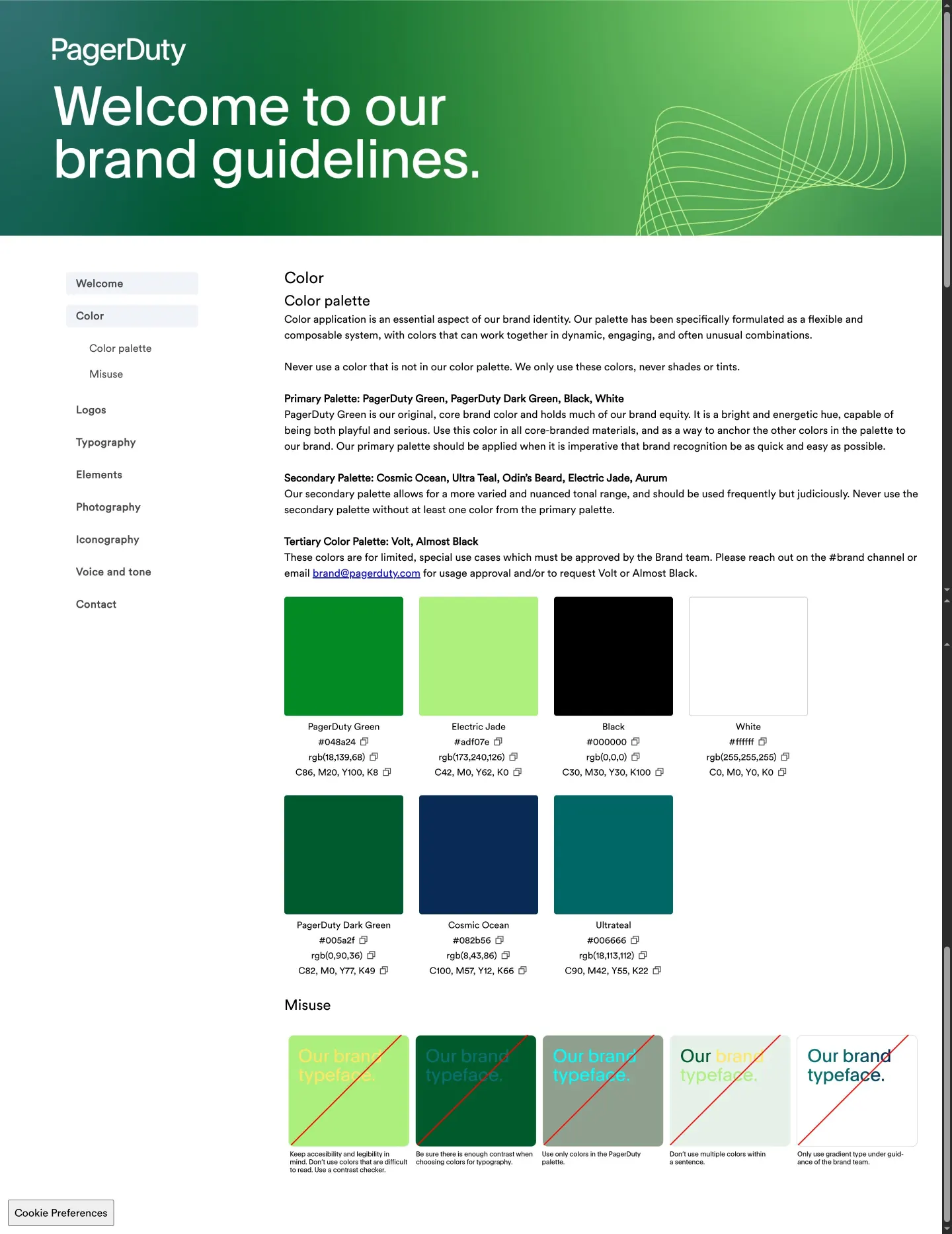
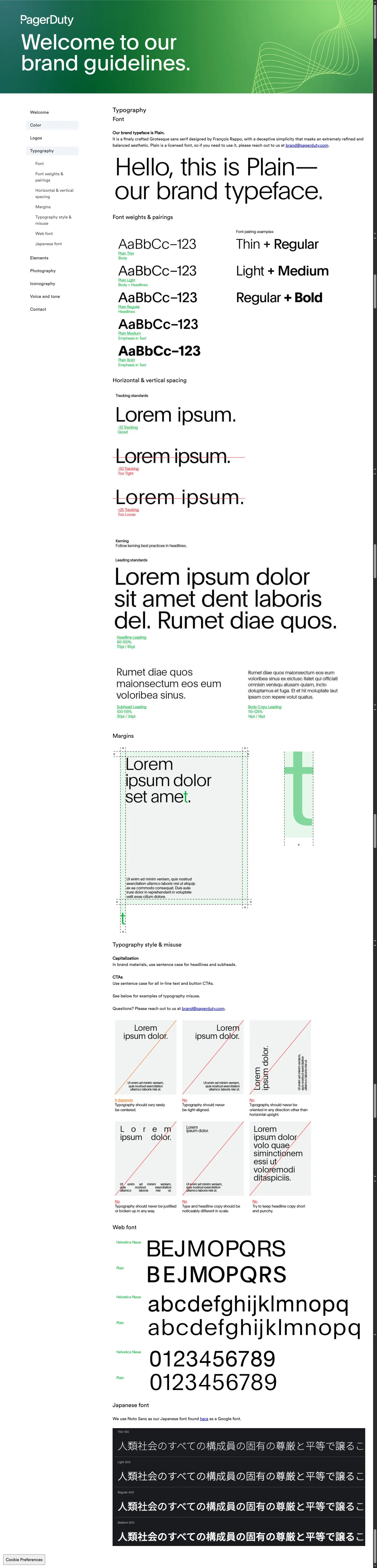
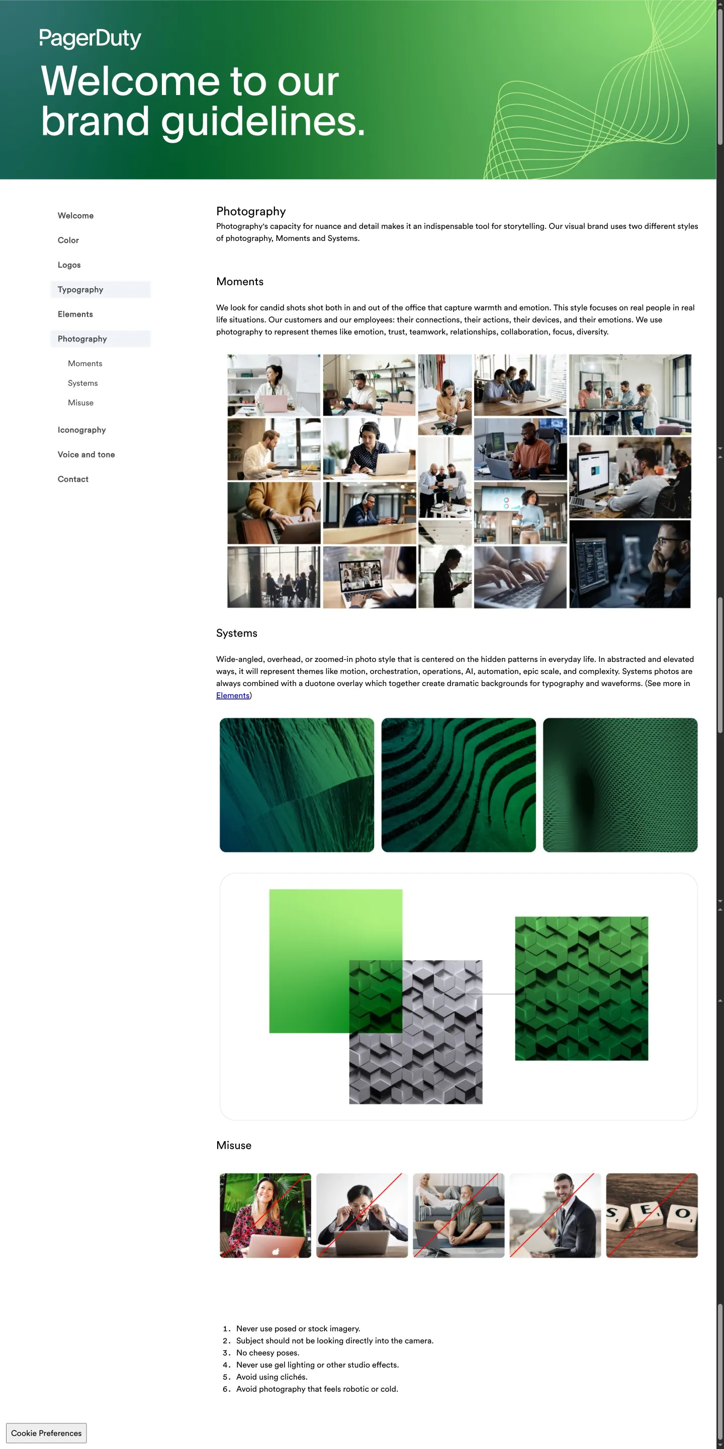
PagerDuty's Brandfolder guide covers essential identity standards, international typography, visual elements like waveforms, and distinct photographic categories.
Freedam's take — I like how cleanly structured PagerDuty sets up their online guidelines. Built on Brandfolder, the documentation splits complex topics into very manageable chunks, from foundational elements like logos, color, and typography to specific brand expressions like waveforms and duotone overlays. I appreciate that they dedicate space to Japanese typography alongside web fonts, showing care for international implementations. They also separate photography into moments and systems, giving creatives distinct conceptual buckets to work within rather than relying on generic photo advice.
Details
- Type
- Guidelines
- Access
- Public
- Industry
- Technology
- Capabilities
- Guidelines, Asset browsing
- Tags
- typography, photography, color system, multilingual
- Added
- Last checked
What I noticed
- The guide includes specific typography guidance for Japanese font usage alongside web font rules.12
- Visual identity elements include specific sections for waveforms as well as gradients and duotone overlays.345
- Photography guidance is organized into categories labeled Moments and Systems.67
- The site is hosted on Brandfolder.8
Numbers refer to the screenshots above.
What I could not see
- Could not inspect actual asset download behavior or downloadable file formats.
- Could not view the contents of the iconography library or voice and tone sub-pages beyond navigation labels.
Ideas to borrow
- Explicitly documenting international typography requirements like Japanese font rules prevents global teams from guessing font pairings.
Reviewed on 18 September 2026. Request a correction · I built this