New York City FC brand guidelines
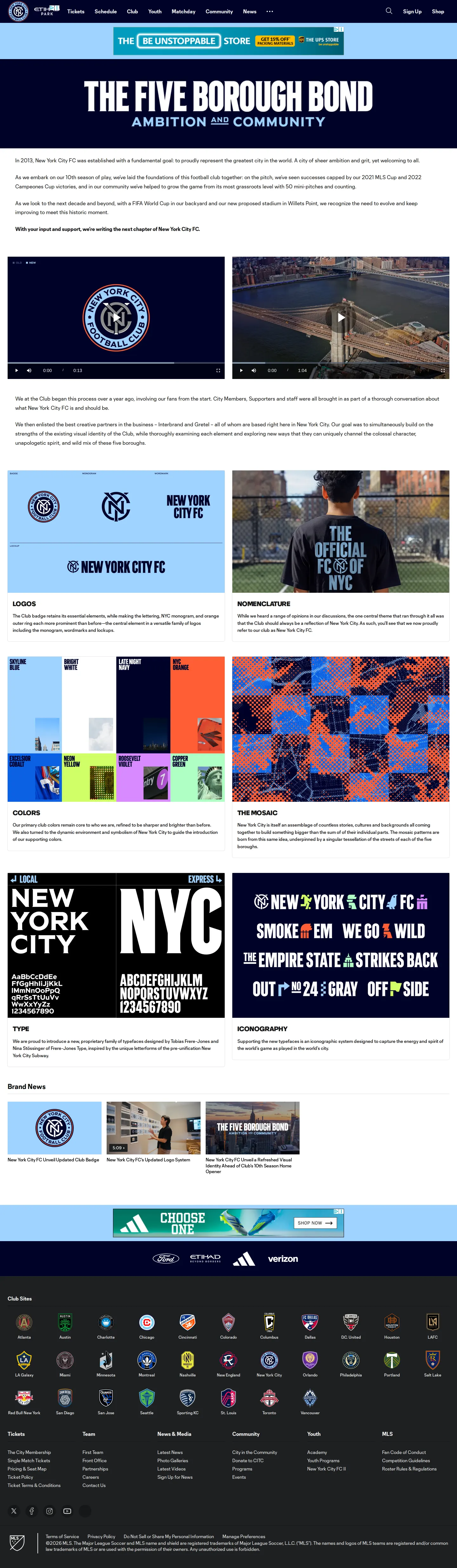
New York City FC outlines its refreshed visual identity, detailing its updated badge, logos, typography, colors, and mosaic graphic system.
Freedam's take — I like seeing sports clubs demystify their visual refresh right on the main site. New York City FC dedicates a clear page to its core identity elements, breaking down essentials like logos, nomenclature, colors, type, iconography, and a graphic motif they call the mosaic. Rather than tucking identity updates into an obscure press release, they frame the updated club badge and visual system directly alongside articles and videos explaining the changes. It gives supporters and creative partners an accessible overview of the team aesthetic.
Details
- Type
- Guidelines
- Access
- Public
- Source
- newyorkcityfc.com
- Industry
- Sports
- Capabilities
- Guidelines, Asset browsing, Search
- Tags
- logo usage, color system, typography, iconography
- Added
- Last checked
What I noticed
- The brand page organizes guidelines under headings for logos, nomenclature, colors, the mosaic, type, and iconography.123456
- The club pairs its identity sections with dedicated editorial content covering its updated badge and 10th season visual refresh.789
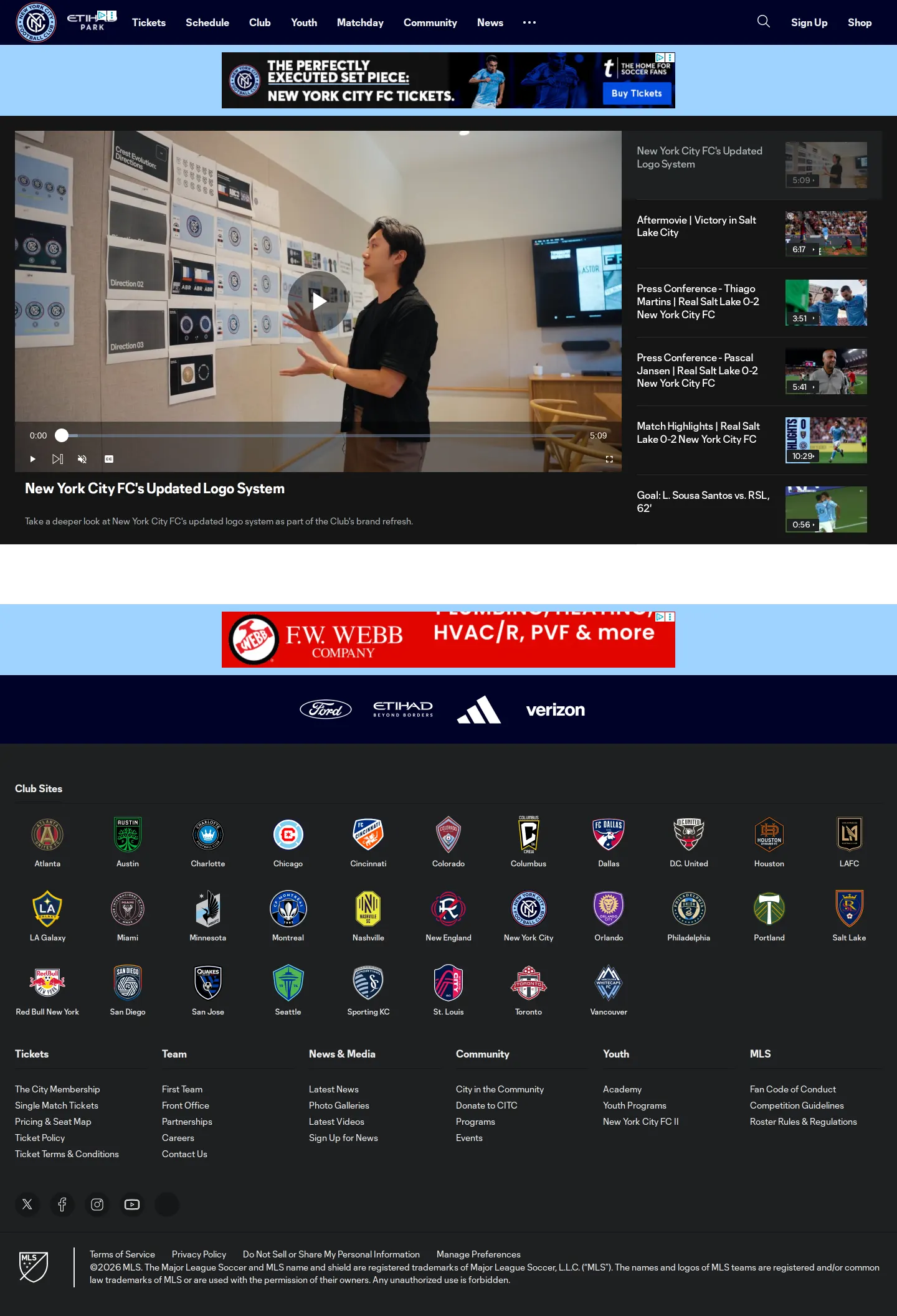
- The site includes a dedicated video page explaining the updated logo system.1011
Numbers refer to the screenshots above.
What I could not see
- Could not view downloadable vector assets, specific hex color codes, or typography licensing rules directly from the captured viewports.
Ideas to borrow
- Combine high-level brand pillars with contextual explanatory videos and launch articles to make identity updates engaging for general audiences.
Reviewed on 18 September 2026. Request a correction · I built this