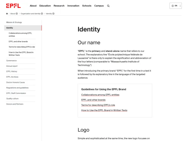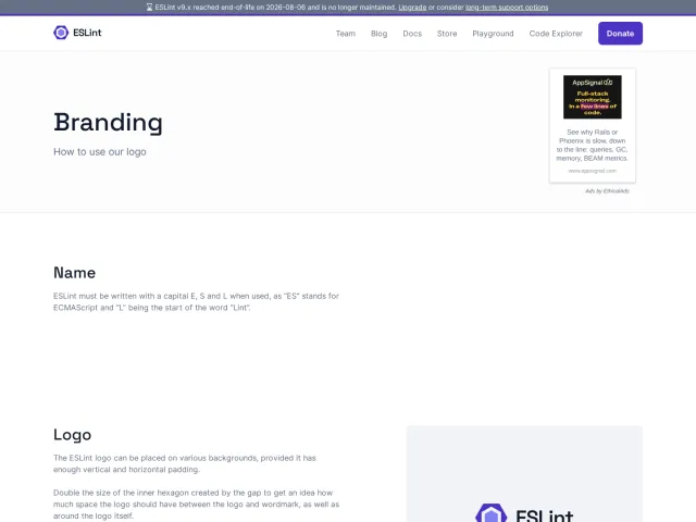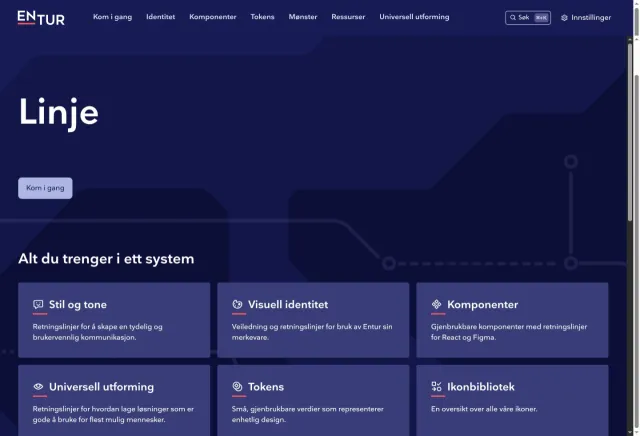
iStock brand guidelines
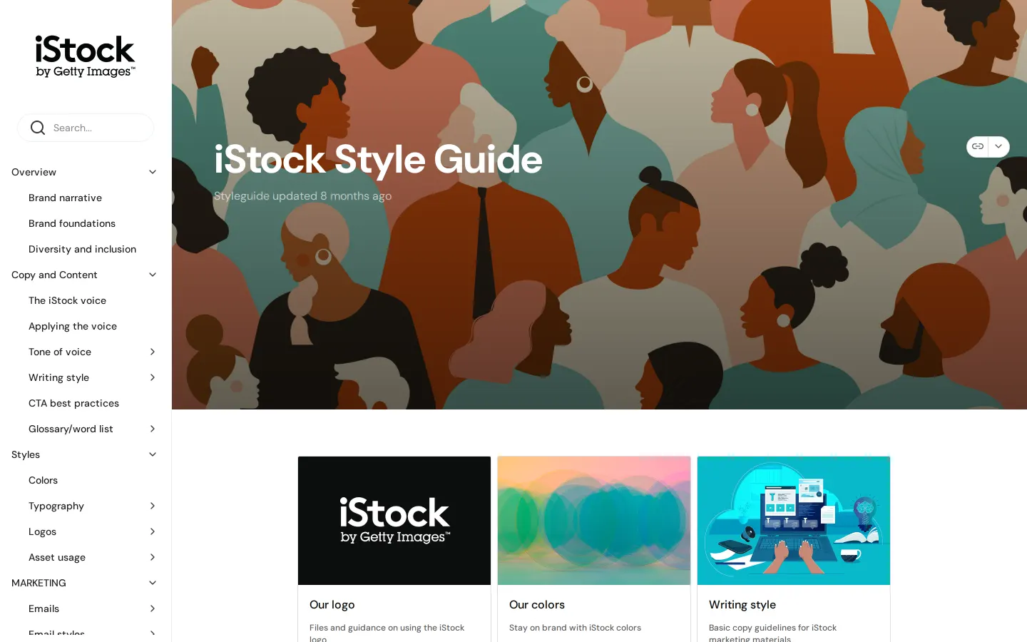
The iStock style guide documents brand foundations, voice principles, motion guidelines, and digital UI patterns within a zeroheight documentation space.
Freedam's take — I love when a style guide pays serious attention to motion, and iStock delivers that nicely here. Built on zeroheight, the site expands beyond static identity assets to outline video specifics, from animated logo intros and outros across square, vertical, and wide aspect ratios to dedicated color palettes for video. The navigation balances high-level voice and diversity principles with tactical marketing components like email styles, banner ads, and digital UI controls. It feels like a very practical, production-minded workspace for creative teams working across multiple formats.
Details
- Type
- Guidelines
- Access
- Public
- Industry
- Technology, Media & entertainment
- Capabilities
- Guidelines, Asset browsing, Search, Downloads, Templates
- Tags
- motion design, advertising, color system, tone of voice, ui components, asset downloads, zeroheight
- Added
- Last checked
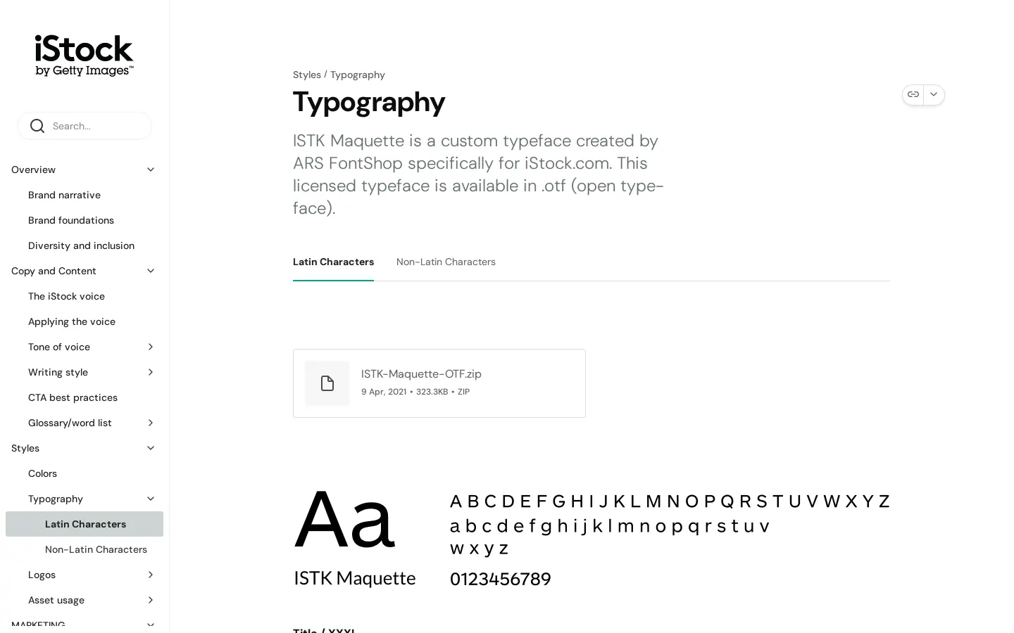
What I noticed
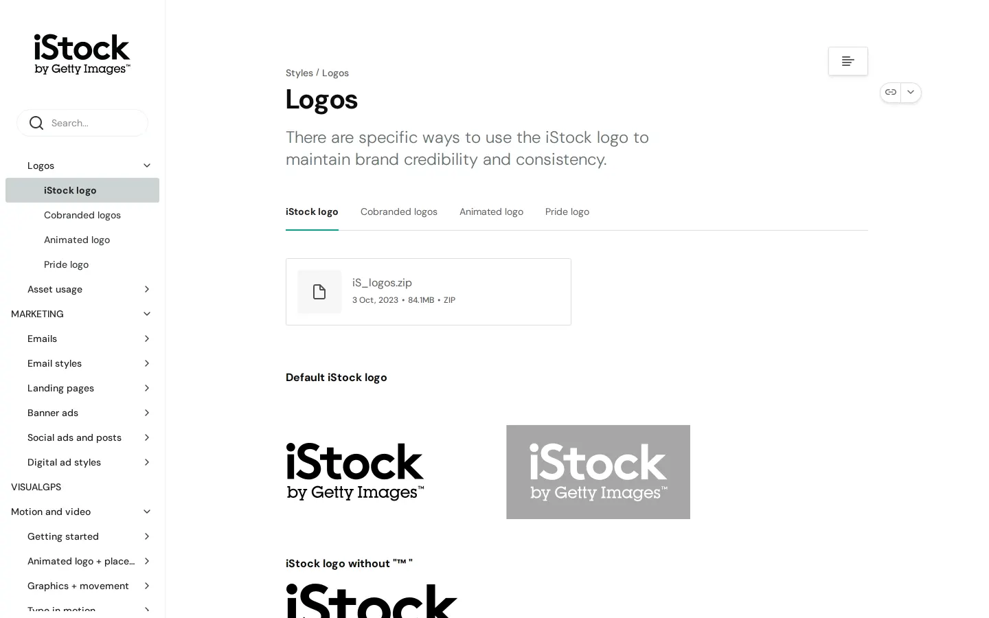
- The documentation site is hosted on zeroheight.12
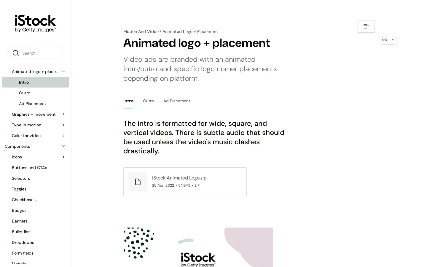
- The site provides dedicated guidelines for animated logo placement across wide, square, and vertical video formats.34
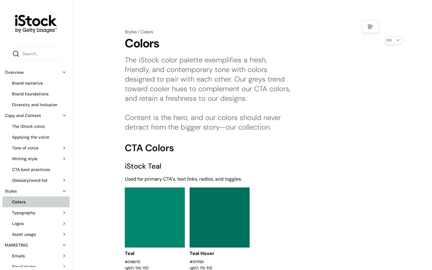
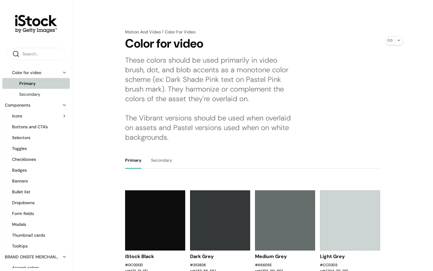
- Color palettes are documented with functional groupings like CTA colors, supporting colors, and video-specific palettes.567
- A central downloads page is made available throughout the navigation.89
Numbers refer to the screenshots above.
What I could not see
- Could not view the contents of the downloads page or asset files directly.
- Could not inspect the full depth of UI component behaviors beyond navigation headings.
Ideas to borrow
- Teams producing video content can benefit from documenting format-specific intro and outro rules alongside audio pairing instructions.4
Reviewed on 18 September 2026. Request a correction · I built this