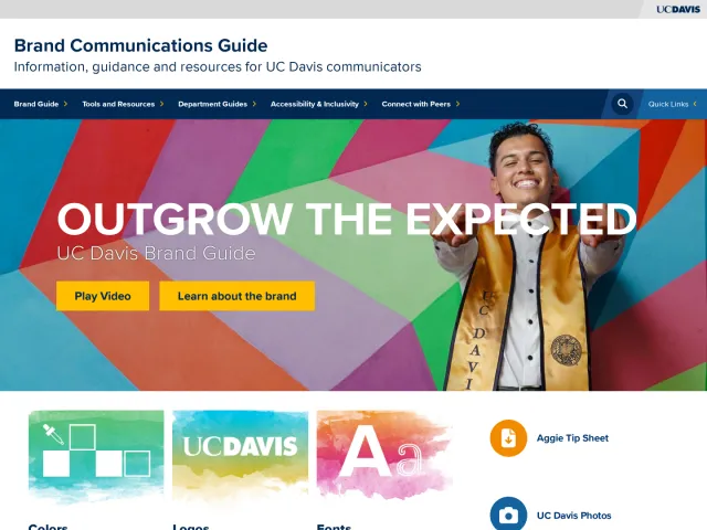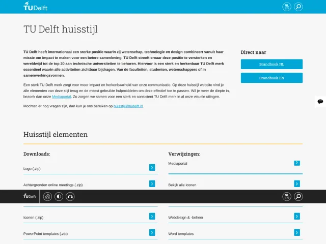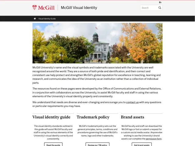
Georgetown University brand guidelines
Georgetown University provides visual identity guidelines detailing logo lockups, typography standards, and color usage thresholds.

Georgetown University visual identity page showing core logos, typography specifications, and brand guideline links.
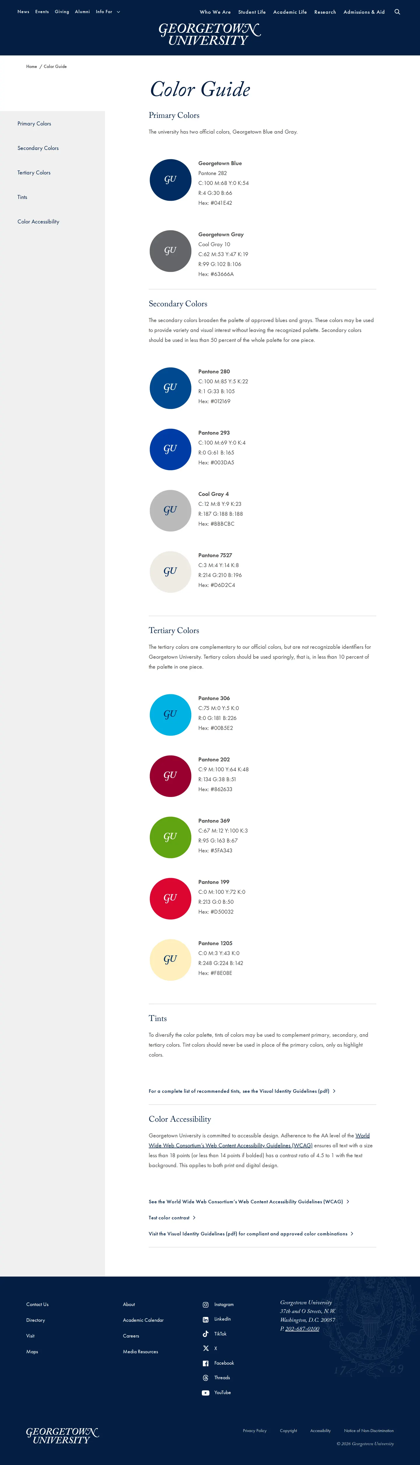
Color guide displaying circular swatches, color breakdowns, percentage usage rules, and accessibility links.
Want a brand center like Georgetown University’s?
Create your brand center with Freedam ↗Freedam's take
I spent time walking through Georgetown University's visual identity pages, and I appreciate how clearly the team lays out their foundational assets. Everything from the seal lockups to Adobe Caslon typography sits within a clean, structured sidebar navigation. The dedicated color guide caught my eye because it goes beyond listing Pantone and hex values. It defines exact balance thresholds for secondary and tertiary palettes alongside dedicated accessibility links. Linking out to a PDF guideline and formal request form keeps governance orderly for campus departments.
At a glance
- Sections
- Introduction · Logos · Logotype · Logomark (seal) · School and University Office Lockups · Sub-Brand Expression · Co-Branding · Typography · Colors · Photography and Images · Web Templates · Powerpoint Templates · Foundational Documents · Logo Usage Request Form · Visual Identity Guidelines · Web Guidelines
- Downloads
- Tone
- Clear, structured academic guidance prioritizing consistency and visual hierarchy.
What I noticed
- The visual identity guidelines detail the official logo lockup, standalone logotype, logomark seal, and school office lockups.12
- Typography specifications define Adobe Caslon across multiple weights alongside Neue Helvetica as the secondary typeface.3
- The color guide provides circular swatches with monogram graphics accompanied by Pantone, CMYK, RGB, and Hex codes.45
- Secondary colors are limited to under 50 percent of the palette for a piece, while tertiary colors are capped at under 10 percent.67
Numbers refer to the screenshots above.
What I could not see
- Could not inspect the downloadable Visual Identity Guidelines PDF or the contents of the Logo Usage Request Form.
- Could not view individual templates listed in navigation for PowerPoint and web.
Ideas to borrow
Quick answers
What primary typefaces are approved for Georgetown University?
The primary typeface is Adobe Caslon in multiple weights, supported by Neue Helvetica as a secondary typeface.3
Reviewed on 25 September 2026. Request a correction · I built this
Similar brand centers
All brand guidelines →