Free Hanseatic City of Bremen brand guidelines
Styleguide Bremen provides design documentation, digital layout standards, and usage guidelines for the Free Hanseatic City of Bremen.
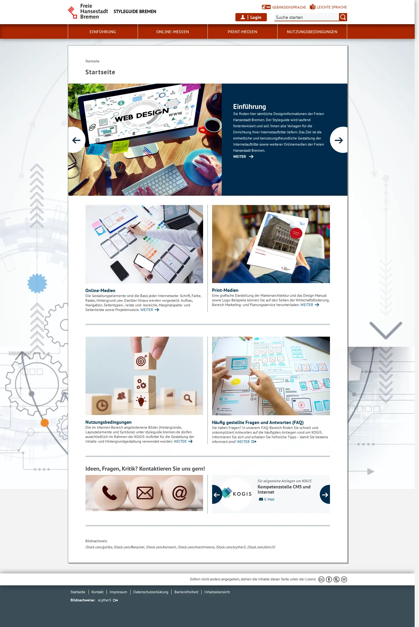
Homepage of the Styleguide Bremen portal displaying core navigation for online media, print media, accessibility links, and support contacts.
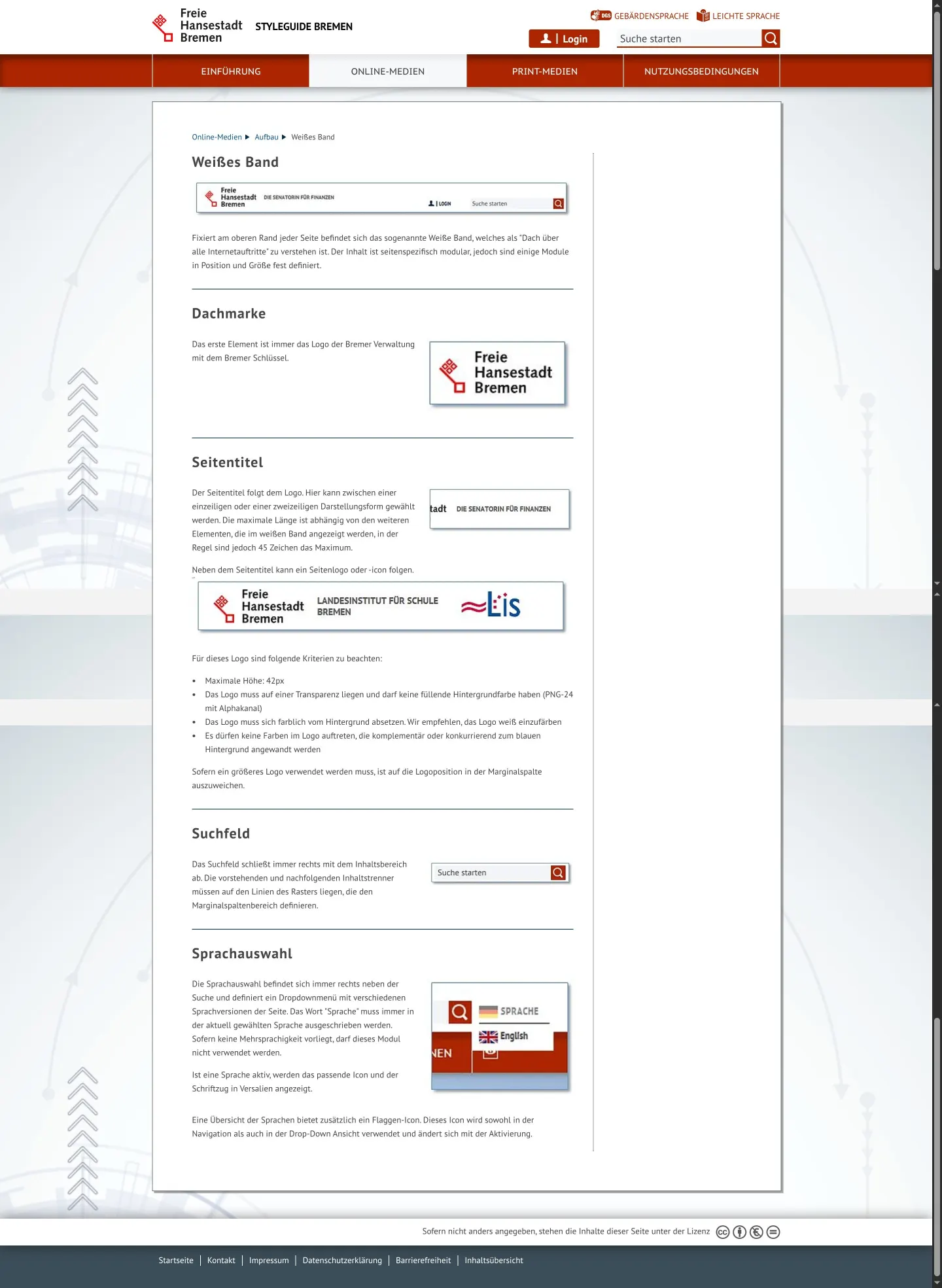
Documentation page outlining structural criteria and component rules for the 'Weißes Band' web header element.
Want a brand center like Free Hanseatic City of Bremen’s?
Create your brand center with Freedam ↗Freedam's take
I spent time browsing the Styleguide Bremen portal, and I appreciate how clearly it addresses public administration requirements. The home screen highlights direct paths for online media, print guidelines, and accessibility features like sign language and simplified text. Diving into the web documentation, I noticed specific layout rules for their top bar, including exact height limits for sub-logos and clear structure for the master brand mark. It feels very functional and focused on helping local municipal departments stay consistent across their digital touchpoints.
At a glance
- Sections
- Einführung · Online-Medien · Print-Medien · Nutzungsbedingungen
- Tone
- Functional, civic, and practical digital governance documentation.
What I noticed
- The header includes dedicated accessibility links for German Sign Language (Gebärdensprache) and Plain German (Leichte Sprache).123
- The online guidelines specify a maximum height of 42 pixels and transparent PNG-24 format for sub-logos within the top bar.4
- The site provides dedicated contact channels for CMS and KOGIS support directly on the homepage.567
Numbers refer to the screenshots above.
What I could not see
- Could not inspect the contents behind the login area or print-media sections beyond navigation labels.
- Could not view direct asset download repositories or file packages from the captured pages.
Ideas to borrow
Reviewed on 25 September 2026. Request a correction · I built this
Similar brand centers
All brand guidelines →