
Duke University brand guidelines
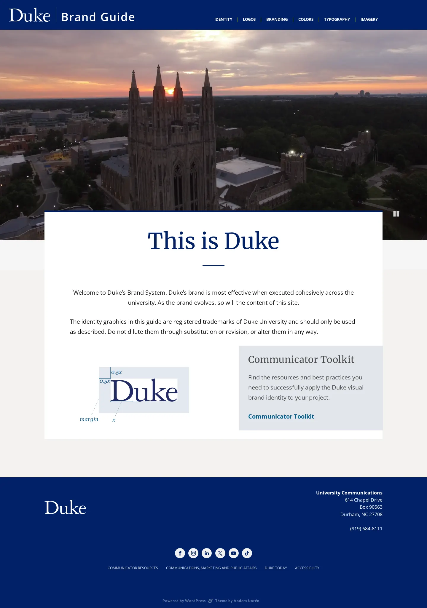
Duke University's brand guide outlines core identity standards, typography, colors, photography, and detailed sub-branding rules for departments and partner institutions.
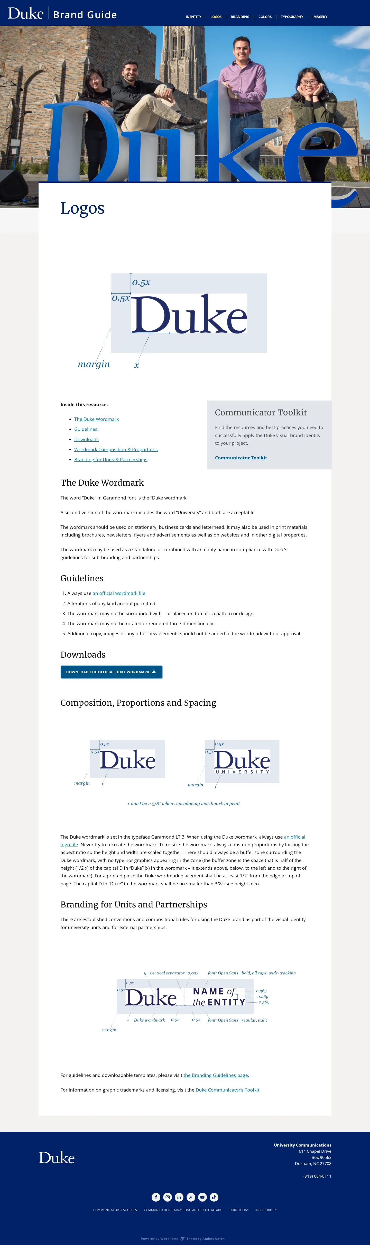
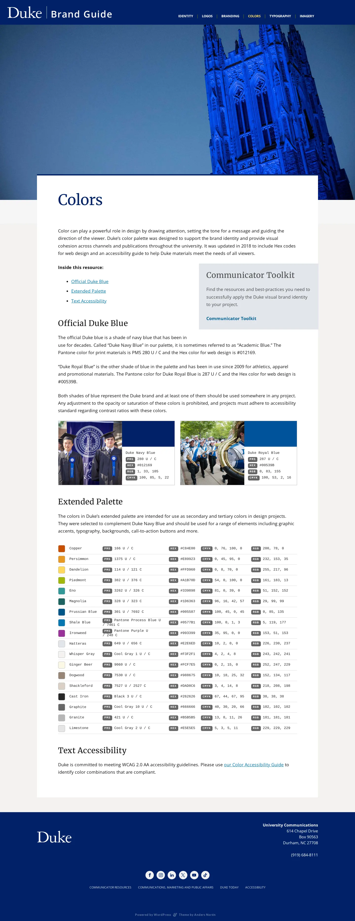
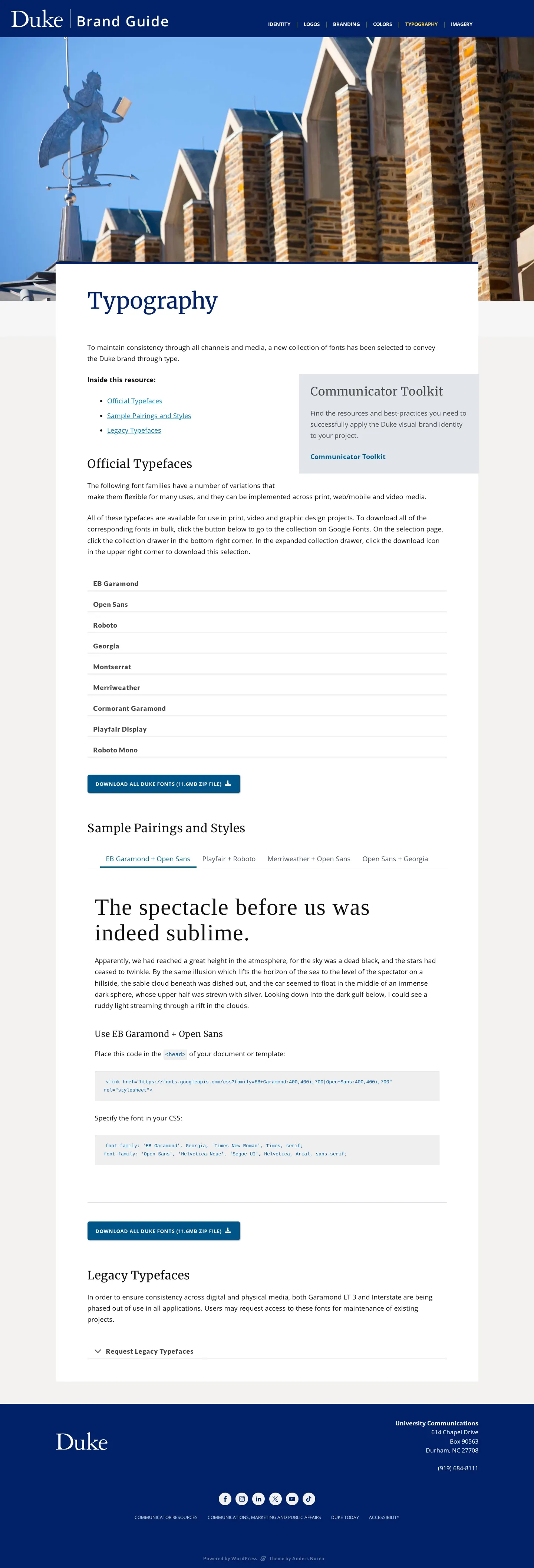
Freedam's take — I like how direct Duke University keeps their online brand guide. Built on WordPress, the site gives campus communicators a straightforward toolkit covering everyday essentials. You can explore the core Duke wordmark, extended color palettes with explicit guidance on text accessibility, official type pairings, and imagery rules. What stands out to me is how thoughtfully they address institutional complexity. They offer specific guidance and downloadable cheat sheets for sub-branding, departmental marks, dual branding, and video use, making a large university identity feel manageable rather than overwhelming.
Details
- Type
- Guidelines
- Access
- Public
- Source
- brand.duke.edu
- Industry
- Education
- Capabilities
- Guidelines, Asset browsing, Downloads, Partner resources
- Tags
- brand architecture, accessibility, typography, color system, photography, asset downloads, pdf downloads, wordpress
- Added
- Last checked
What I noticed
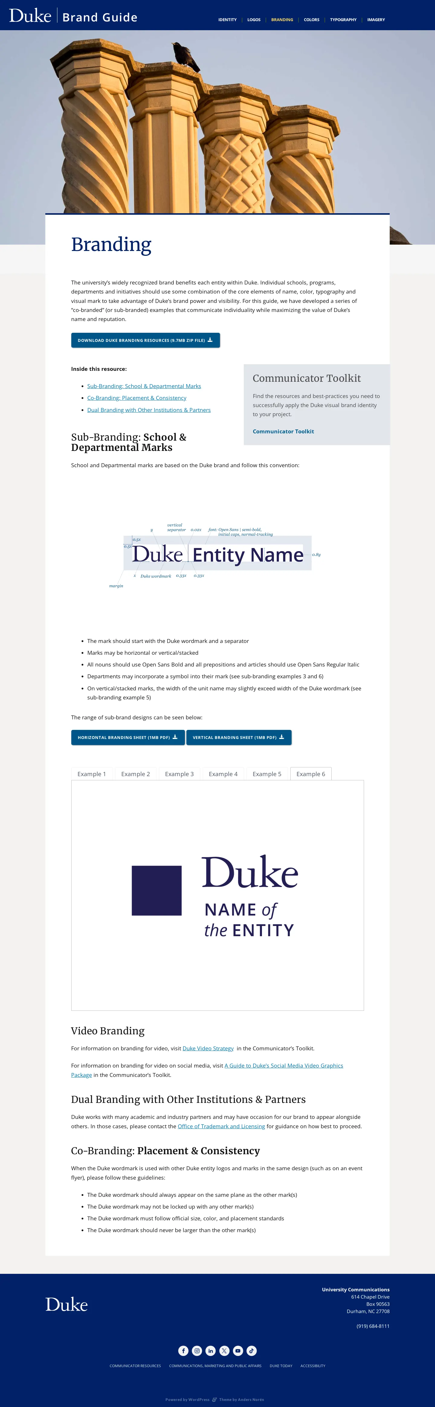
- The guide includes direct zip downloads for official wordmarks, typefaces, and sub-branding resources.123
- The color section includes a dedicated heading and guidance for text accessibility alongside the official Duke Blue and extended palette.456
- Sub-branding guidance provides horizontal and vertical option sheets as downloadable PDFs for departments and partner setups.789
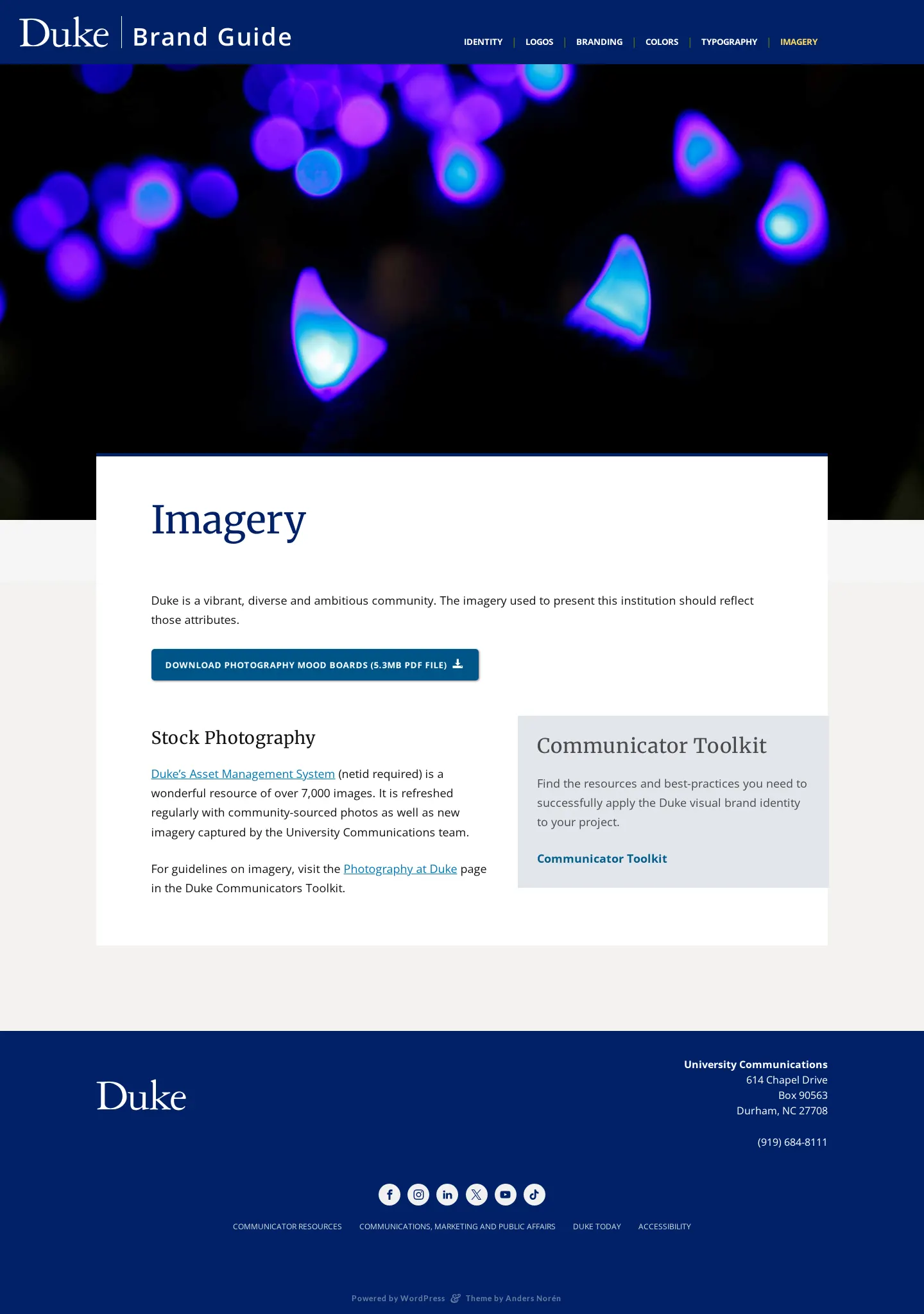
- The platform is powered by WordPress across its captured pages.101112131415
Numbers refer to the screenshots above.
What I could not see
- Could not inspect the full text, imagery previews, or interactive color contrast tools on the pages.
- Could not verify whether a search function or restricted asset portal exists behind an internal login.
Ideas to borrow
Reviewed on 18 September 2026. Request a correction · I built this

