
City of Chicago brand guidelines
The Chicago Design System provides guidelines for municipal symbols, color systems, typography, and public marks for city employees and residents.
Freedam's take — I love seeing civic design systems made accessible to everyone, and the City of Chicago does a wonderful job laying out its civic identity. The portal spans foundational symbols like the city seal and flag alongside modern digital guidelines. I appreciate how practical the documentation feels, from breaking down the star and color palette to specifying departmental mark lockups and community partnerships. It treats public design as a shared municipal utility, giving both city workers and the public clear rules for building consistent services.
Details
- Type
- Guidelines
- Access
- Public
- Source
- design.chicago.gov
- Industry
- Public sector
- Capabilities
- Guidelines
- Tags
- brand architecture, partner branding, color system, typography, accessibility, ui components
- Added
- Last checked
What I noticed
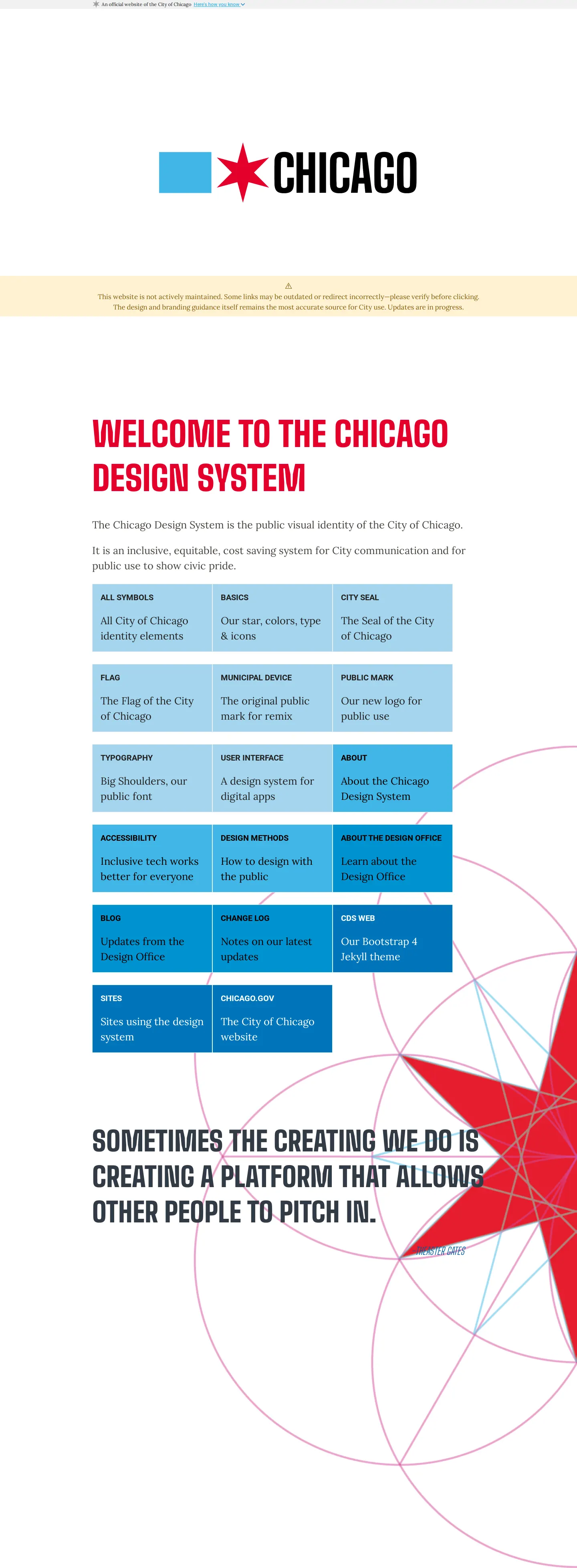
- The homepage categorizes system elements into symbols, basics, user interface, accessibility, and design methods.12345
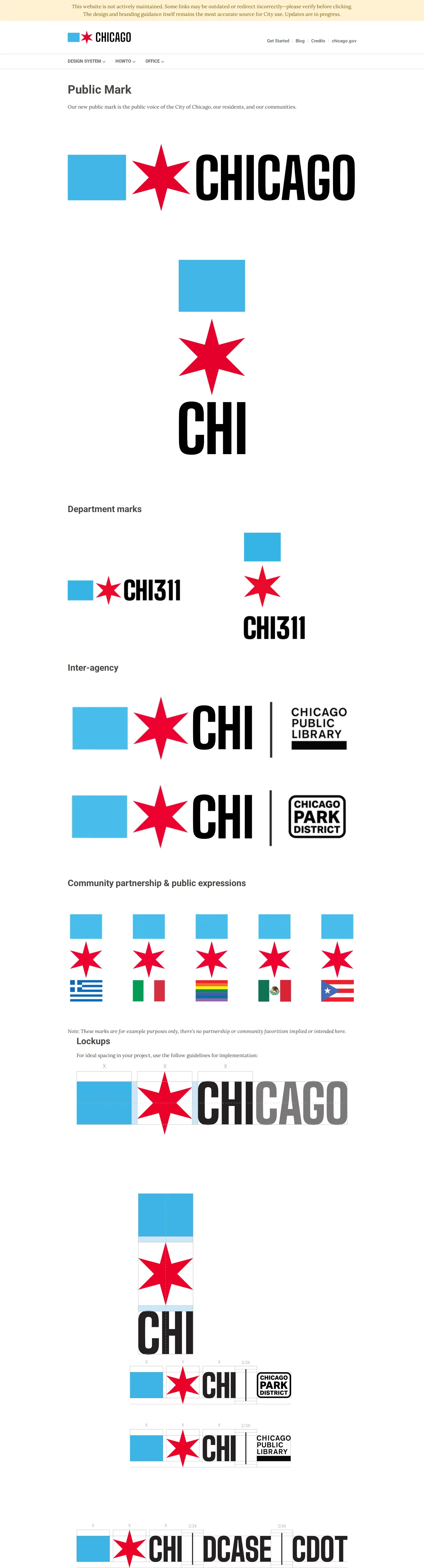
- The public mark guidelines include specific rules for department marks, inter-agency use, community partnerships, and lockups.6789
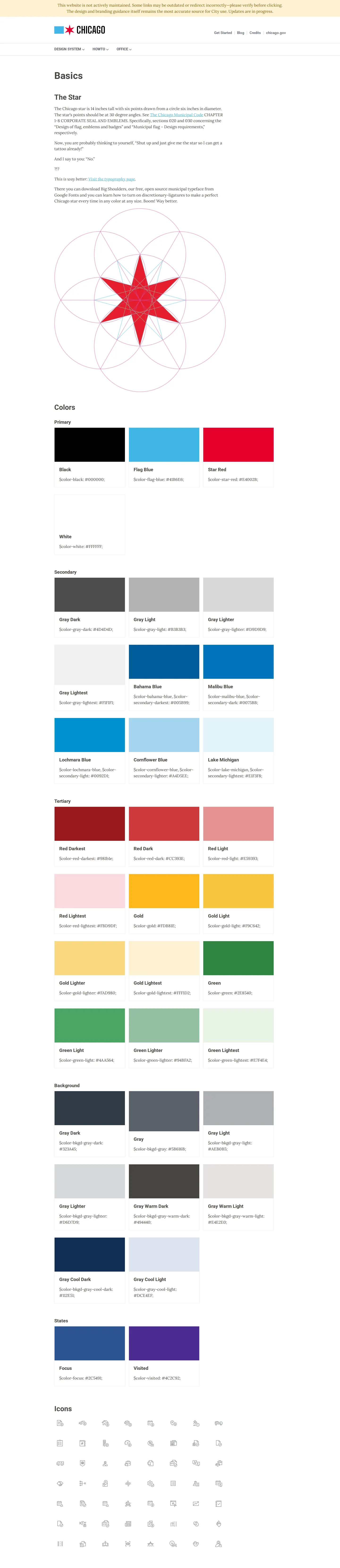
- The color system organizes hues into primary, secondary, and tertiary tiers with city-inspired naming like Flag Blue, Star Red, and Lake Michigan.101112131415
Numbers refer to the screenshots above.
What I could not see
- Could not view downloadable font files or graphic asset packages directly from the captured text.
- Could not inspect the user interface component library implementation details.
Ideas to borrow
- Civic organizations can establish clear tiers of branding for partner organizations and sub-agencies to protect foundational civic emblems while remaining flexible.
Reviewed on 18 September 2026. Request a correction · I built this

