 Shopify
Technology
Press & asset kit
Shopify
Technology
Press & asset kit
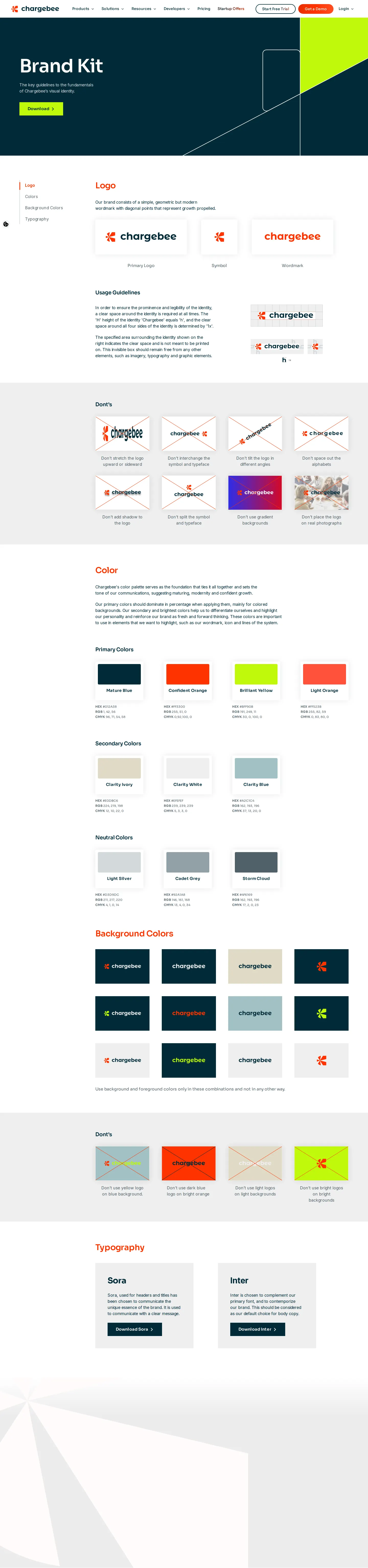
Chargebee provides a concise brand kit covering logo rules, categorized color palettes, and direct links to fonts and download bundles.
Freedam's take — I like how Chargebee keeps their brand assets straightforward and accessible right within their press presence. The Brand Kit page gets straight to business, presenting essential logo usage rules and a clear list of dos and dont's alongside color palettes categorized into primary, secondary, neutral, and background tones. Instead of hosting complex type tooling, they link directly out to Google Fonts for both Sora and Inter, alongside a single zip download for the full media kit. It feels lightweight, practical, and easy for any partner or journalist to quickly grab what they need.
Numbers refer to the screenshots above.
Reviewed on 18 September 2026. Request a correction · I built this