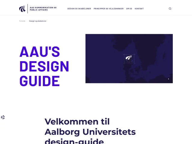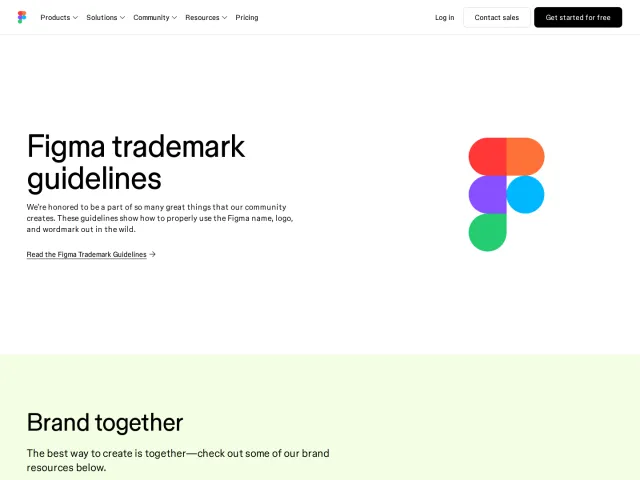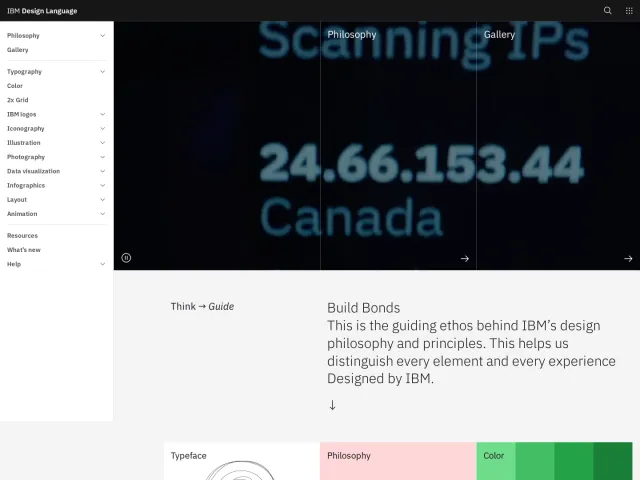
Boardmans brand guidelines
A concise brand guidelines portal outlining identity foundations, logo variants, color palettes, and typography for Boardmans.
Freedam's take — I added Boardmans to the gallery because I appreciate how direct and uncluttered this brand portal feels. As a design business founded in 1925, they lay out their visual essentials clearly on a single page. You can jump quickly between the logotype, mark, stacked lockups, and typography, alongside dedicated sections for colour palettes and files. It feels like a straightforward, no-nonsense reference built for partners and internal teams who just need the core identity specifications without navigating through layers of complex documentation.
Details
- Type
- Guidelines
- Access
- Public
- Industry
- Fashion
- Capabilities
- Guidelines
- Tags
- logo usage, color system, typography, single page, minimal
- Added
- Last checked

What I noticed
- The page organizes guidance under headings including The Brand, Logotype, Device, Logotype Stack, Colour, Fonts & Type, Colour Palette, and Files.12345678
- Navigation labels provide quick links across logo, device, stack, colour, fonts, palette, and documents.9101112131415
- The portal introduces the business with its 1925 heritage as a Manchester accessories designer.16
Numbers refer to the screenshots above.
What I could not see
- Could not inspect individual file download formats or color values beyond section headings.
- Subpages or external links could not be explored beyond the single captured view.
Ideas to borrow
- Teams with concise identity systems can build single-page brand guides with persistent section navigation to keep core assets accessible.
Reviewed on 18 September 2026. Request a correction · I built this