Bancontact brand guidelines
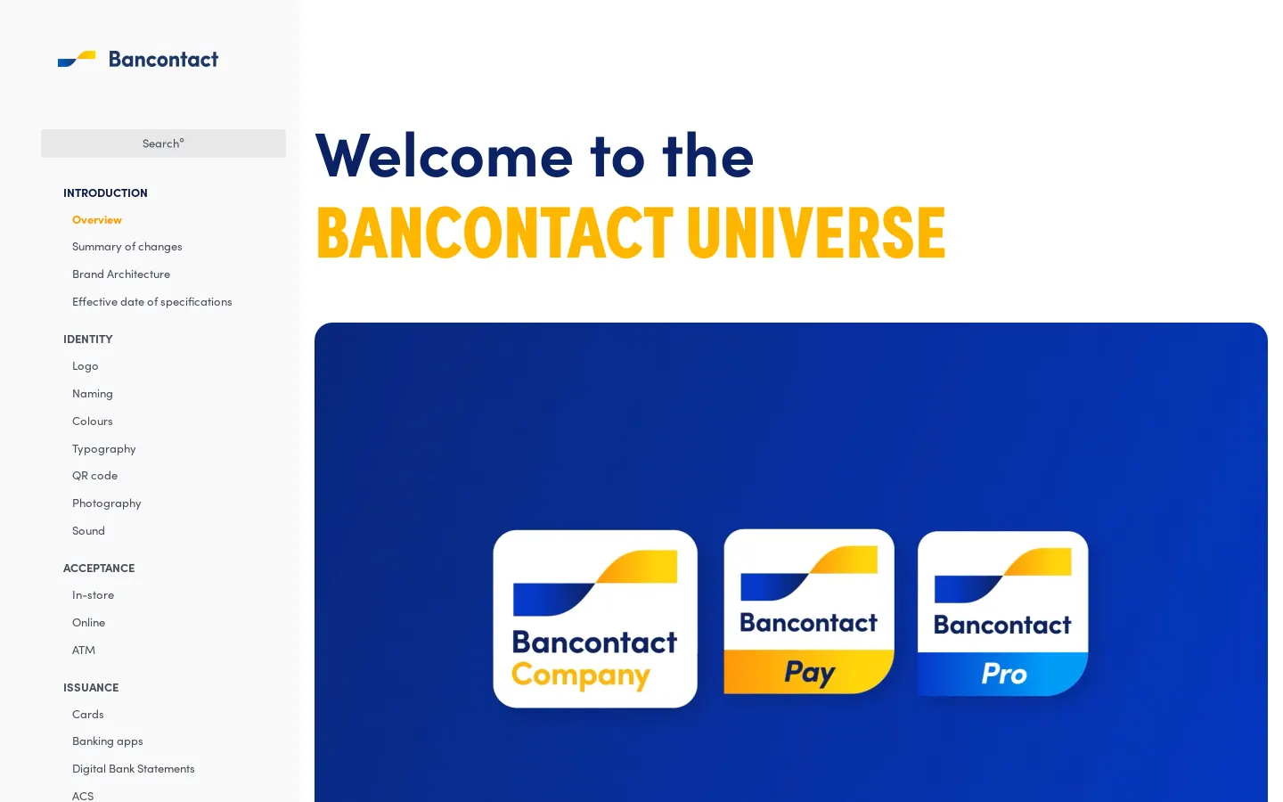
Bancontact provides an online brand portal detailing brand architecture, logo variations, typography, and photography styles across its product offerings.
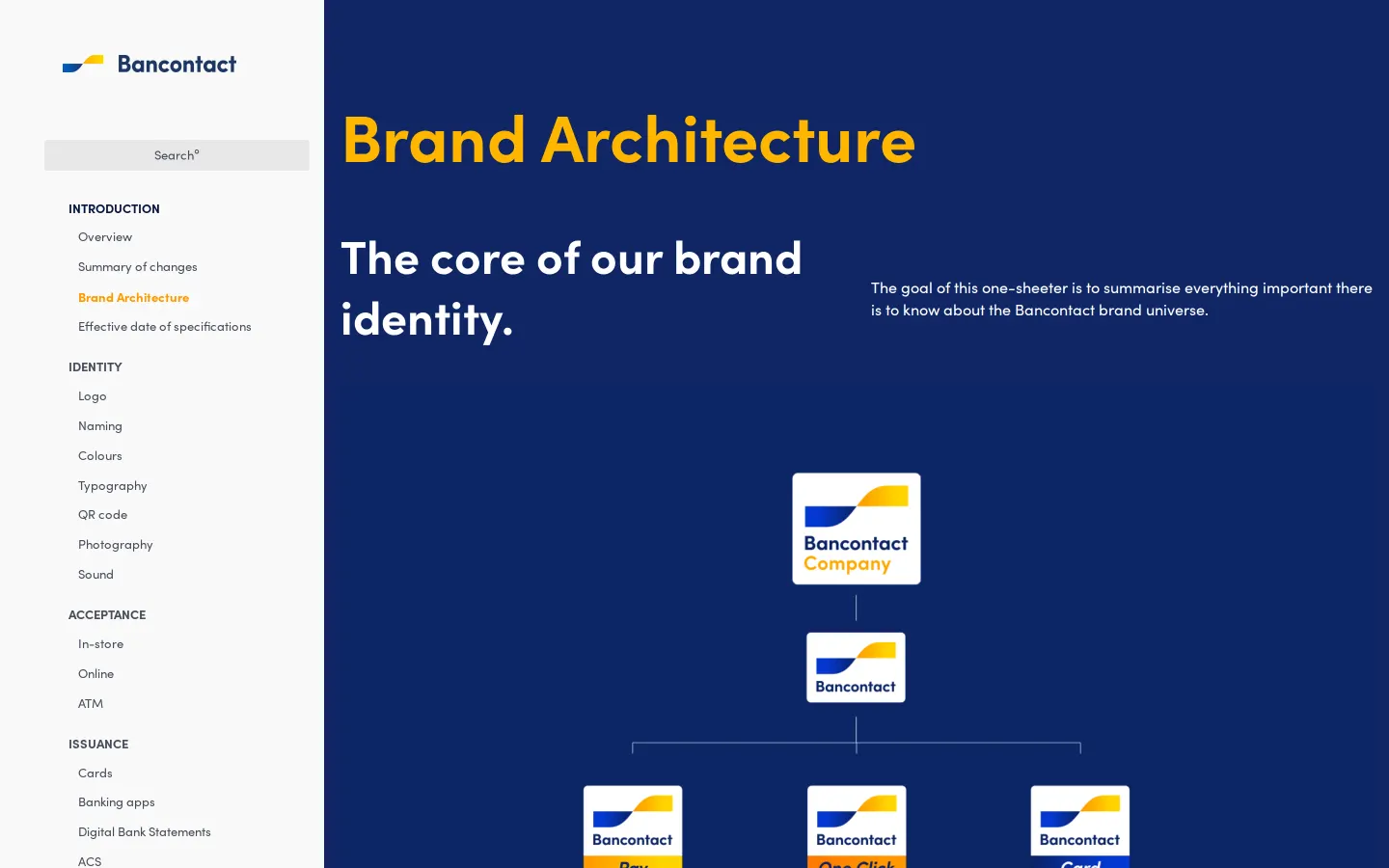
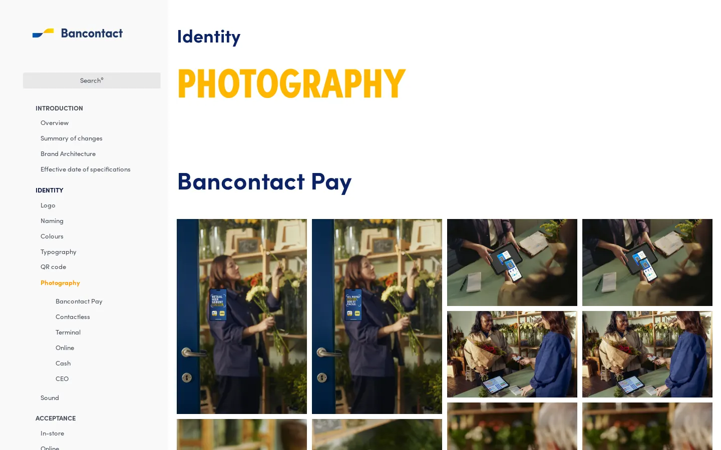
Freedam's take — I spent some time looking through the Bancontact brand guidelines, and I appreciate how systematic the layout is. Built on Corebook, the portal clearly separates primary identity elements like logo variants, brand architecture, and typography. I particularly like the structure of their photography section, which organizes images by concrete touchpoints such as terminal, contactless, and online interactions. Breaking down sub-brand marks for Bancontact Pay and Bancontact Card alongside multi-branding rules gives partners and internal teams exactly what they need to deploy the brand correctly.
Details
- Type
- Guidelines
- Access
- Public
- Source
- brand.bancontact.com
- Industry
- Finance
- Capabilities
- Guidelines, Asset browsing, Downloads
- Tags
- brand architecture, photography, typography, logo usage, partner branding, corebook
- Added
- Last checked
What I noticed
- The brand guidelines platform is generated using Corebook.123456
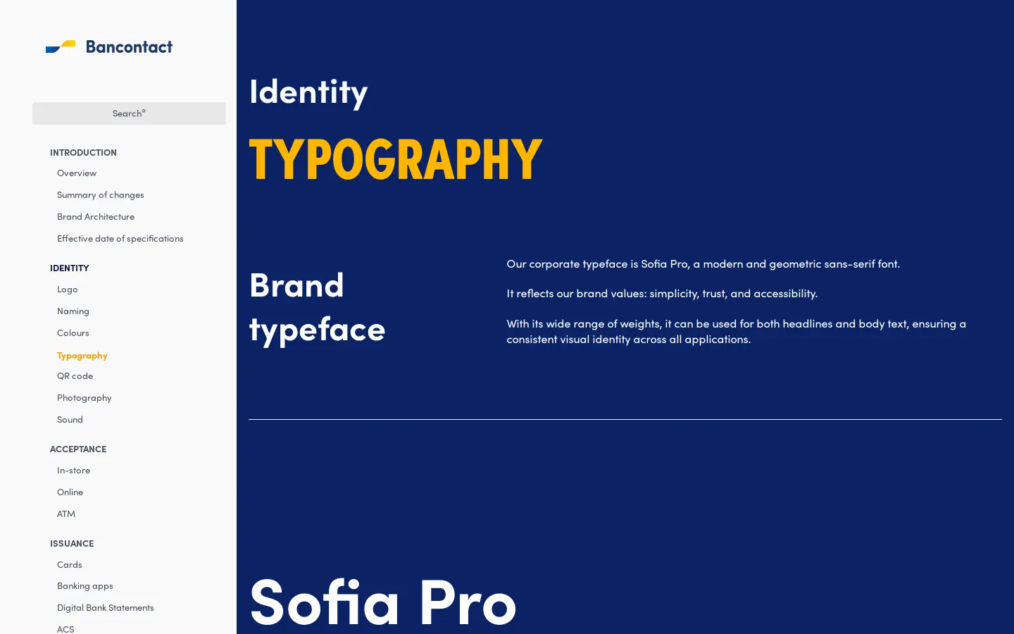
- The typography section specifies Sofia Pro as the brand typeface.78
- The photography documentation categorizes imagery by specific use cases including Pay, Contactless, Terminal, Online, Cash, and CEO.9101112131415
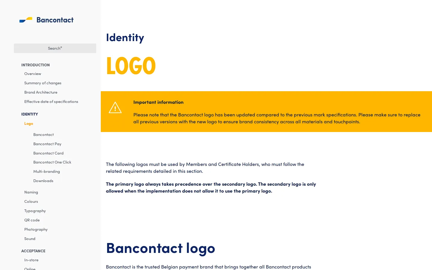
- The logo section provides distinct guidance and downloads for products like Bancontact Pay, Bancontact Card, and Bancontact One Click.1617181920
Numbers refer to the screenshots above.
What I could not see
- Could not inspect the full content or downloadable file formats within the logo downloads anchor.
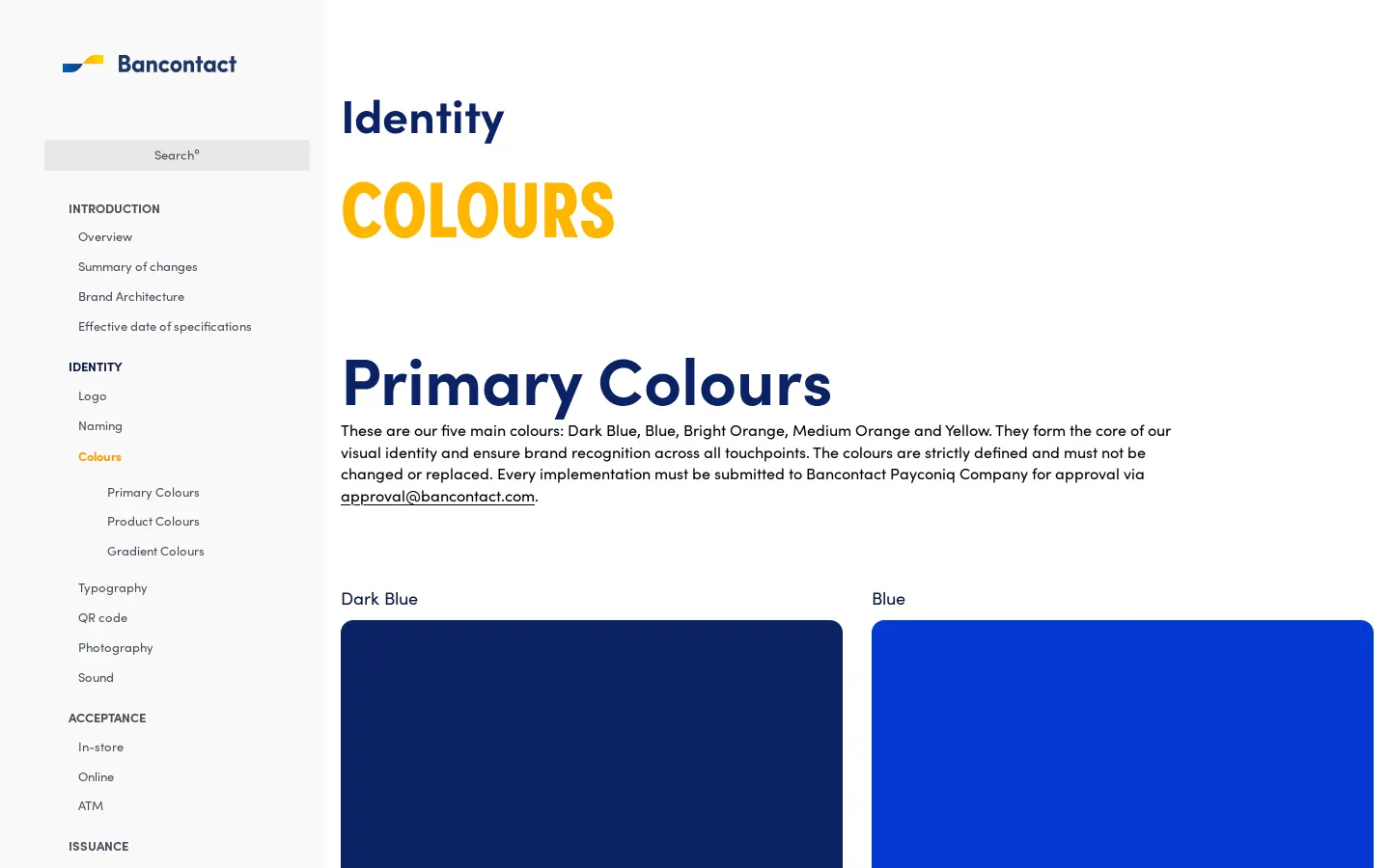
- Could not view full colour hex codes or palette specifications beyond the section headings.
Ideas to borrow
- Organizing photography guidelines around specific customer touchpoints and hardware contexts clarifies visual direction for digital and physical marketing.
Reviewed on 18 September 2026. Request a correction · I built this