Airtasker brand guidelines
Airtasker's brand page outlines core identity elements including the logotype, stylized logomark, color palettes, and typography.
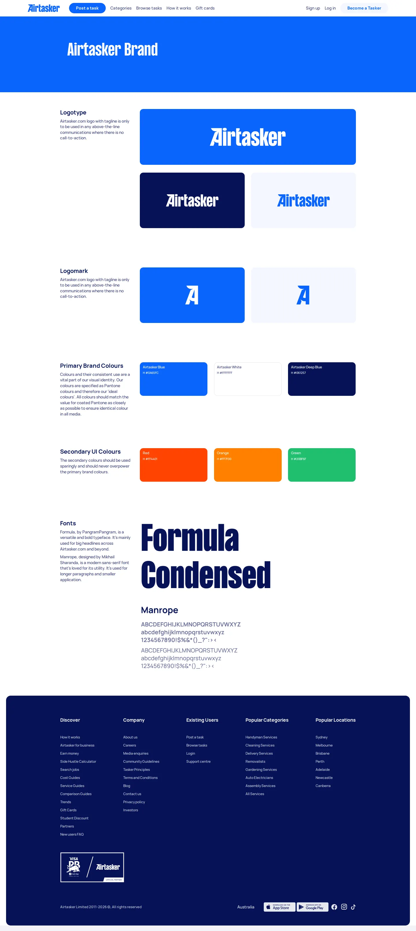
Brand guidelines webpage for Airtasker outlining brand identity elements including logos, color palettes, and typography.
Want a brand center like Airtasker’s?
Create your brand center with Freedam ↗Freedam's take
I added Airtasker's brand page to the gallery because it keeps basic identity rules straightforward and clear. On a single page, I can see how their logotype and stylized logomark sit against core background colors. They present the primary brand palette with hex values, introduce secondary UI tones, and set their typographic pairing using Formula Condensed for headlines and Manrope for body copy. It is a neat, focused overview of fundamental assets without any extra clutter.
At a glance
- Sections
- Logotype · Logomark · Primary Brand Colours · Secondary UI Colours · Fonts
- Tone
- Direct, practical, and clean overview of foundational identity assets.
What I noticed
- The Logotype section shows the Airtasker wordmark on blue, dark blue, and light gray background cards.1
- The Logomark section displays a stylized 'A' mark on blue and off-white cards.2
- Primary Brand Colours include swatch cards for Airtasker Blue, Airtasker White, and Airtasker Deep Blue with HEX values.3
- The Fonts section specifies Formula Condensed for headlines and Manrope for body text, displaying sample character sets.4
Numbers refer to the screenshots above.
What I could not see
- No downloadable asset files or links were visible on the captured page.
- No guidance on clear space, minimum sizing, or misuse was visible.
Ideas to borrow
Quick answers
What fonts are specified in the Airtasker brand guidelines?
Formula Condensed is specified for headlines and Manrope is specified for body text.4
Reviewed on 26 September 2026. Request a correction · I built this