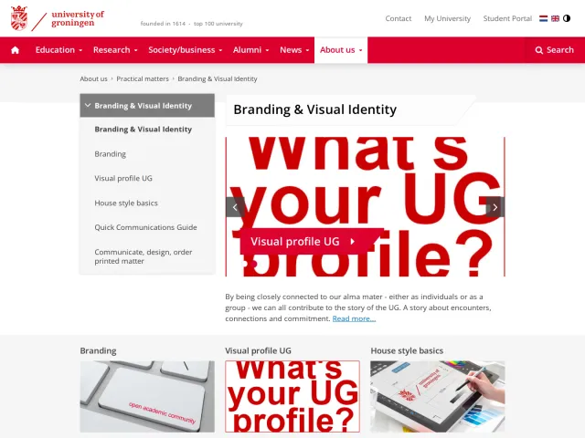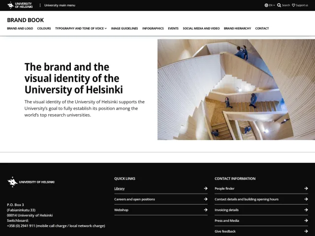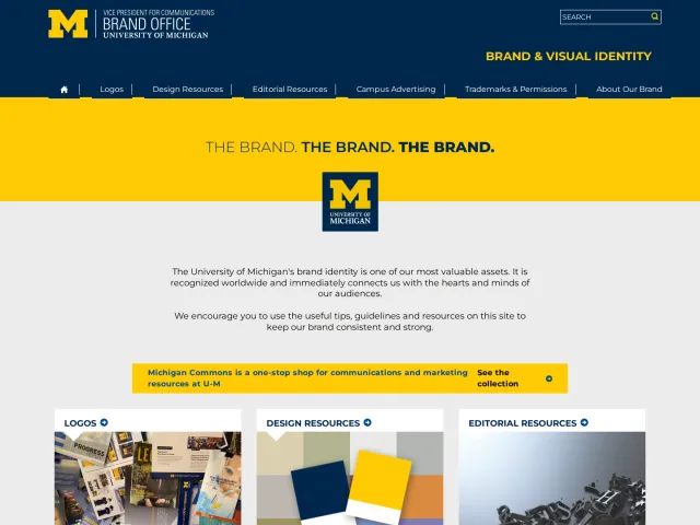
Viber brand guidelines
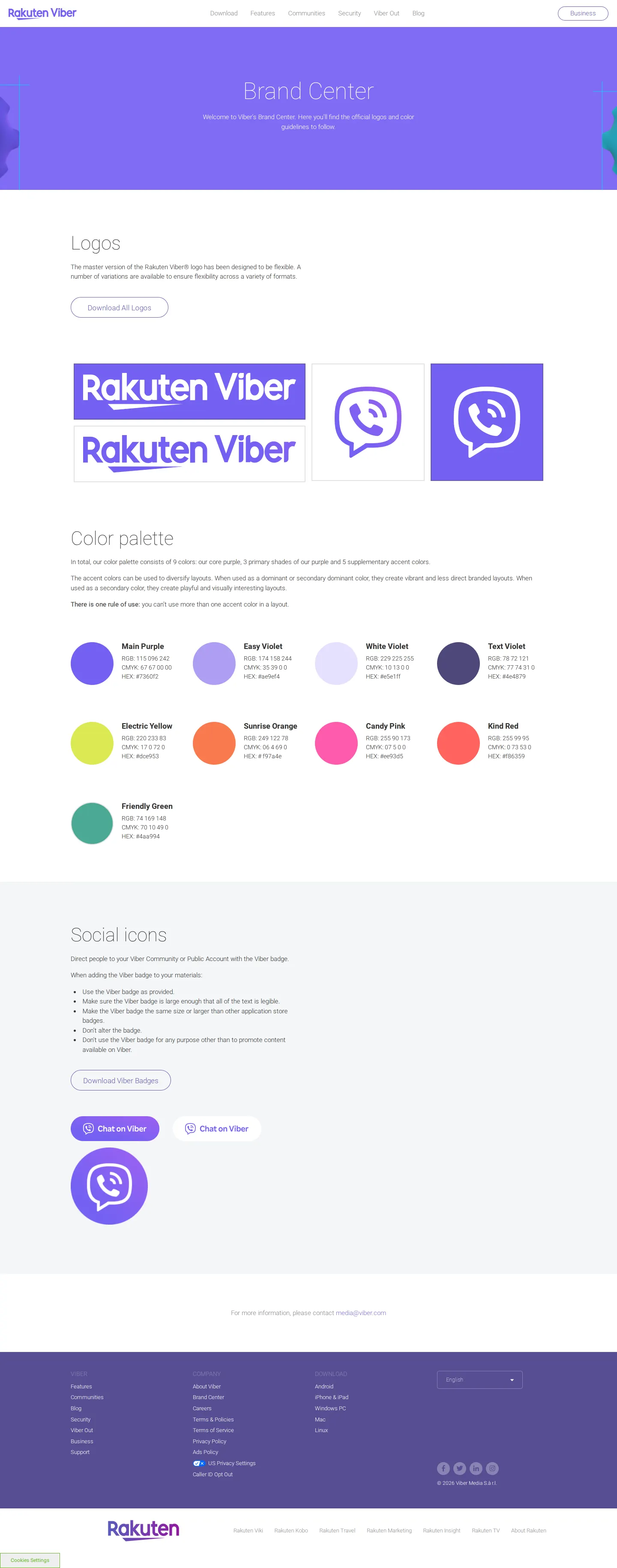
Viber's brand center provides an overview of essential logos, named color palettes, and downloadable asset packages.
Freedam's take — I like how Viber keeps its brand center straightforward and focused on the essentials. The page gathers the core visual foundations in one place, starting with the logos, a defined color palette, and social badges. Their palette names, like Easy Violet and Electric Yellow, immediately give personality to the interface. Rather than burying files behind complicated portals, they provide direct zip downloads for logo packs and badge assets right alongside the visual references.
Details
- Type
- Guidelines
- Access
- Public
- Source
- viber.com
- Industry
- Technology, Telecom
- Capabilities
- Guidelines, Search, Downloads
- Tags
- logo usage, color system, social media, asset downloads, minimal
- Added
- Last checked
What I noticed
- The brand center features dedicated sections for logos, a color palette, and social icons.123
- The color system defines tones including Main Purple, Easy Violet, White Violet, Text Violet, Electric Yellow, Sunrise Orange, Candy Pink, Kind Red, and Friendly Green.456789101112
- Direct download links are provided for a full logo archive and Viber social badges.1314
Numbers refer to the screenshots above.
What I could not see
- No typography guidelines, spacing specifications, or brand voice documentation were visible in the captured views.
Ideas to borrow
- Giving distinct, emotive names to palette swatches helps convey brand personality across simple identity pages.
Reviewed on 17 September 2026. Request a correction · I built this
Similar brand centers
All brand guidelines →