Telenor brand portal
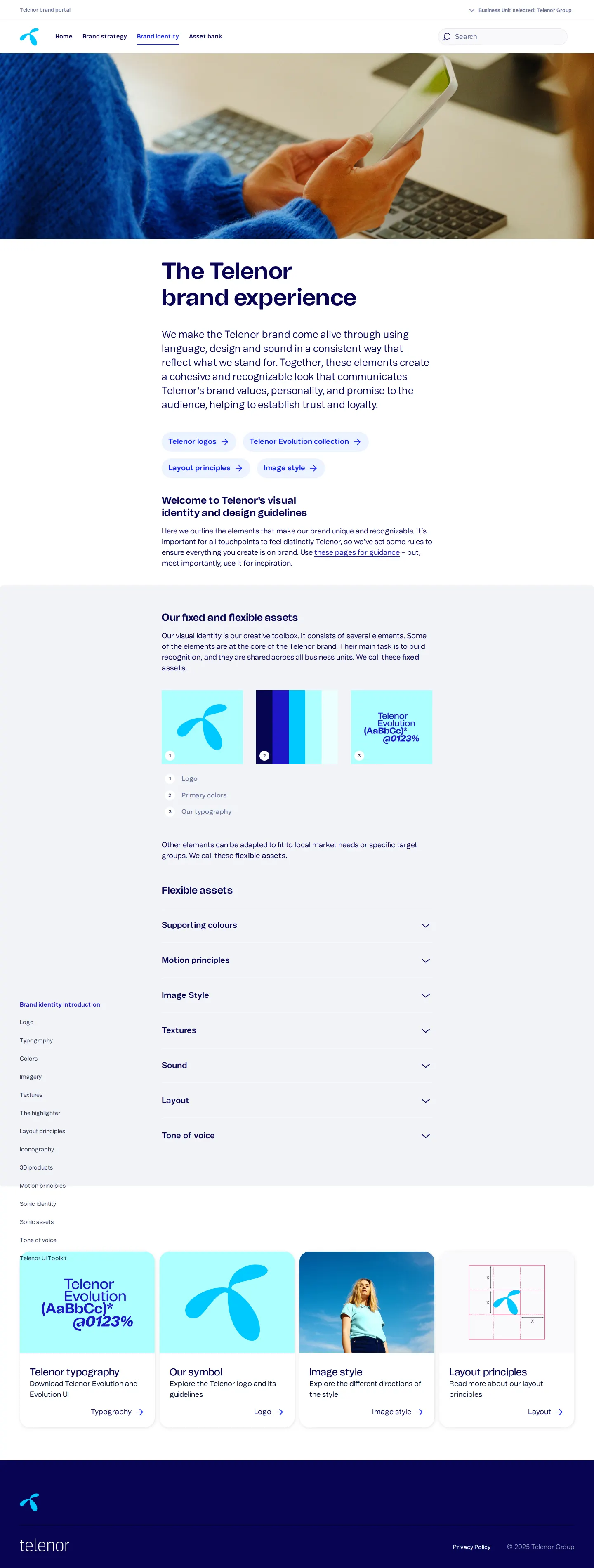
Telenor's brand portal provides guidelines and downloadable assets covering its visual identity, custom typography, color palettes, and brand strategy.
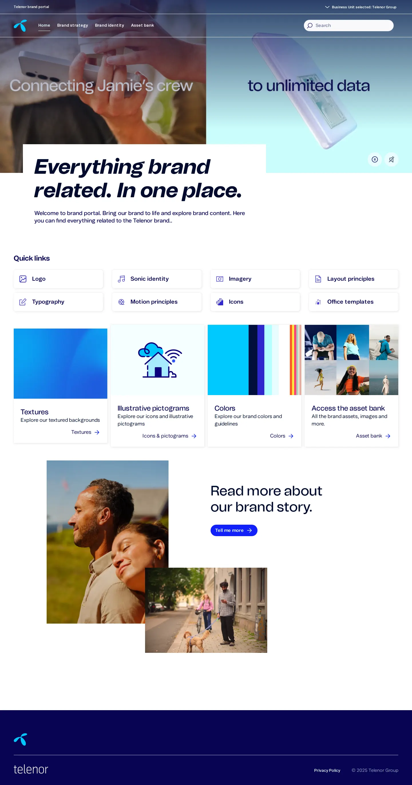
Homepage of the Telenor brand portal with introductory media, navigation links, and quick-access cards.

Logo guidelines detailing symbol rules, mathematical sizing formulas, corner placement, and misuse examples.
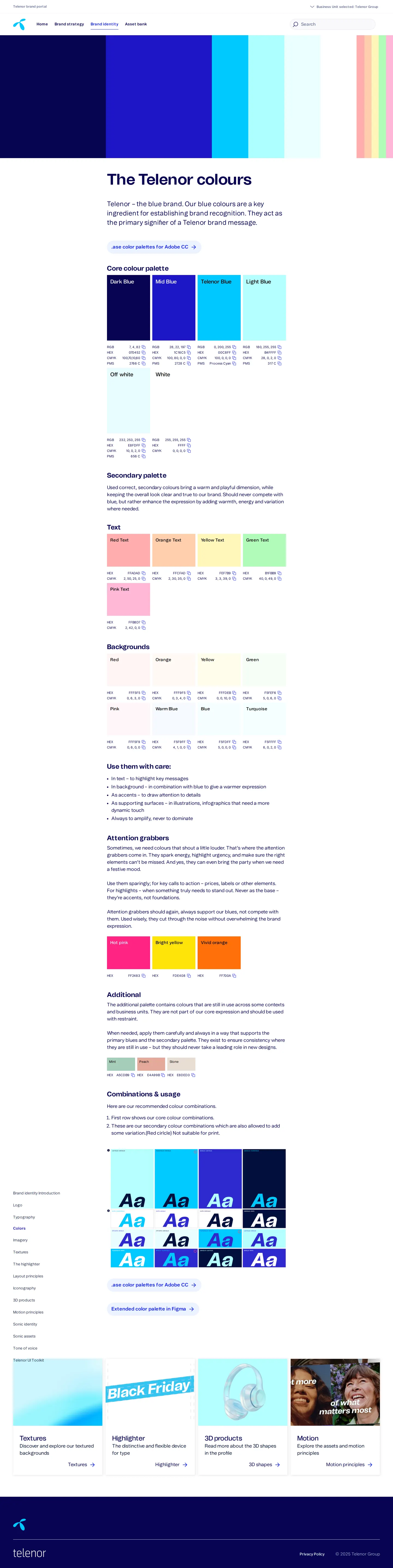
Color palette documentation outlining core blue tones, secondary colors, usage combinations, and swatch downloads.
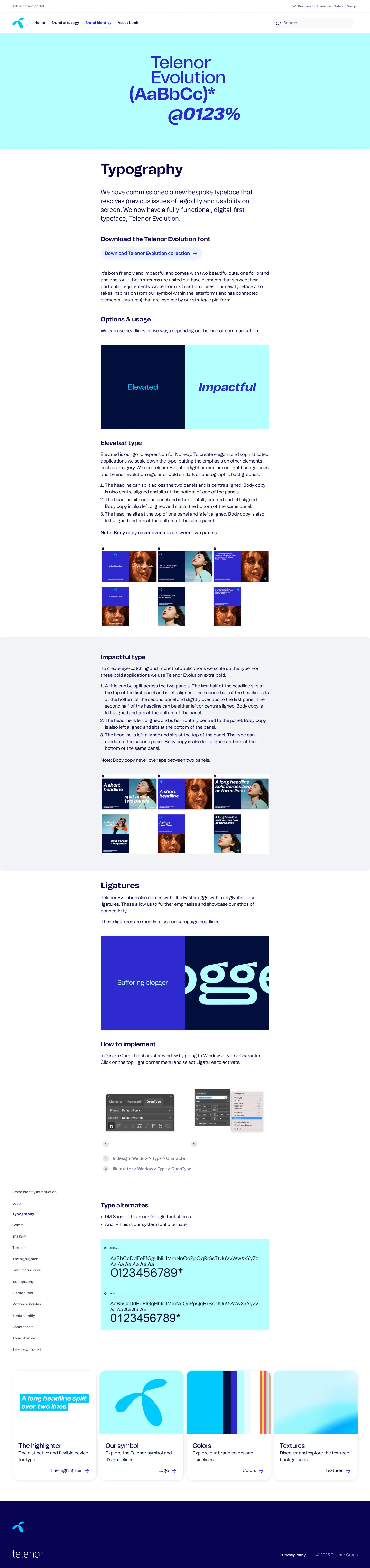
Typography guidelines showcasing the bespoke Telenor Evolution font, headline expressions, and ligatures.
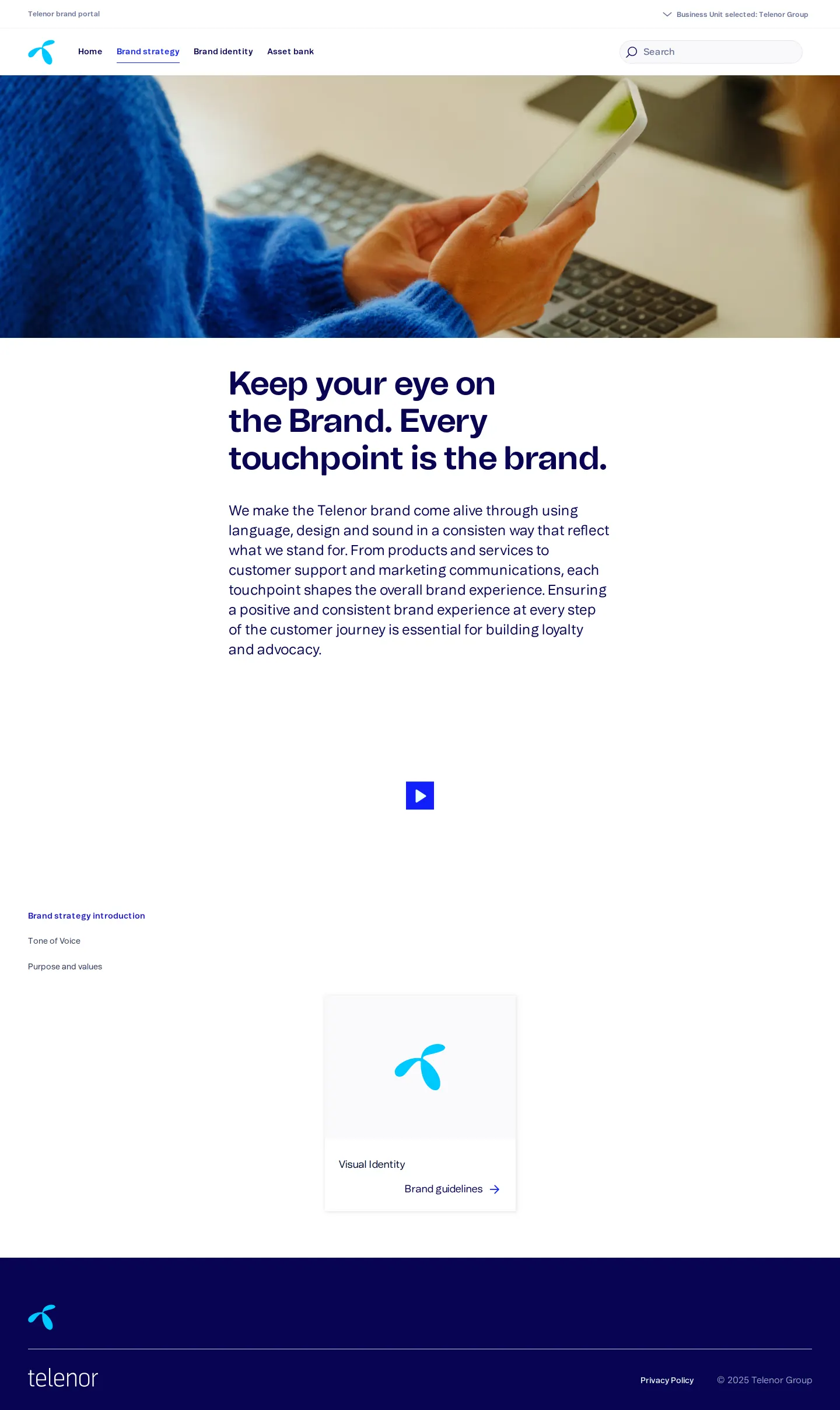
Brand strategy introduction page with touchpoint philosophy and visual identity navigation.
Want a brand center like Telenor’s?
Create your brand center with Freedam ↗Freedam's take
I really appreciate how clearly Telenor explains its visual elements. The guidelines break their custom typeface, Telenor Evolution, into practical elevated and impactful headline treatments, while also listing DM Sans and Arial as fallbacks. What stood out to me most was the logo rule where the symbol and wordmark are unlocked across opposite corners of a layout rather than forced together. They back this with clear mathematical sizing formulas based on height X and copyable palette values. It feels like an approachable system built for working designers.
At a glance
- Sections
- Home · Brand strategy · Brand identity · Asset bank
- Downloads
- ASE, Figma
- Tone
- Structured, functional, and digital-first guidance focused on practical design implementation.
What I noticed
- Telenor separates typography styles into two distinct headline expressions labeled Elevated and Impactful.12
- Layout rules direct designers to place the symbol and wordmark in opposite corners rather than grouped in a single lockup.3
- Color palettes show specifications across RGB, HEX, CMYK, and PMS with quick-copy icons alongside ASE swatches.45
Numbers refer to the screenshots above.
What I could not see
- The internal contents of the linked external asset bank application could not be inspected.
- The sub-pages for Tone of Voice and Purpose and values were not captured.
Ideas to borrow
- Provide explicit font fallback mappings, such as pointing to DM Sans for Google Fonts and Arial for system fallbacks, alongside custom typefaces.6
Quick answers
What is Telenor's primary brand typeface?
Telenor uses a custom digital-first typeface called Telenor Evolution, with DM Sans specified as the Google font alternate and Arial as the system font fallback.786
How are the Telenor symbol and wordmark positioned in layouts?
The symbol and wordmark are unlocked and placed across opposite corners of the composition rather than grouped into a single combined lockup.3
What color swatch formats are available for download?
Color palettes are available as .ase files for Adobe CC and as an extended palette within Figma.5
Reviewed on 26 September 2026. Request a correction · I built this
Similar brand centers
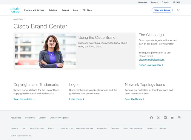
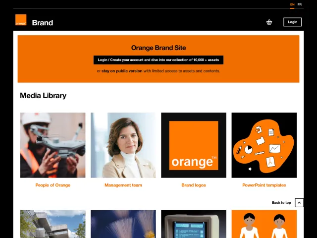
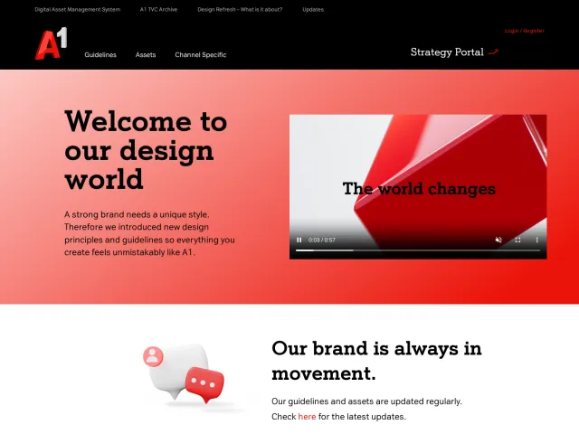
All brand portals →Telenor shares its typography, logo formulas, and color palettes openly alongside downloads for Figma and ASE swatches. In contrast, A1 Telekom Austria gates multiple sections behind user authentication, and Cisco provides downloadable packages tailored to network topology diagrams.