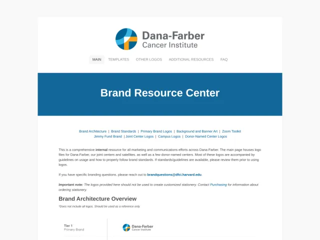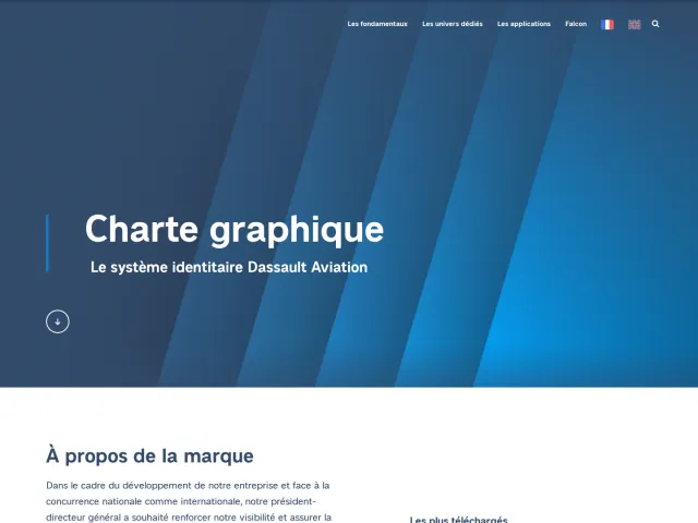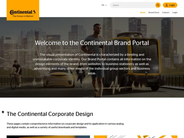
Macquarie Group brand portal
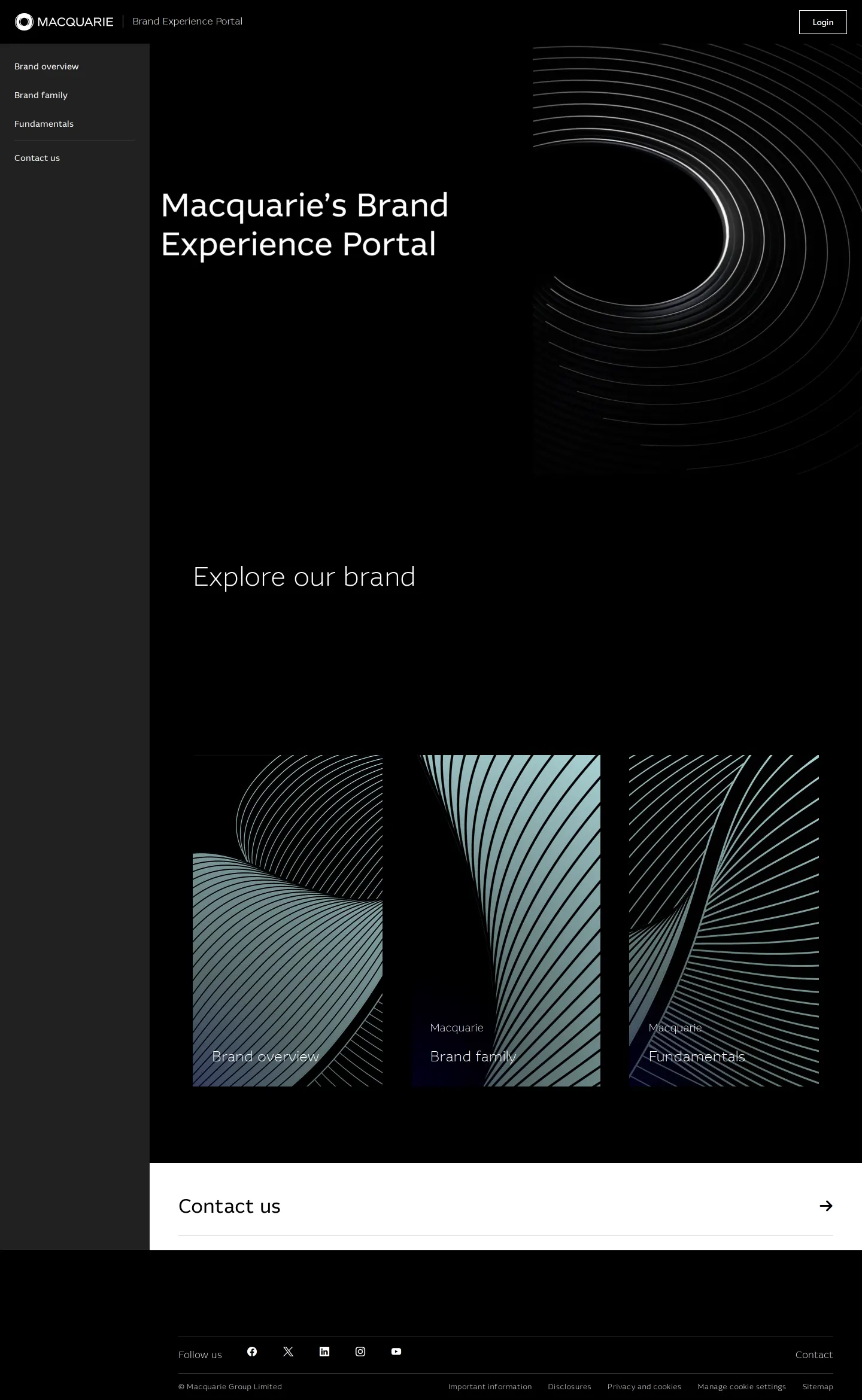
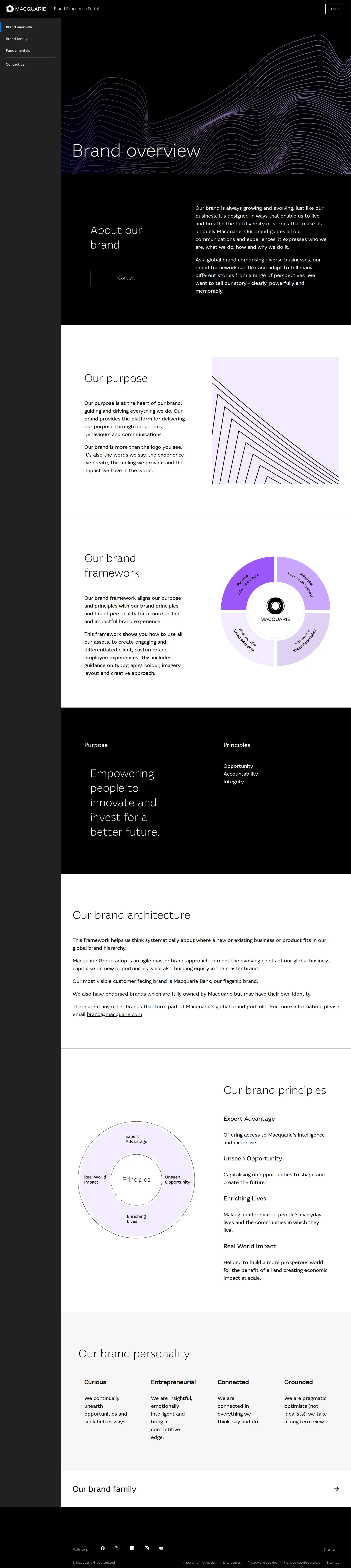
Macquarie Group's brand portal outlines architecture, core principles, and fundamentals split into fixed and flexible assets, backed by regional contacts.
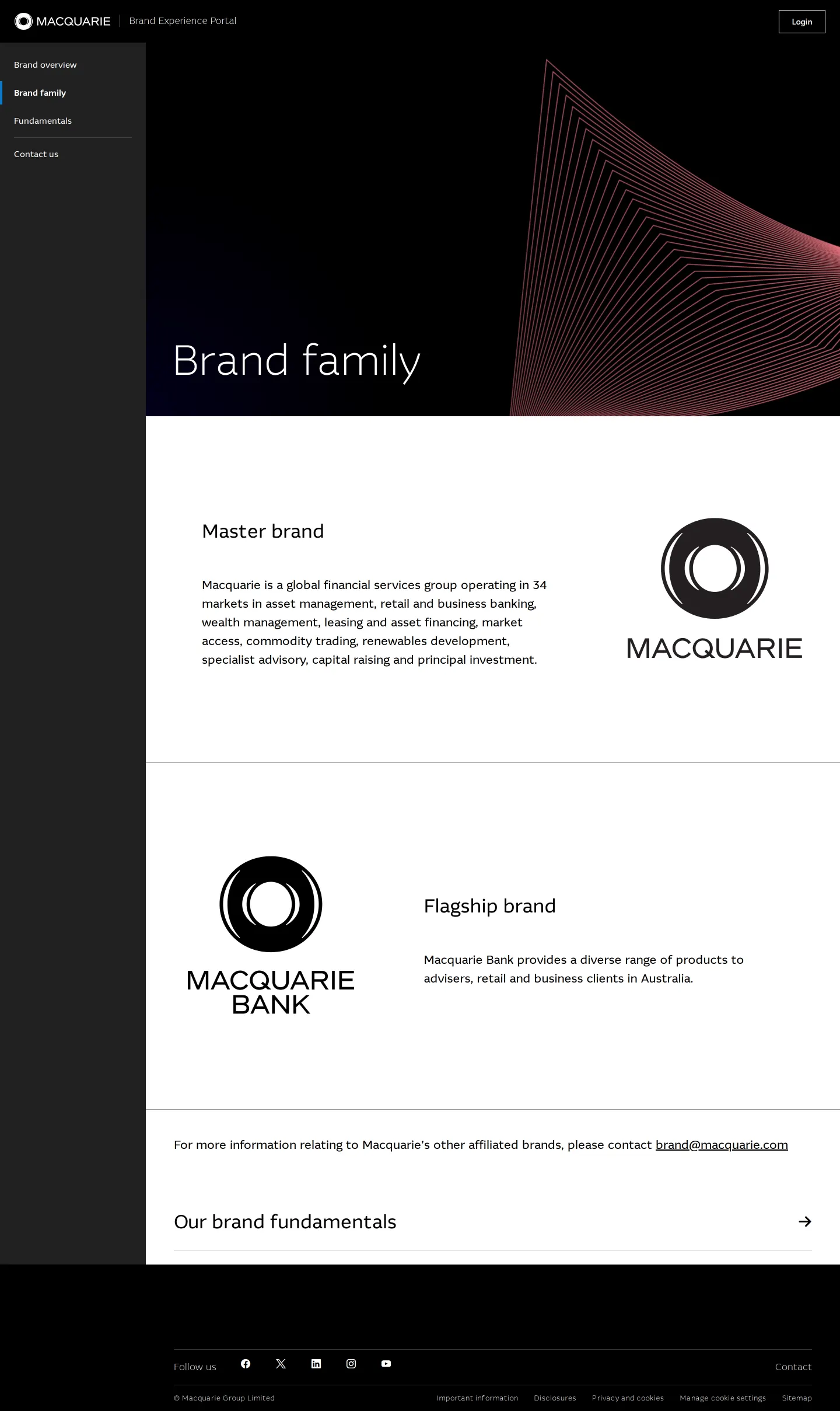
Freedam's take — I like how Macquarie Group organizes its brand elements into fixed and flexible assets. Looking through the fundamentals, fixed essentials like logo, typography, color, and grid sit right alongside flexible pieces like video, illustration, and animation. The site also takes care to outline architecture across a master brand and flagship brand. Having regional contact sections for ANZ, Americas, Asia, and EMEA gives teams clear points of contact, though a login prompt appears across pages, meaning deeper resources might be tucked behind an internal portal.
Details
- Type
- Brand portal
- Access
- Public
- Source
- brand.macquarie.com
- Industry
- Finance
- Capabilities
- Guidelines, Asset browsing, Search, Templates
- Tags
- brand architecture, logo usage, typography, color system, illustration, search, gated access
- Added
- Last checked

What I noticed
- The fundamentals section divides brand elements into fixed assets and flexible assets.12
- Brand architecture outlines both a master brand and a flagship brand.345
- The contact section is broken down by global regions including ANZ, Americas, Asia, and EMEA.6789
- A search form and login link are present on all captured pages.101112131415
Numbers refer to the screenshots above.
What I could not see
- Content behind the login form could not be accessed.
- Actual asset download availability and interactive guidelines could not be evaluated directly from the captured screens.
Ideas to borrow
- Categorizing design components into fixed assets and flexible assets helps designers quickly understand what can be adapted versus what must remain rigid.
Reviewed on 18 September 2026. Request a correction · I built this
Similar brand centers
All brand portals →