Egmont brand portal
Egmont’s brand center offers clear asset downloads, detailed editorial typographic rules, and a paired color system split between ready-to-use tools and design guidance.
Freedam's take — I really appreciate how clearly Egmont structures their brand center. Dividing everything neatly into Ready to use and Design it gives both daily staff and external designers an immediate starting path. Their typography documentation is remarkably thorough, going beyond standard hierarchy into editorial typesetting details like en dashes, curly quotes, and hanging punctuation. I also like their structured palette system built around seven fixed light-and-dark pairs to guarantee contrast across touchpoints. It feels purposeful, grounded, and focused on making implementation straightforward.
Details
- Type
- Brand portal
- Access
- Public
- Source
- brandcenter.egmont.com
- Industry
- Media & entertainment
- Capabilities
- Guidelines, Asset browsing, Downloads, Templates
- Tags
- typography, editorial guidelines, color system, brand architecture, asset downloads
- Added
- Last checked



What I noticed
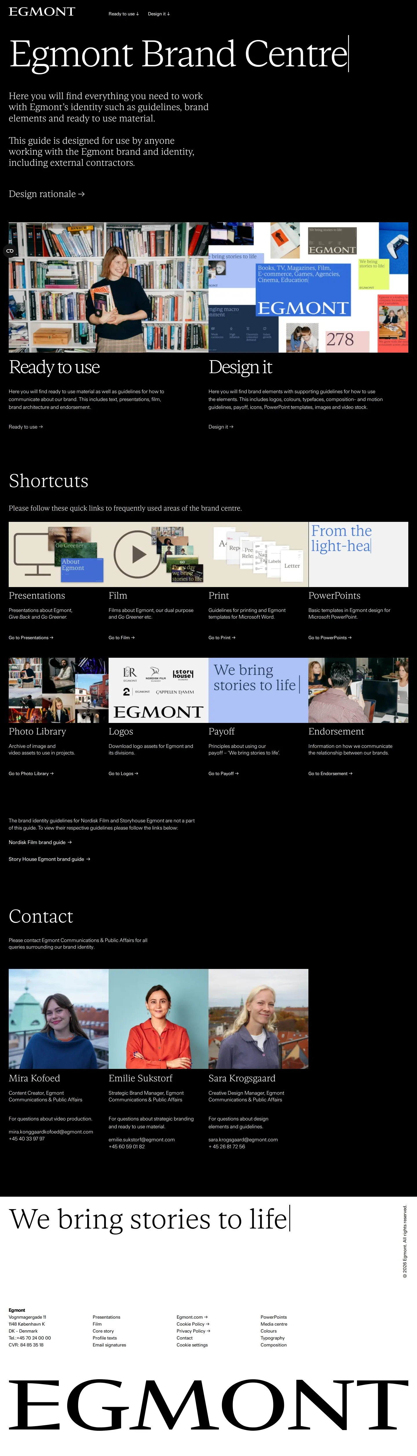
- The primary navigation splits content into two core buckets labeled 'Ready to use' and 'Design it'.12
- Egmont organizes its palette into seven fixed color pairs featuring light and dark tones designed to be used interchangeably.3
- The typography documentation covers granular punctuation rules including ampersands, curly quotes, and hanging punctuation.456
- Direct download packages are provided for the primary Egmont logo as well as division logos like Nordisk Film and Story House Egmont.78
Numbers refer to the screenshots above.
What I could not see
- Could not view search functionality within the navigation interface.
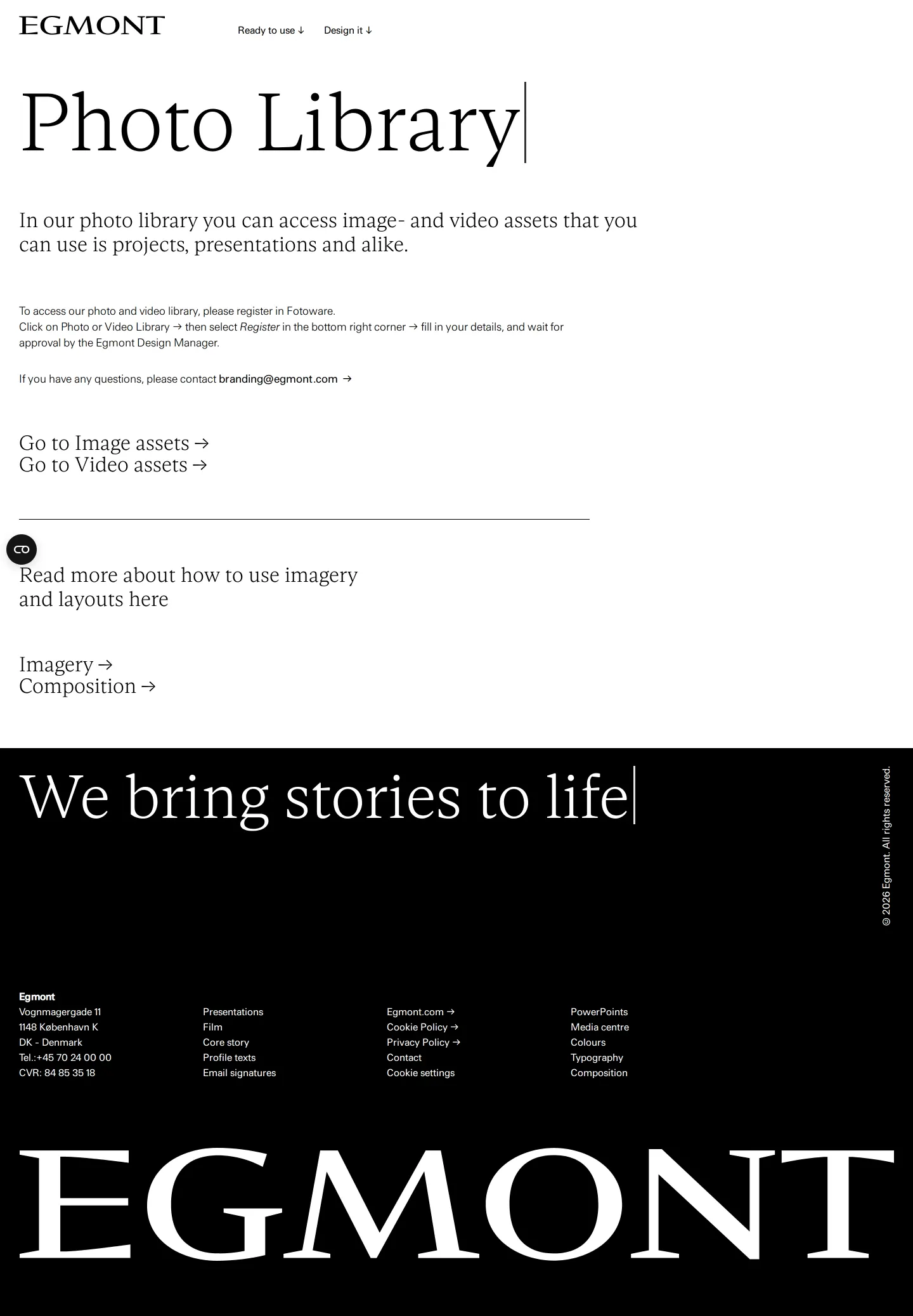
- Could not view the contents of the image and video assets inside the photo library page.
Ideas to borrow
- Structuring brand guidelines around preset accessible color pairs helps non-designers avoid low-contrast combinations.
Reviewed on 18 September 2026. Request a correction · I built this
Similar brand centers
All brand portals →